

Shoot costs, shield your finances
Brand strategy, visual identity with a brand book and a new website for a corporate payment card fintech.
The need
Financial management in a company is a delicate and bureaucratic process. The larger the organisation and the more people who need access to funds, the greater the challenges for management. Sparados answers this with its products.
Issuing and managing employee payment cards, controlling expenses and analysing them on an ongoing basis are the core functions of Sparados. So far the brand had focused on expanding these functions without a crystallised identity, which made it hard to stand out from the competition. Our goal was to build a strategy and design a visual identity system along with a new website — Sparados needed a clear and consistent visual direction. The project included:
- Branding
- Logo design and brand book
- Icon set
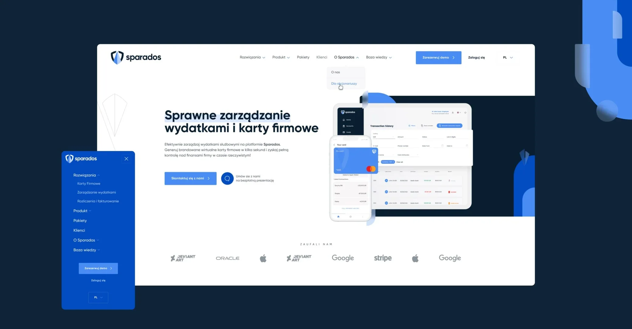
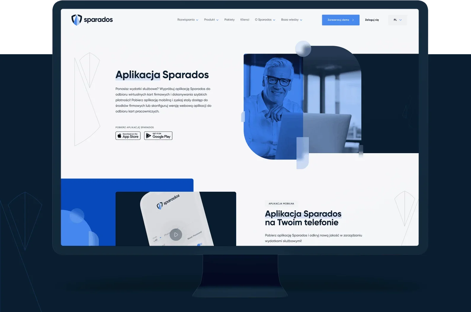
- Website design
- Pre-implementation consultation
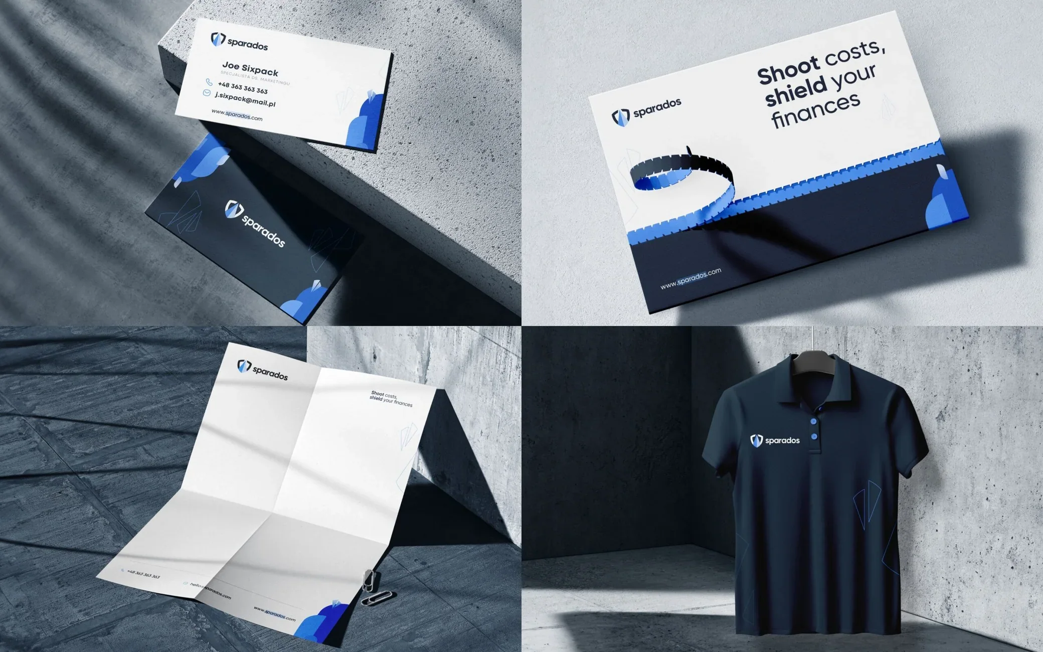
- Marketing assets
Discovery
We started the discovery process with an analysis of the competition, the market and the brand's target groups. In close cooperation with the marketing department, we developed values that guided our search for the brand's visual alphabet.
We were looking for solutions that would make Sparados recognisable as a brand providing quick financial services while giving a sense of security, reliability and stability.
Logo discovery
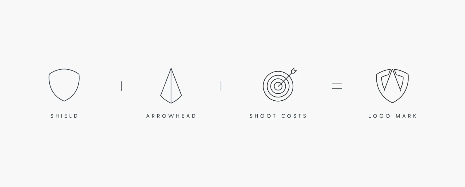
The name Sparados comes from Latin and means shot or arrow. It couldn't be otherwise — we had to use this motif in the logo.
We explored signs with arrowheads, arrows and other dynamic forms. After the first iterations, however, we concluded that dynamic forms did not match the values of solidity and stability, so we moved towards more static shapes. We also wanted the symbol to be associated with security, hence the references to a shield and a seal in the drafts.

Final version
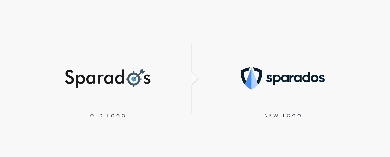
The final logo combines a shield and an arrowhead with sans-serif typography.
It is supported by the slogan “Shoot costs, shield your finances”, which perfectly complements the clear and clean message.


Website concepts
With the logo and identity guidelines in place, we started designing the website. The process had two stages, during which we prepared several concepts and a dozen or so variants.
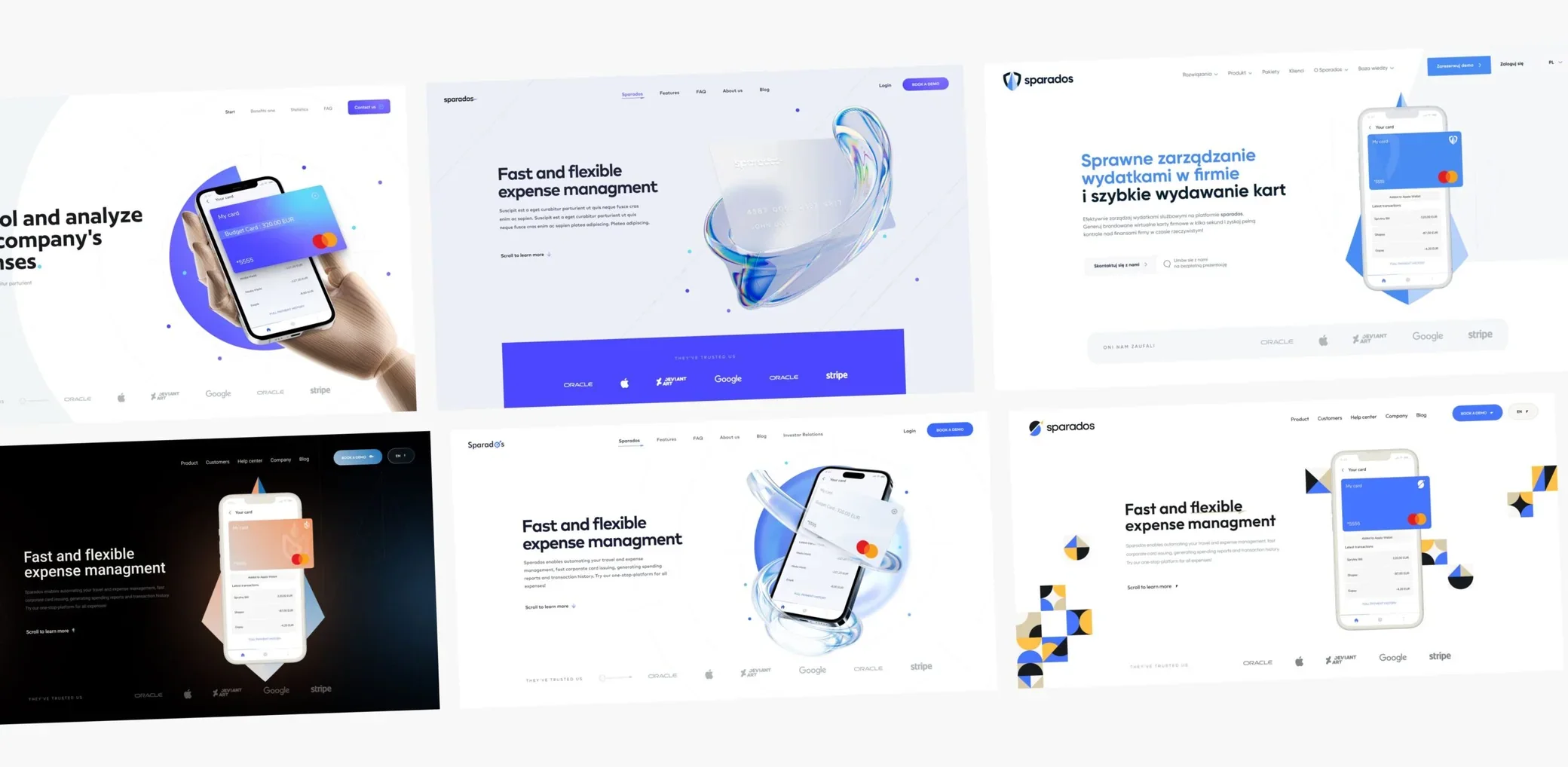
UX/UI design
While designing the website, we also looked for leading motifs to make the brand unique. The results are below.

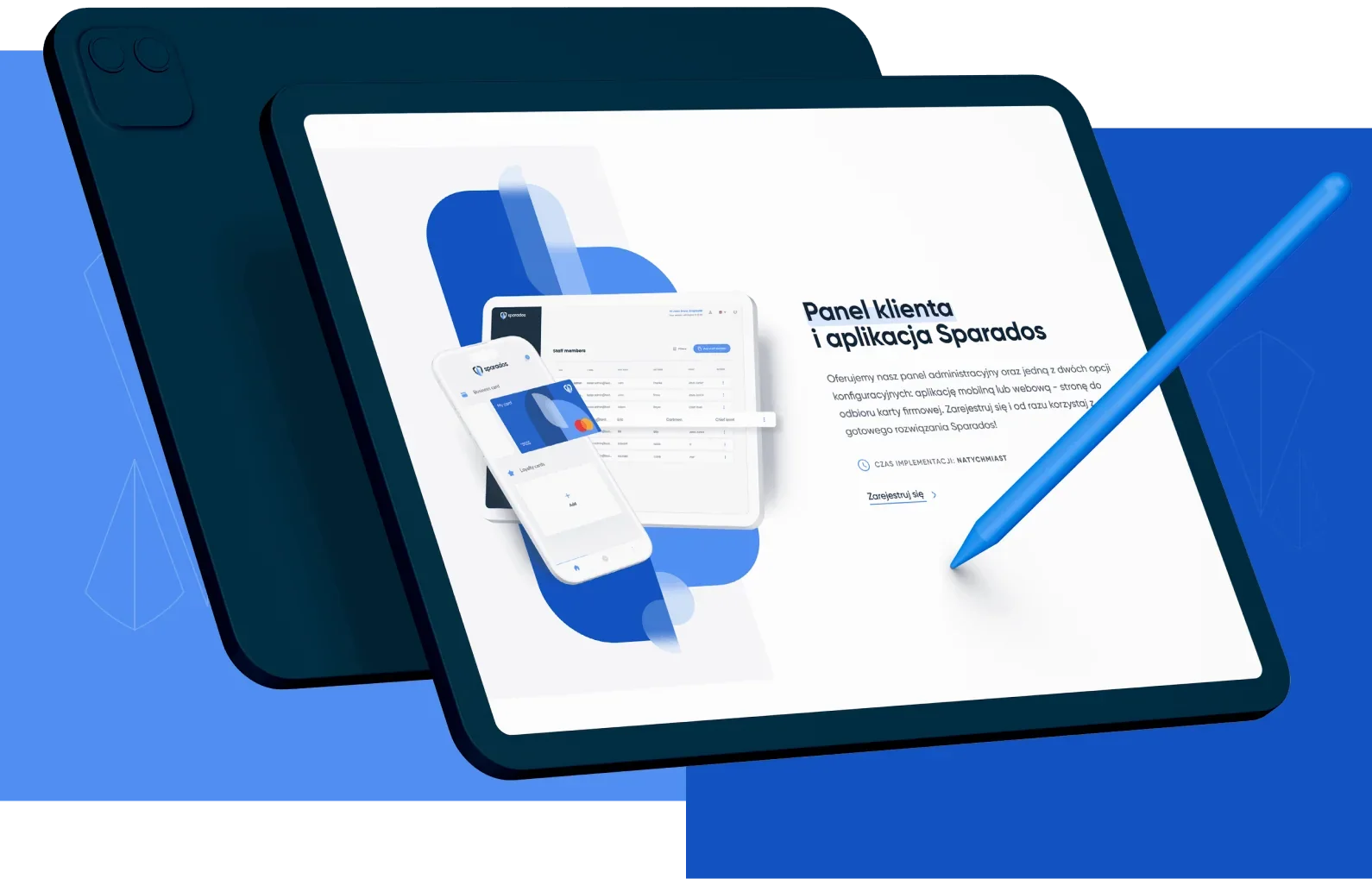
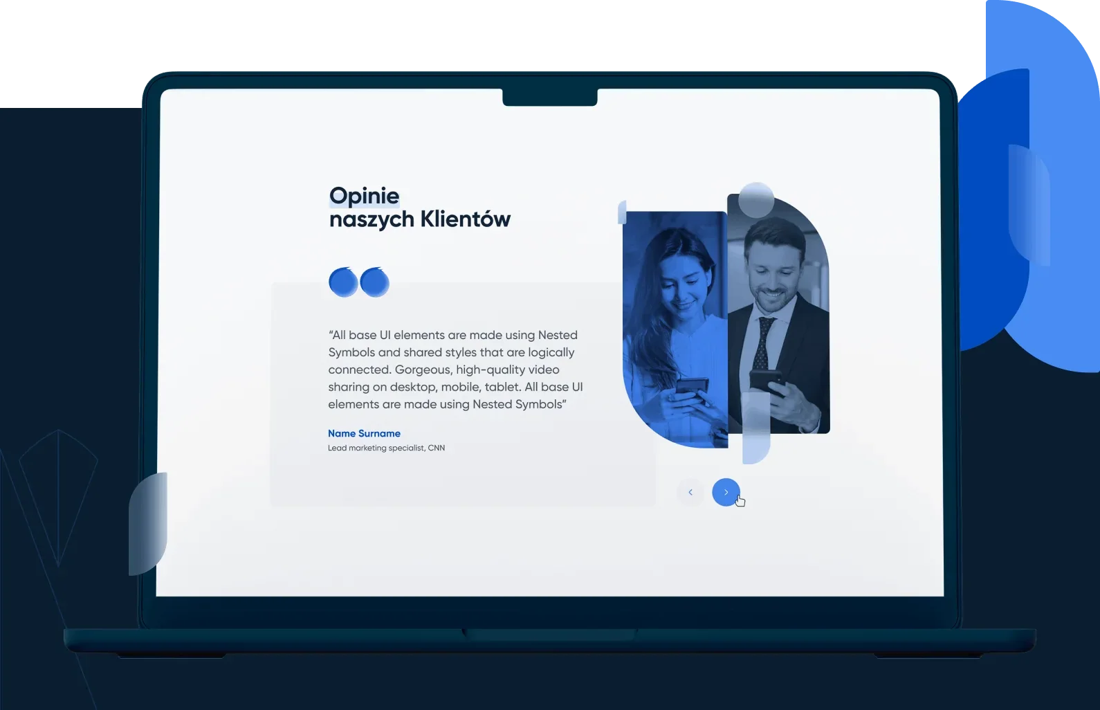
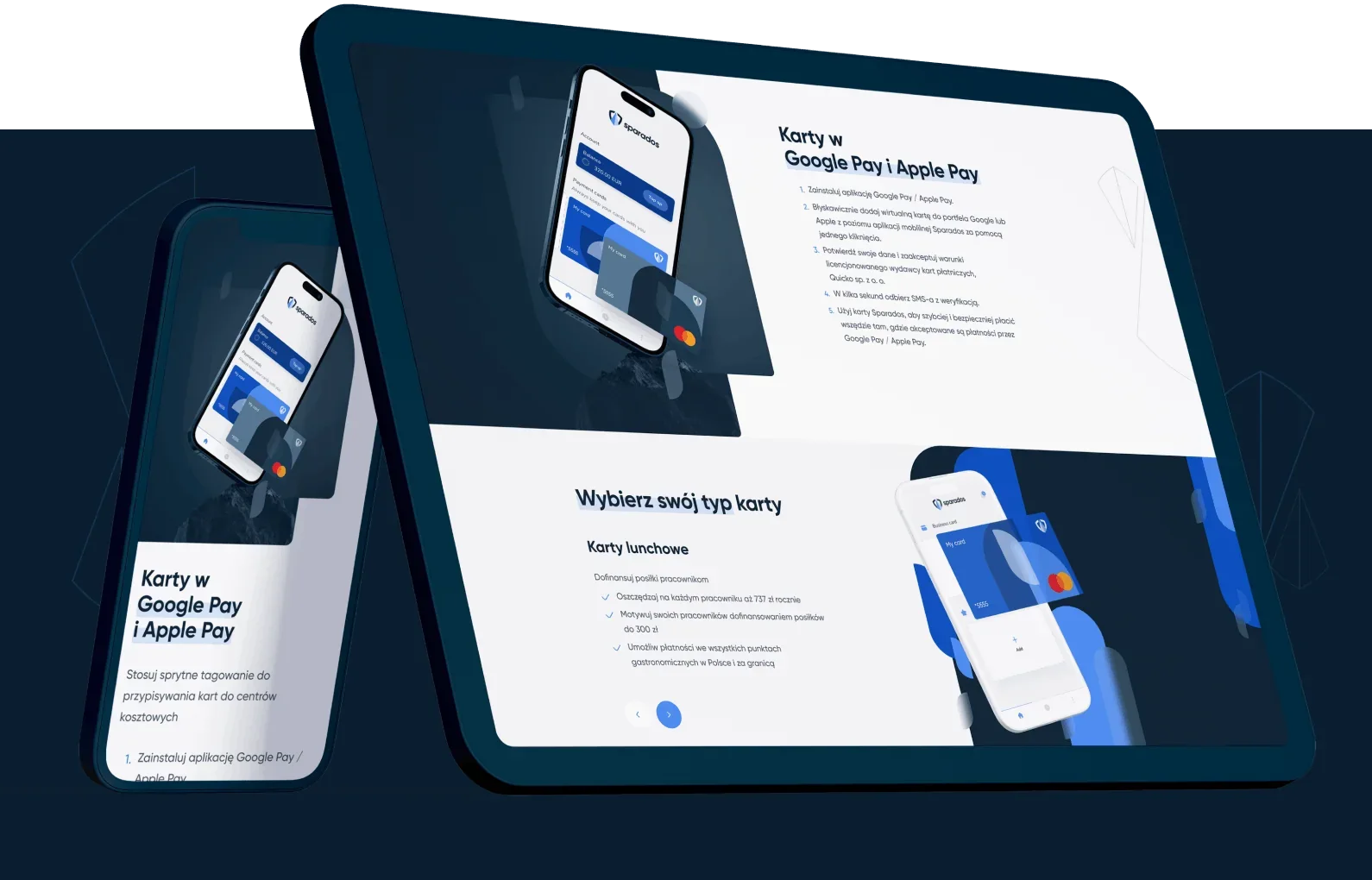
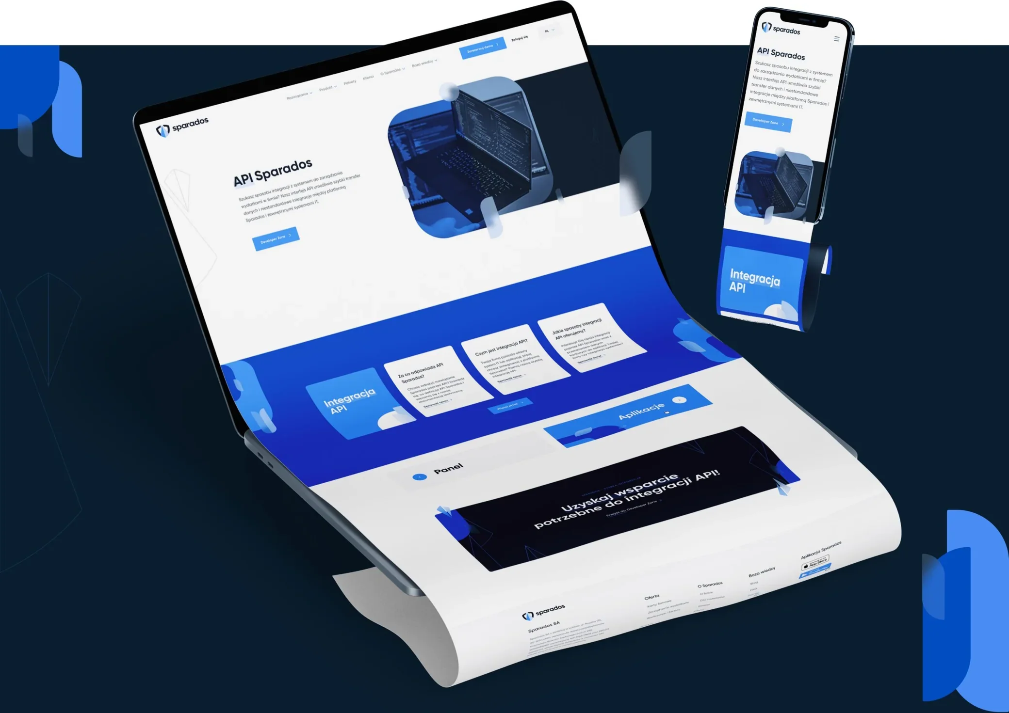
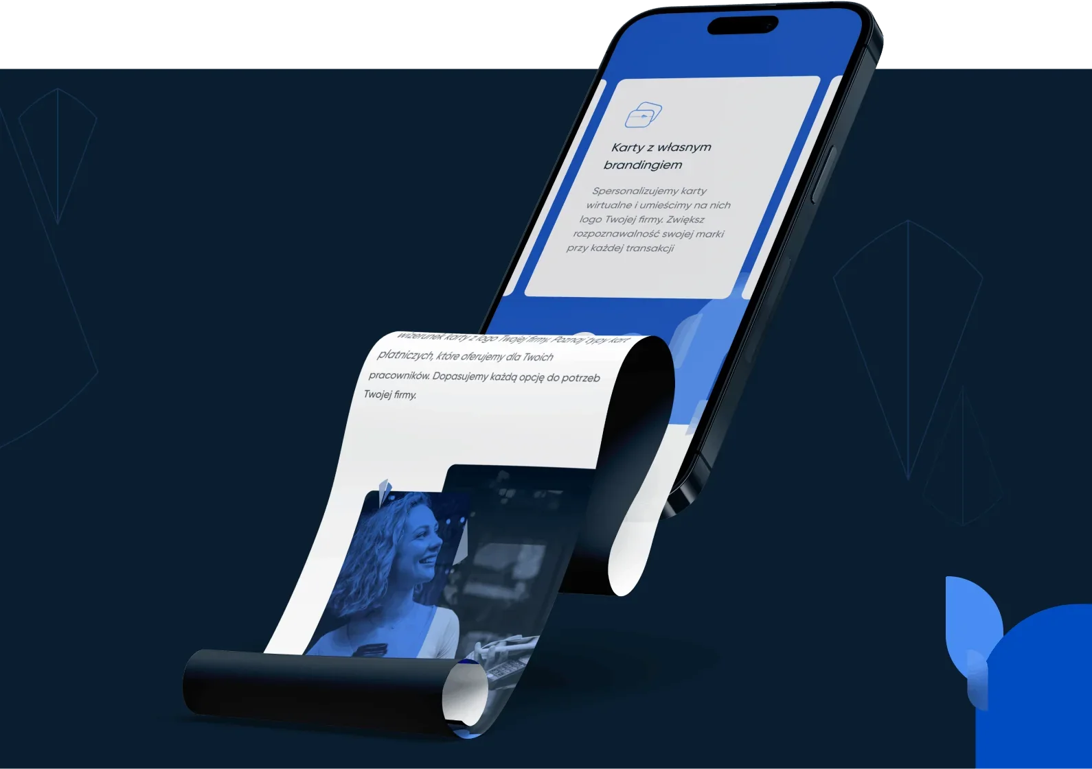
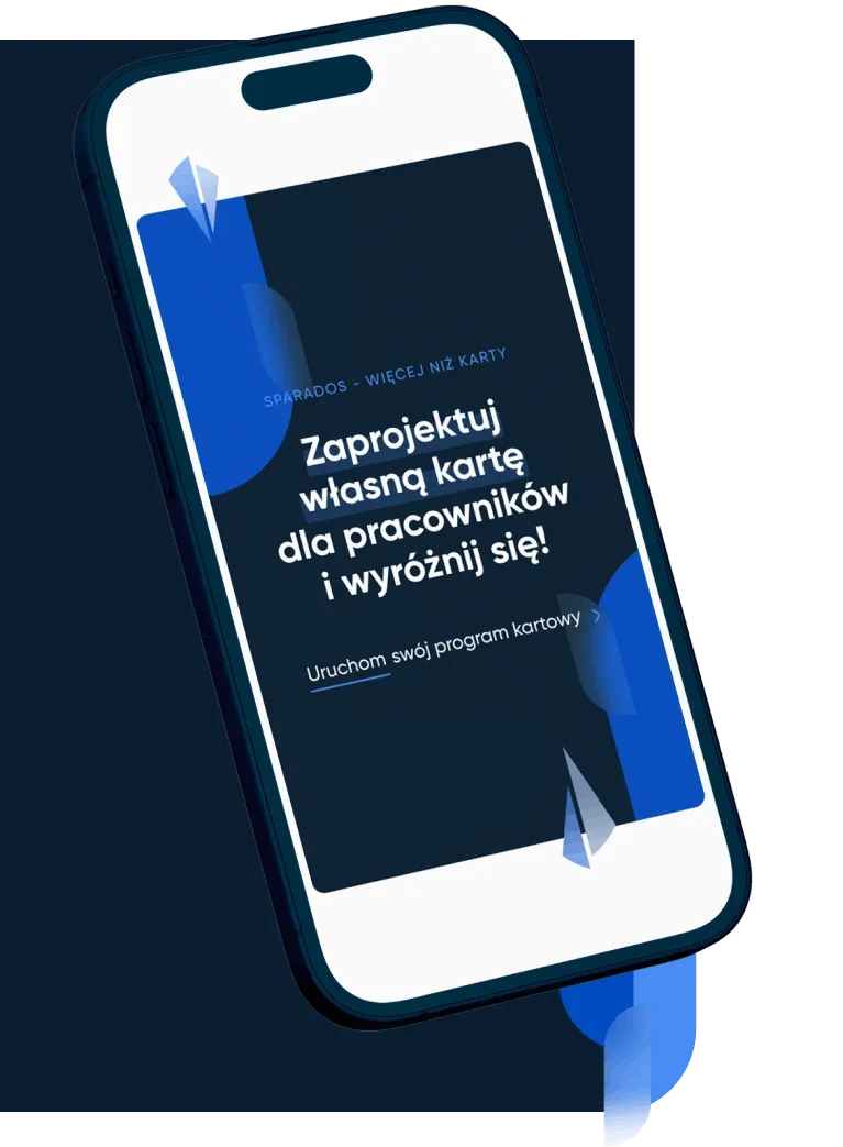
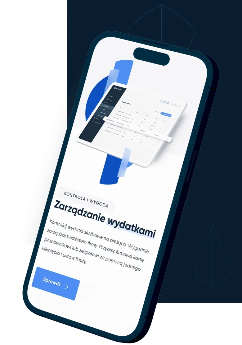
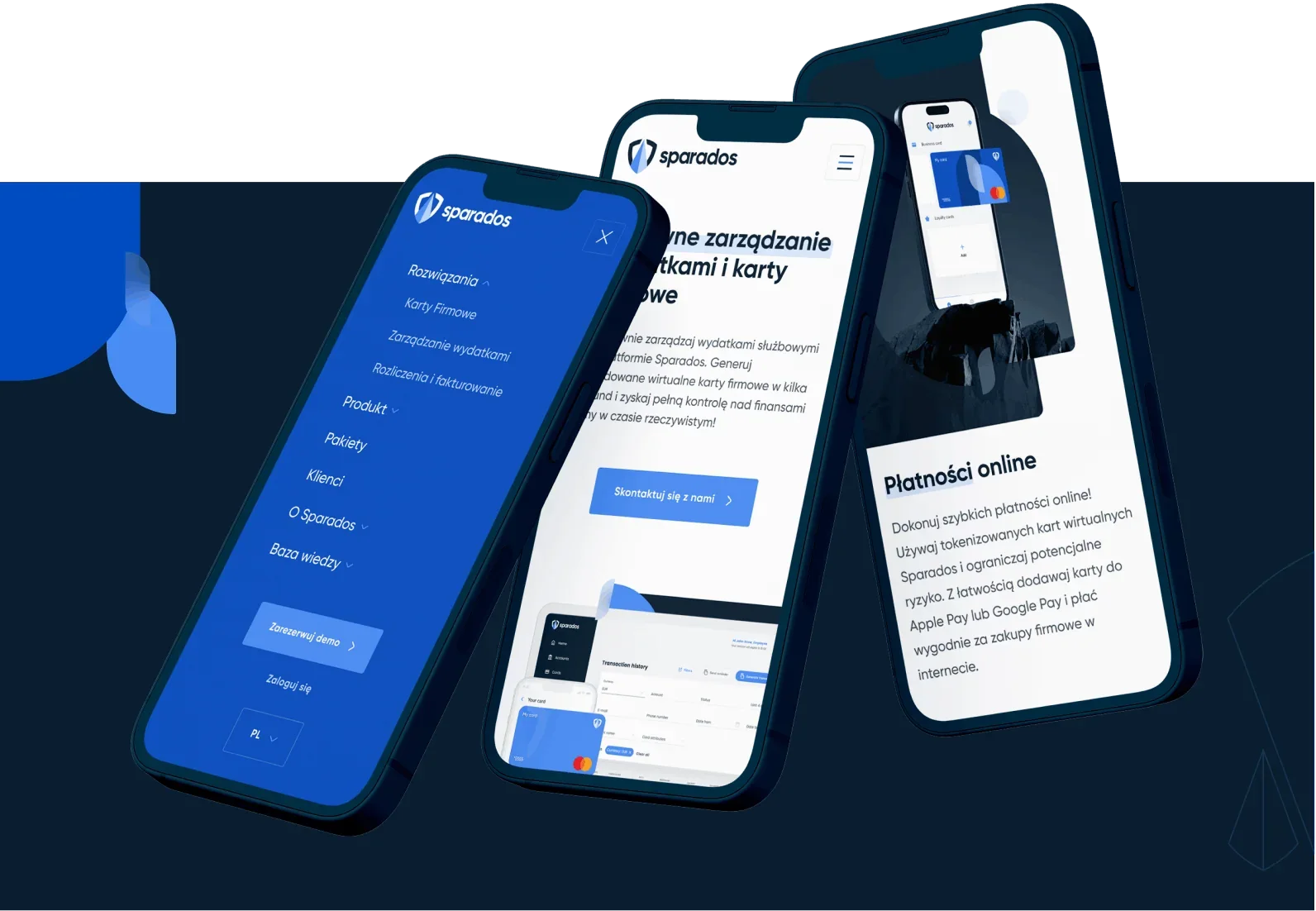
Responsive design
As always, we made every effort to make the website look great on mobile devices.
App icons
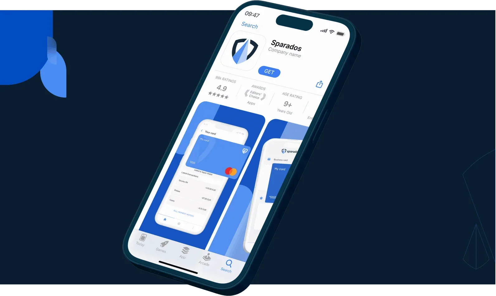
The project also included helping existing Sparados products align with the new visual identity.
We designed icons and advised on the changes needed in the Sparados apps.

Icon set
The icons are part of the website design. The custom set will also be used throughout Sparados' identity and products.

Brand book
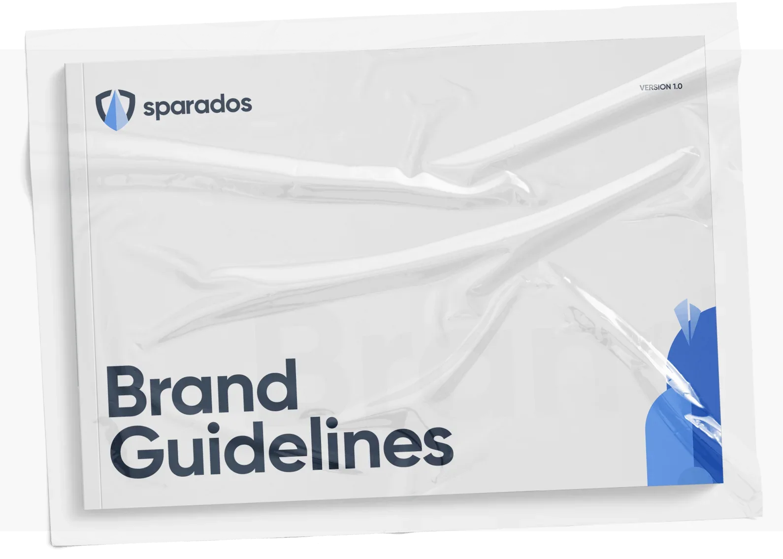
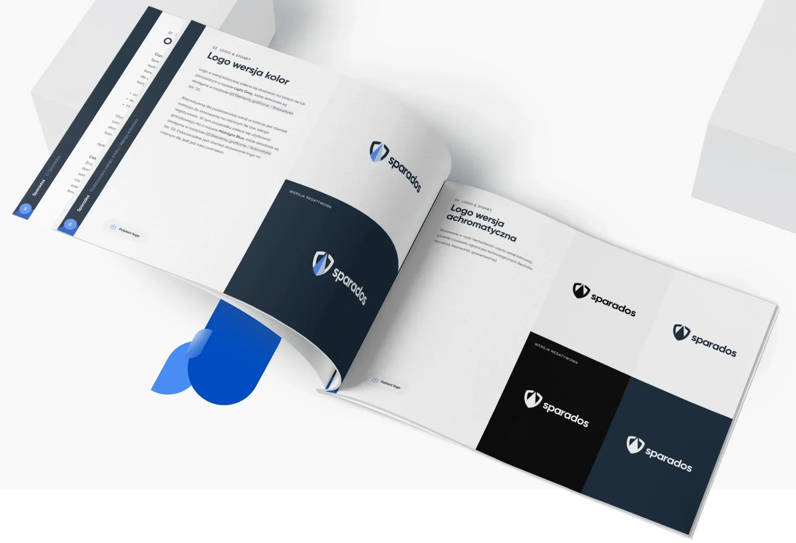
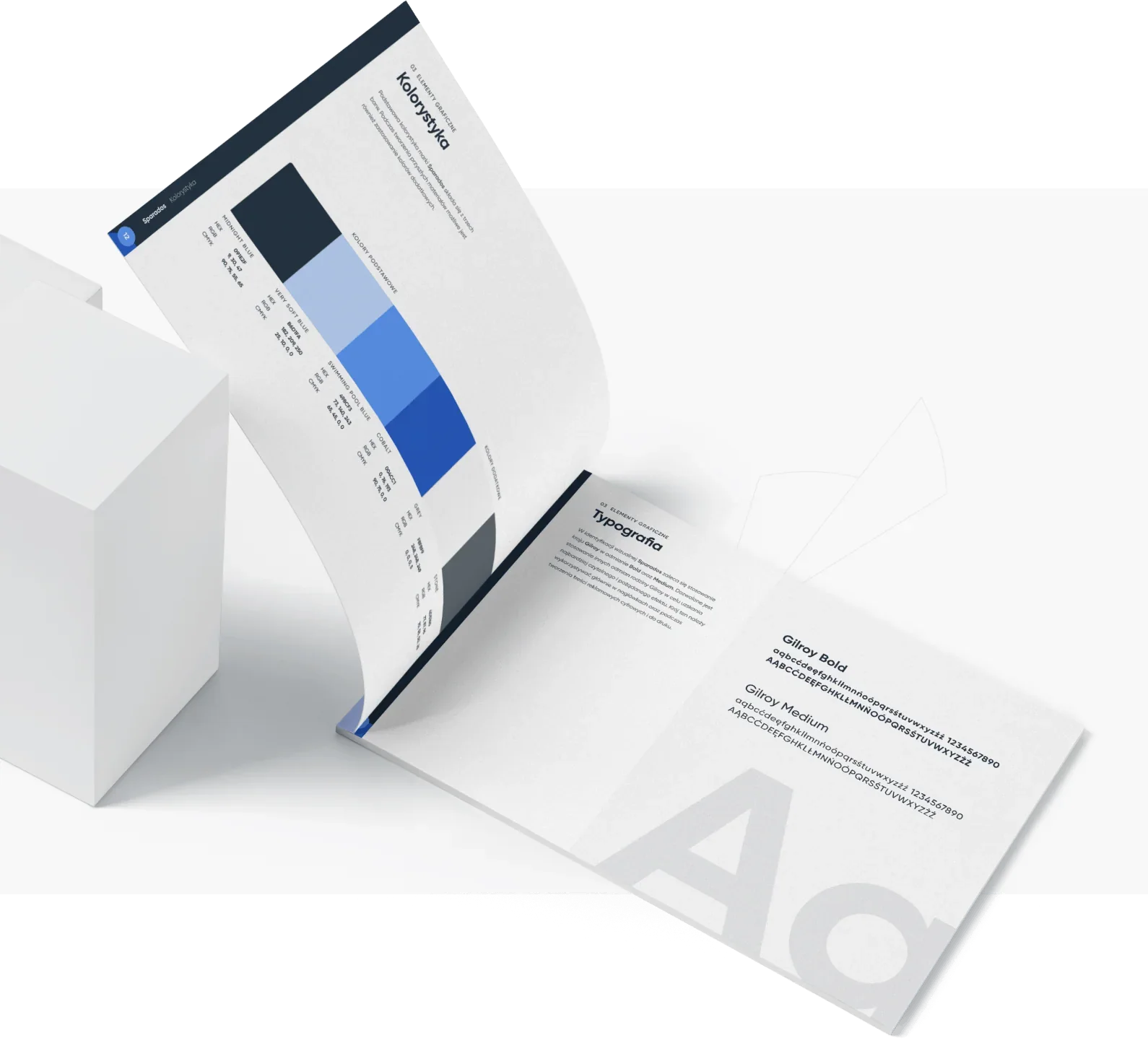
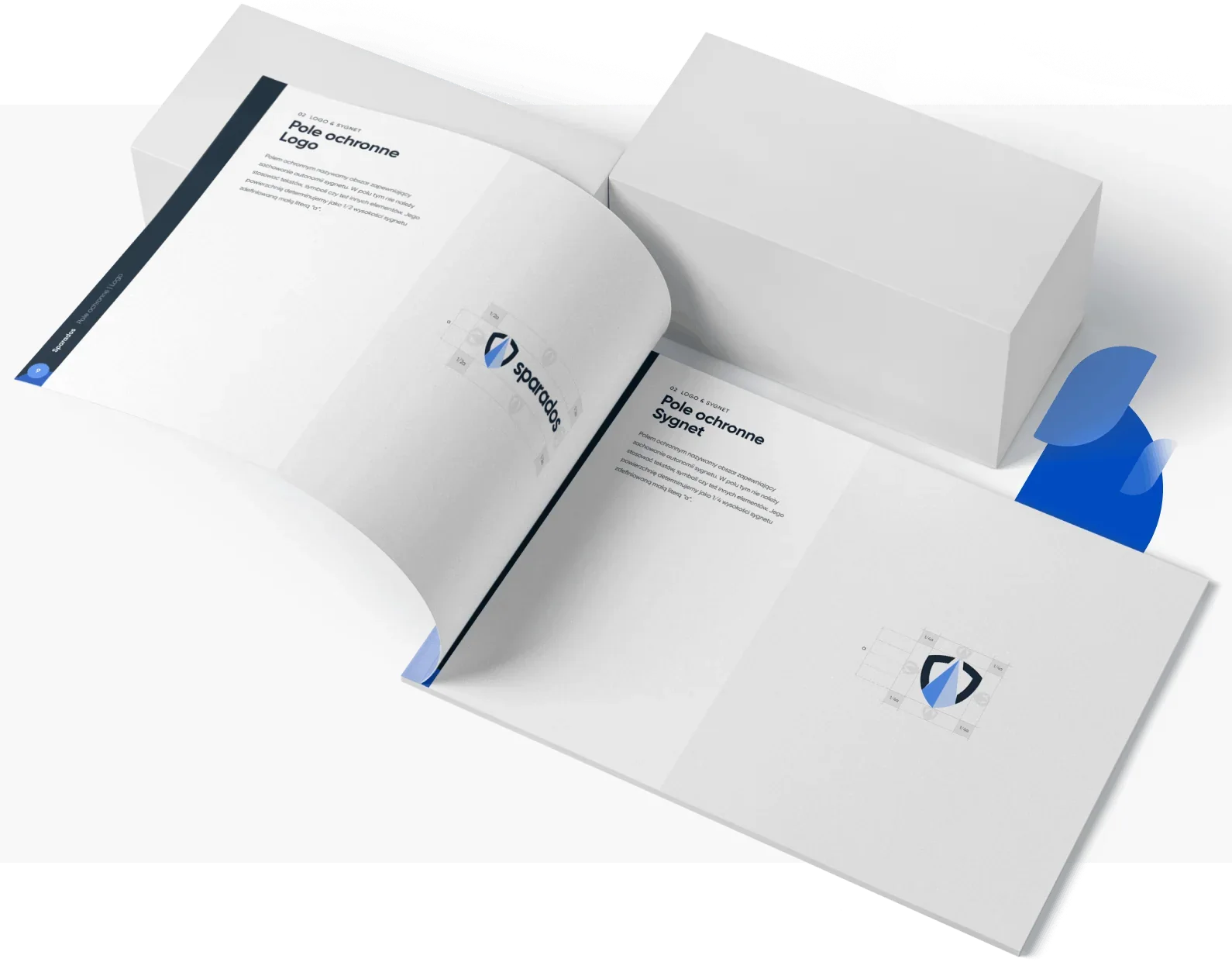
We wrapped the entire project in a carefully and clearly described brand book.
The document will be used not only within the company, but will also be a valuable tool when commissioning work from external companies and subcontractors.
Testimonial
Their ability to find solutions that meet expectations and capabilities is impressive.
Wojciech Nowakowski
Head of Product, Sparados

More projects
All projects



A revolution in preventive healthcare
Case study coming soon
- Healthcare