
Sales commission system made simple
Naming, branding, a no-code website and animations for a SaaS app.
The need
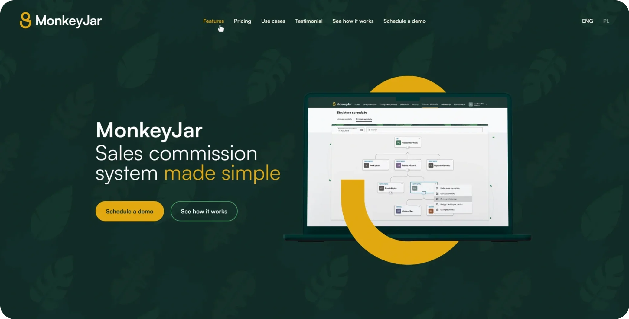
MonkeyJar is a sales commission system offered in a SaaS model designed for medium-sized companies, so they can effectively compete with larger players in the market. MonkeyJar shows that sales commissions can be calculated smarter, faster and more securely than using Excel.
The MonkeyJar app is dedicated to finance and sales directors, people responsible for billing, as well as salespeople, sales agents and consultants. Our goal was to create a completely new image taking into account the target group — from the brand name to the final version of the logo, the website, animations, designs, icons, social media templates and many more materials. The project included:
- Naming and branding research
- Moodboards, logo and website concepts
- Icon and illustration sets, user interface design
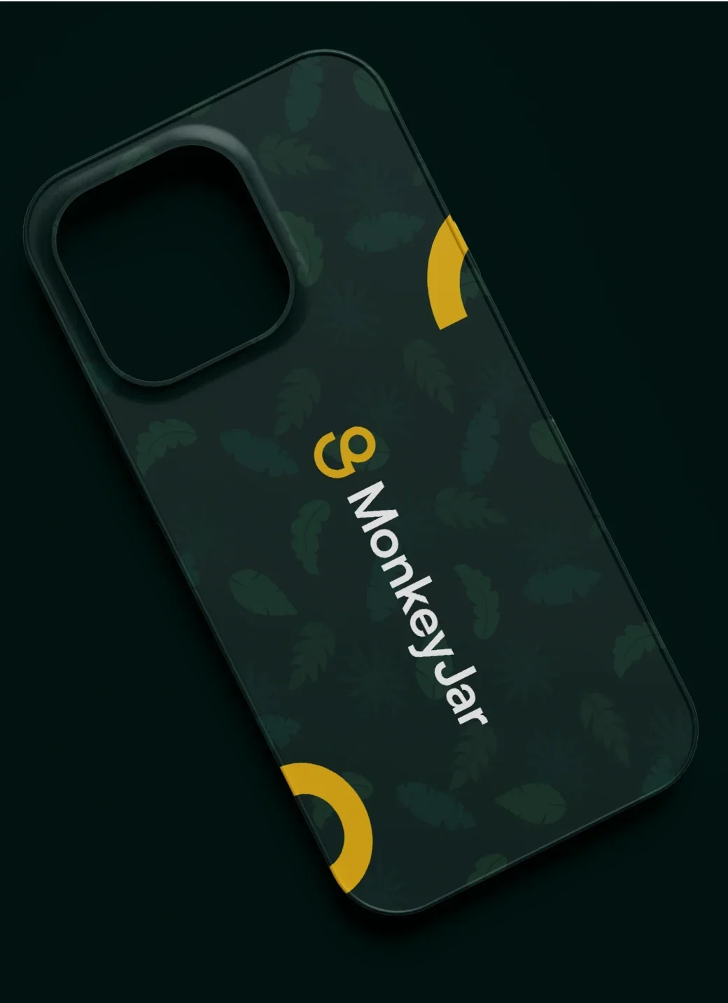
- Exotic-leaf patterns and graphics for the app
- Animations, logo intros and app visualisations
- Creative support for social media graphics
Discovery
We started our work by preparing a new site map and agreeing on the key features of the site, so users can easily navigate it, quickly find information and easily book a demo.
Once the key functions were established, we began looking for the ideal visual style. We examined the market, how visual design is built in similar products, who the site is aimed at and how the visual style should be built. Step by step, creating completely new visual concepts, we arrived at a design that perfectly fits the company's identity.

Website
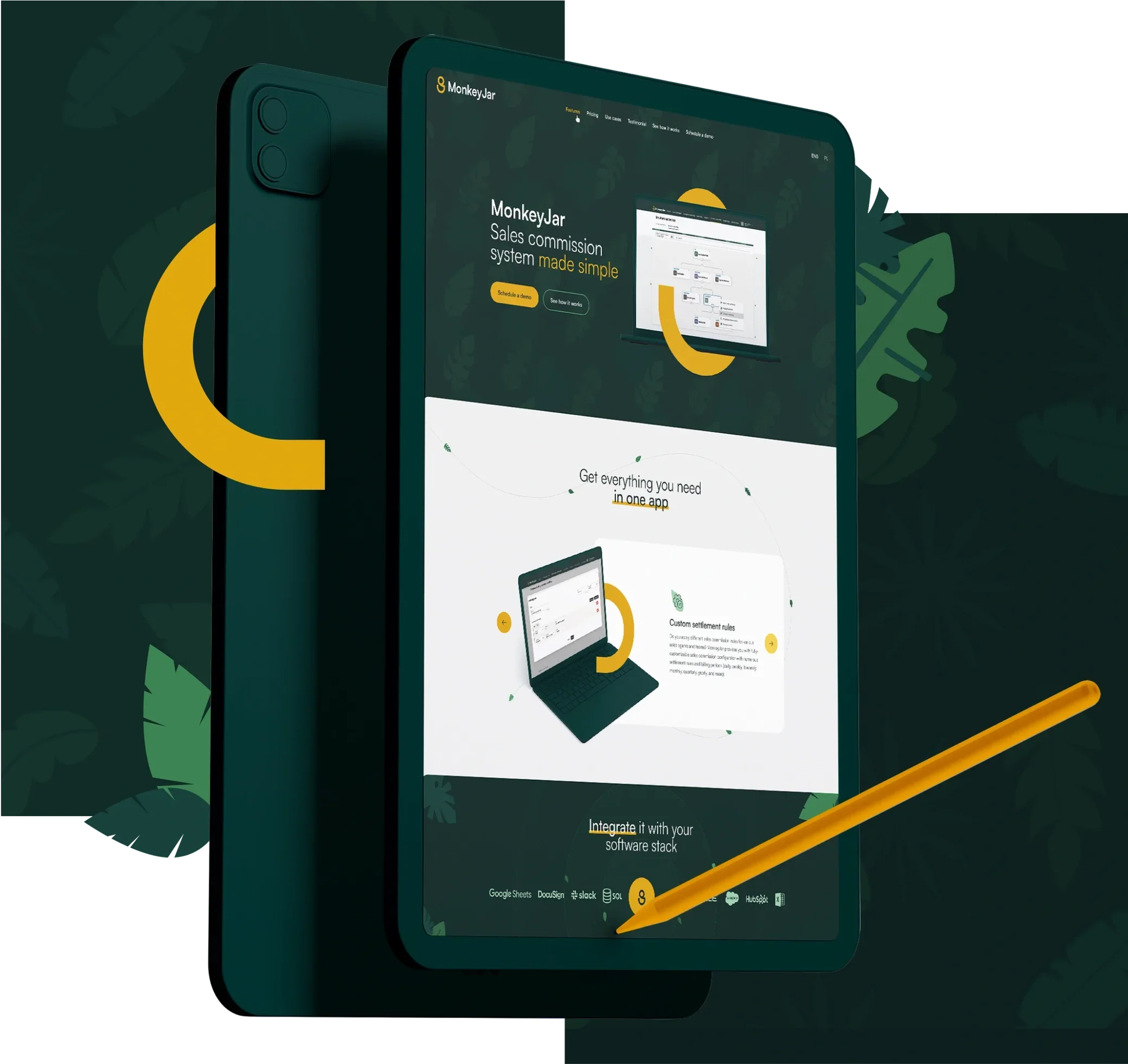
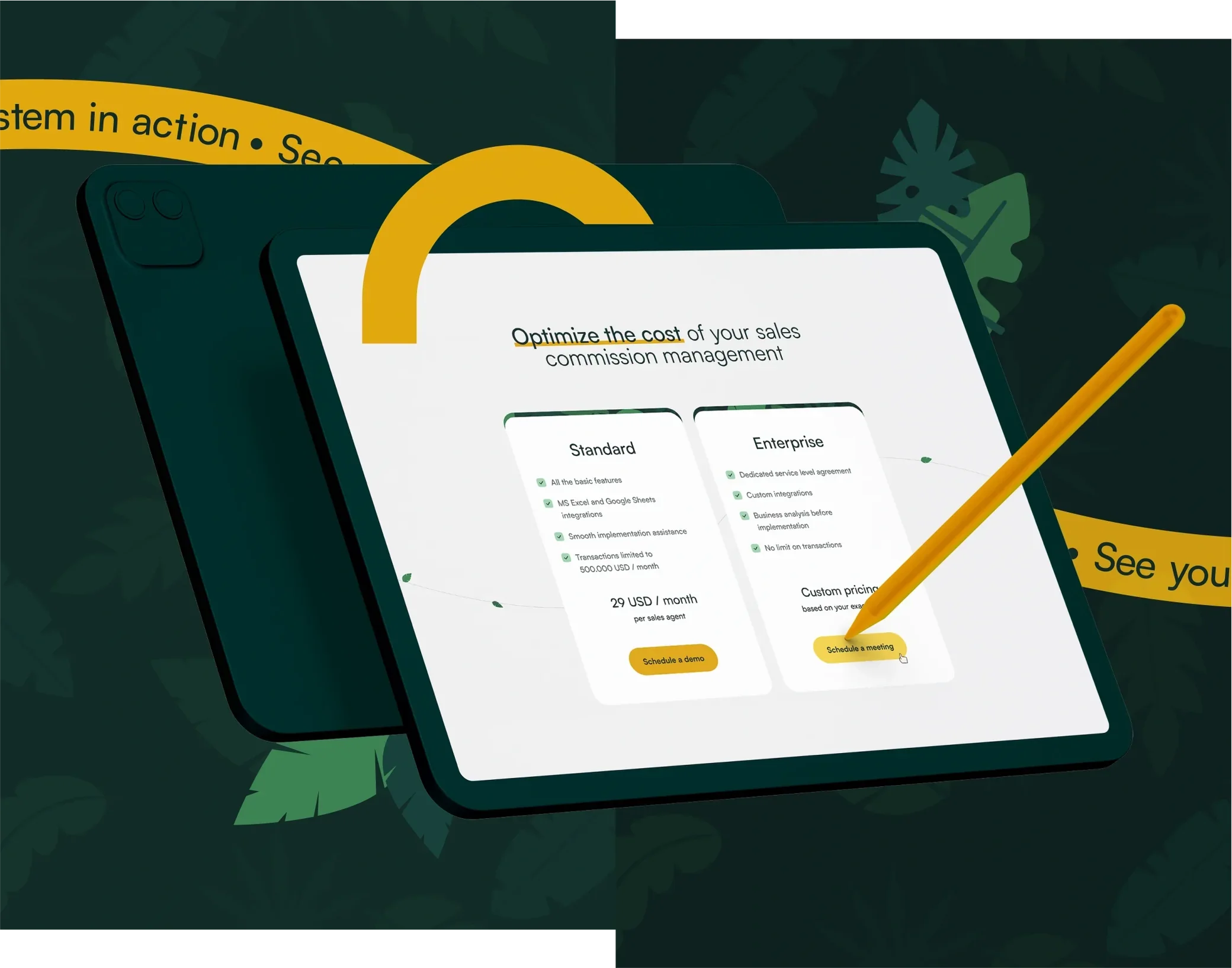
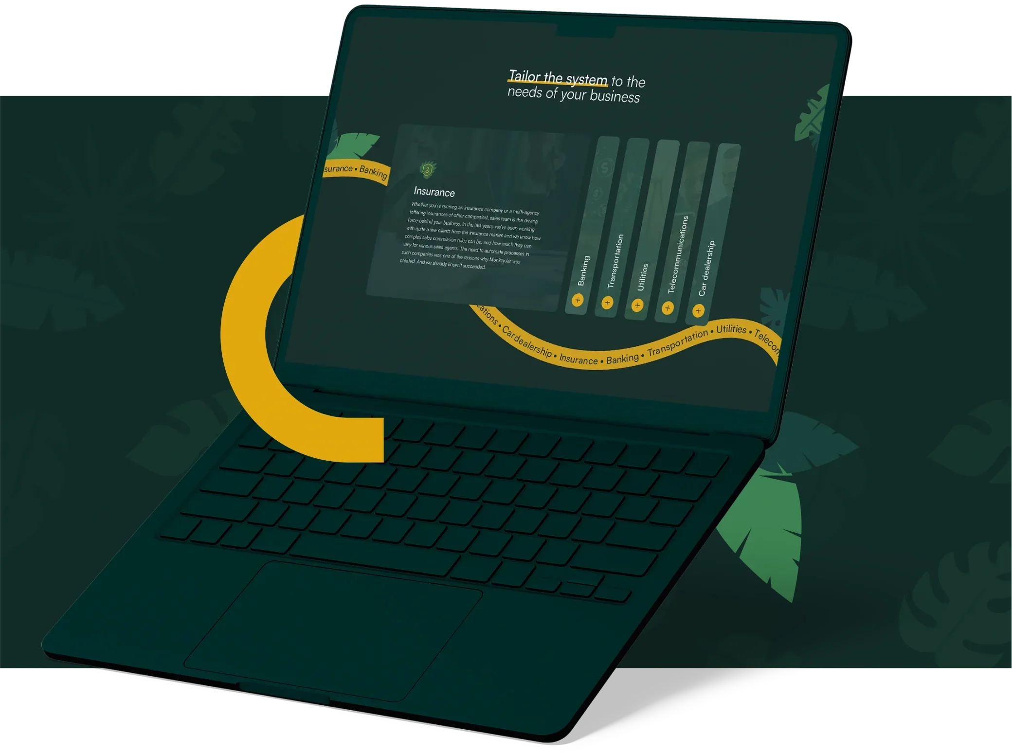
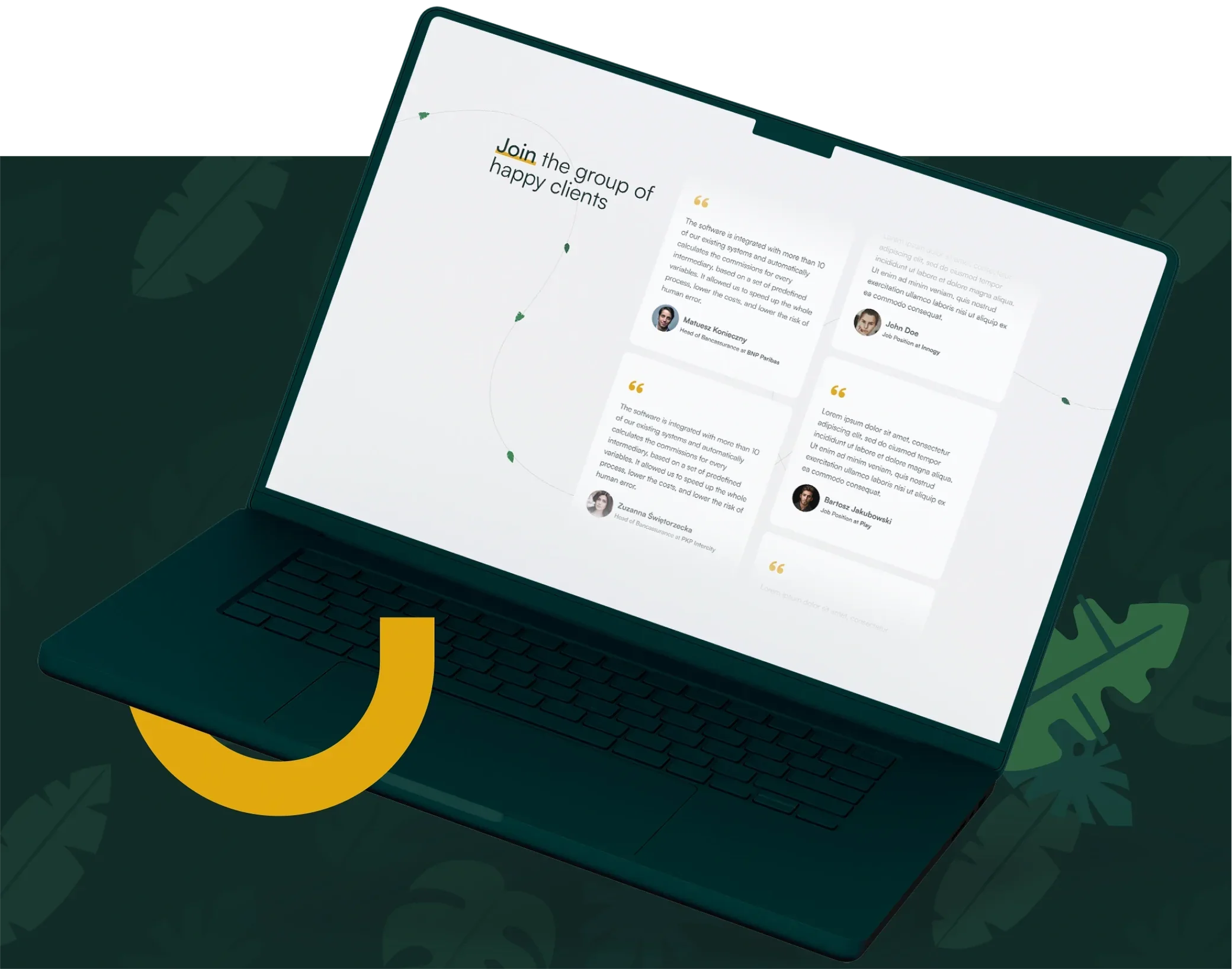
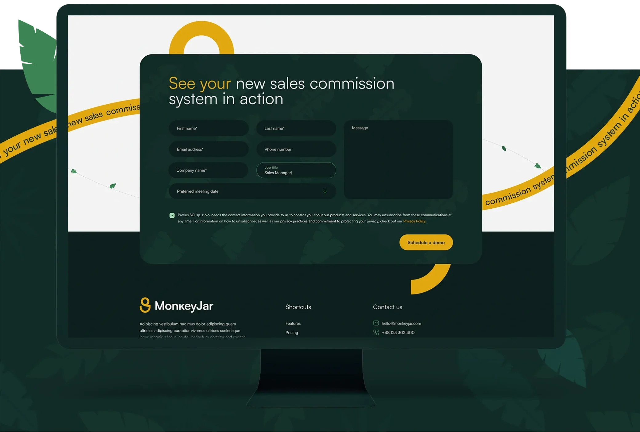
The goal of the website design and the entire brand identity was clear from the beginning: a jungle theme with accents referring to the monkey.
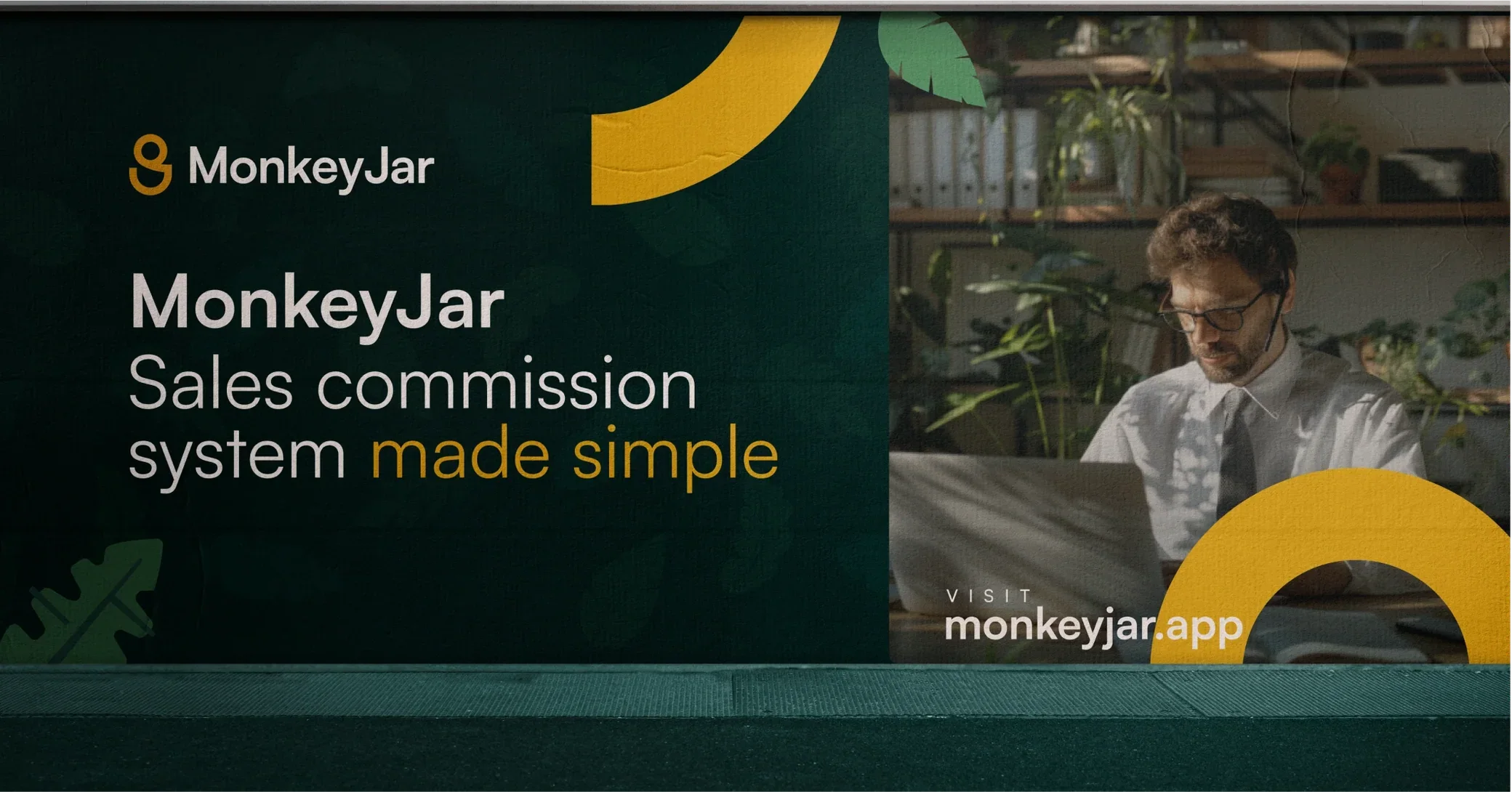
The colour scheme is dark green used interchangeably with light grey sections. One of the leading motifs is the exotic-leaf pattern in the background, along with single leaves decorating some sections. The remaining question was the additional colour that would complete the concept. We prepared more than a dozen versions, from warm yellows to more decisive oranges, a definite red and lime green. The final choice was ochre — not aggressive at all, pleasing to the eye and matching the MonkeyJar audience.
Signet concepts
We prepared dozens of signet versions, based mainly on the symbols of a jar, a coin, a monkey, commission settlement and a jungle motif.
The choice was not easy: we refined the existing versions and created brand new, increasingly less obvious variants of the signet.
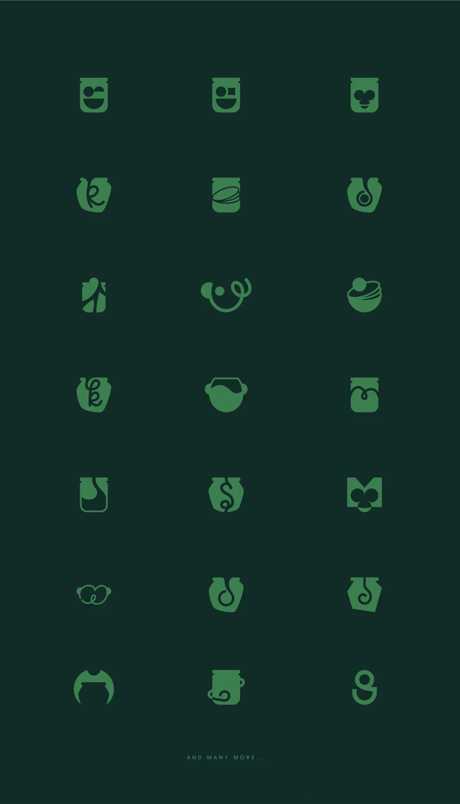
Signet variants
Once the final direction was chosen, we created a few more versions of the signet for comparison, to be sure it was the right one.
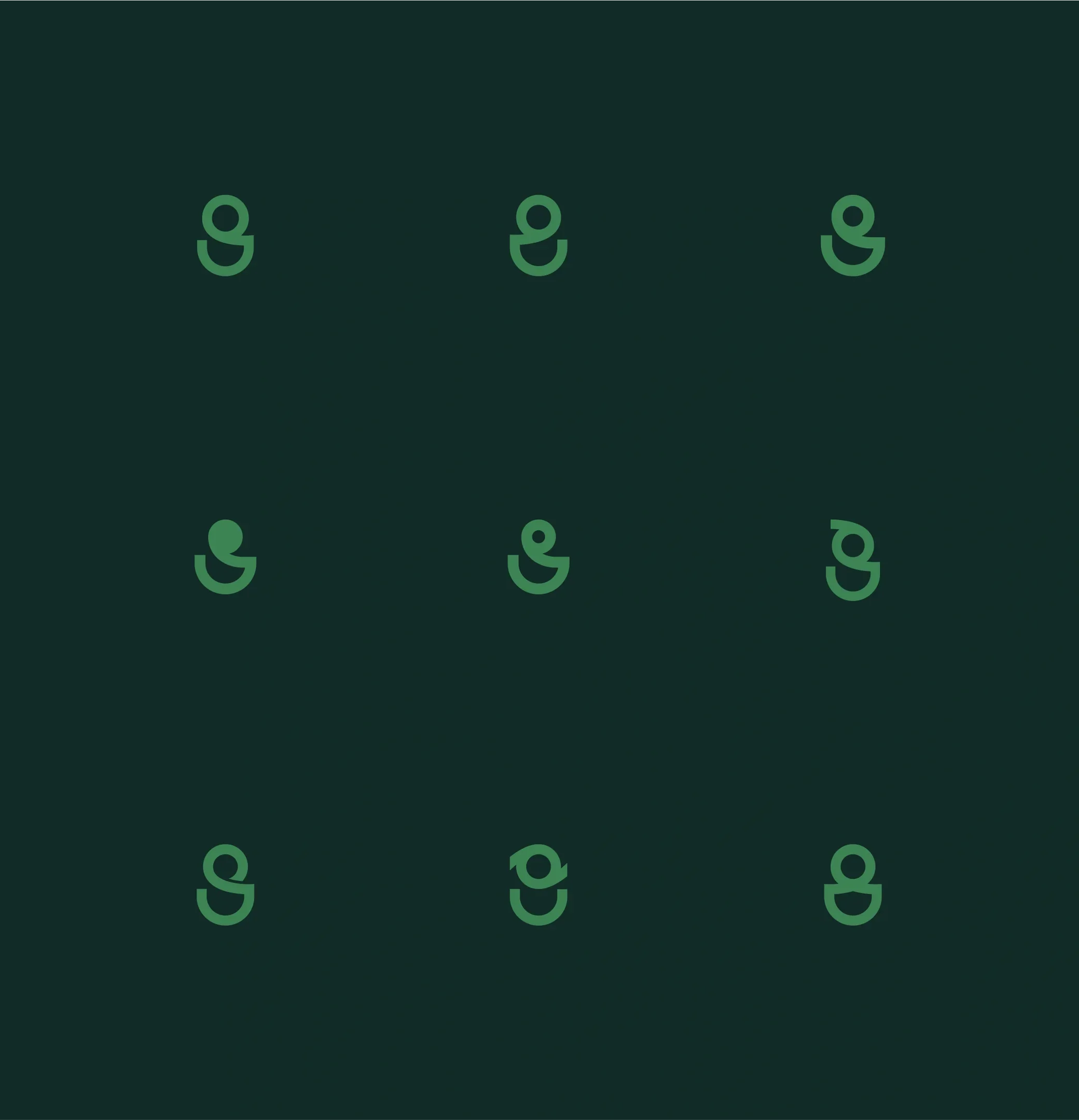
Logo variants
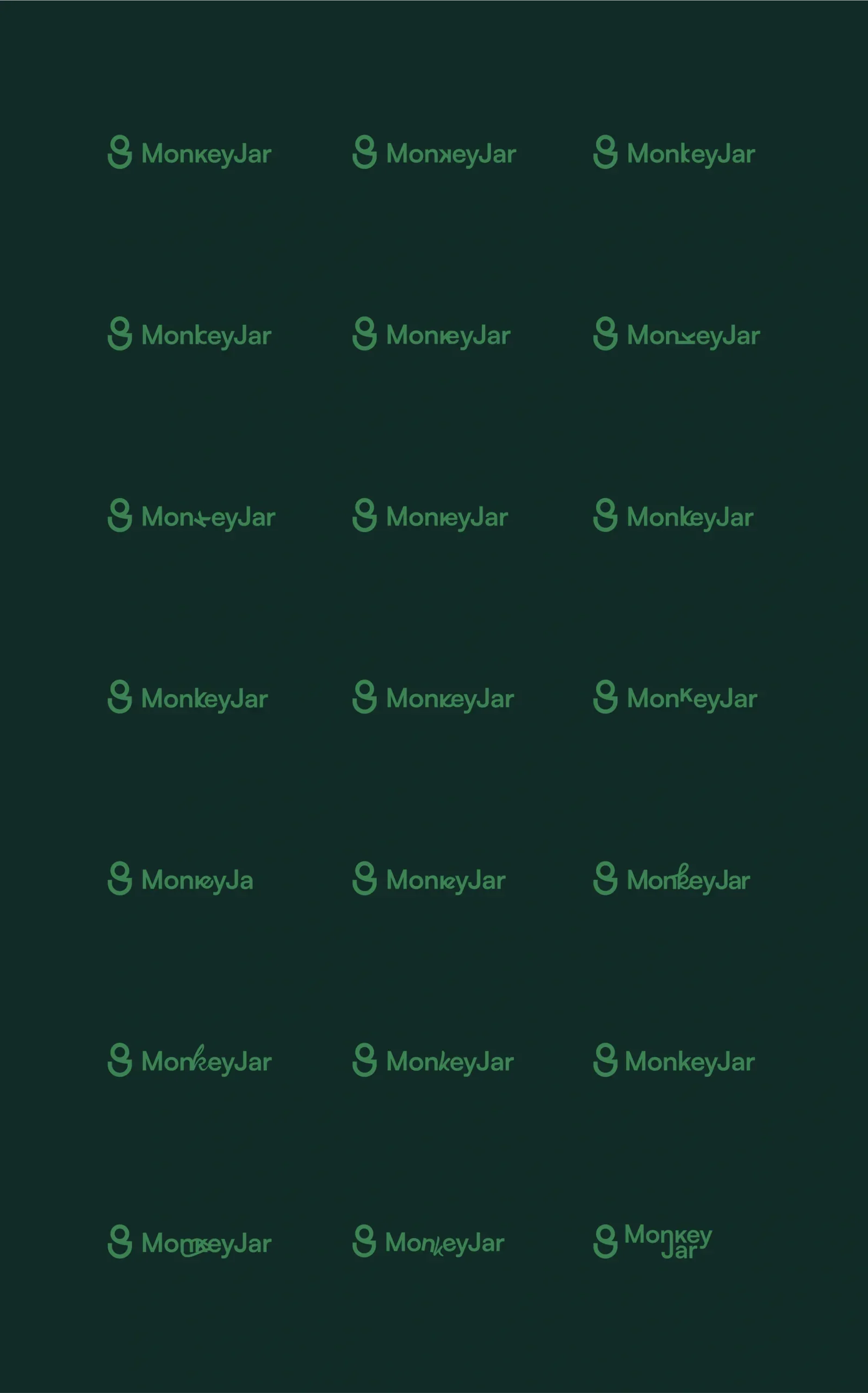
With the signet selected, we moved on to the logotype, for which we also created dozens of versions.
The main goal was to show the play on words “Monkey” / “Money”, so we modified the letter “k” in many different ways. In the end, however, the choice fell on the classic version.
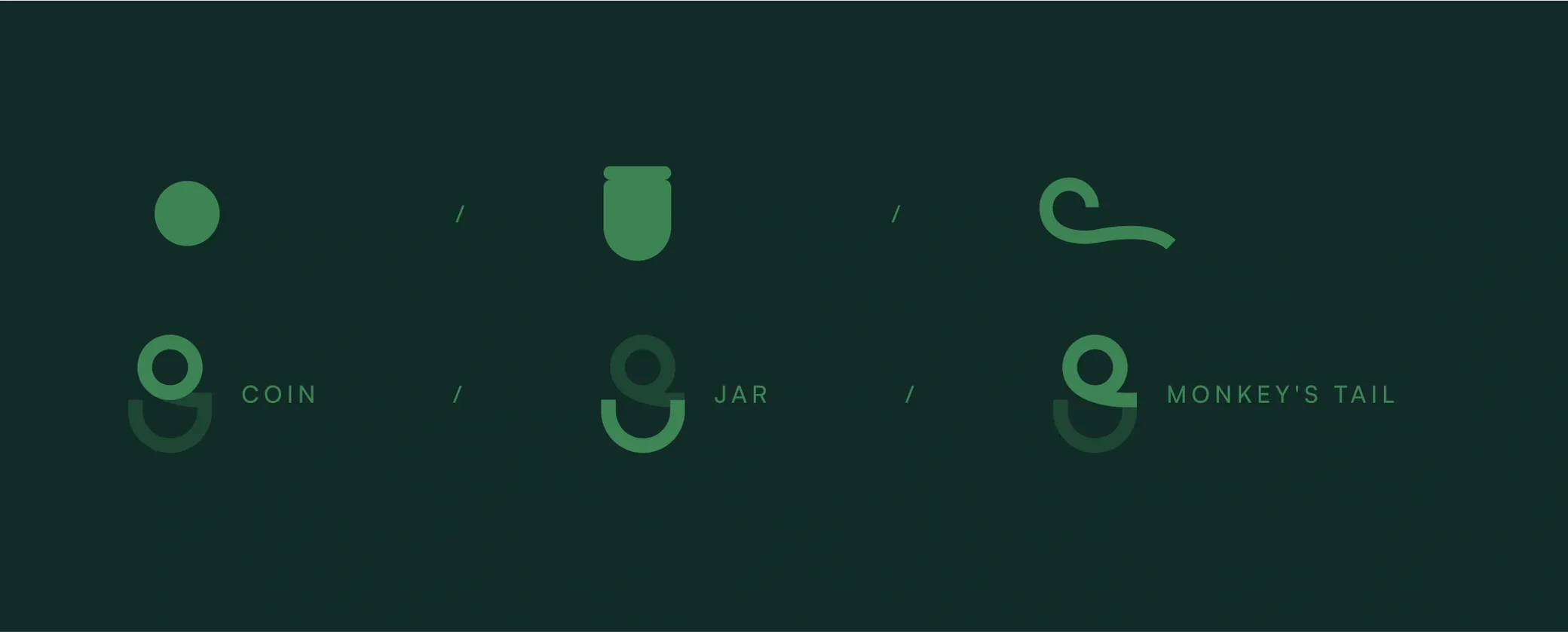
Logo genesis
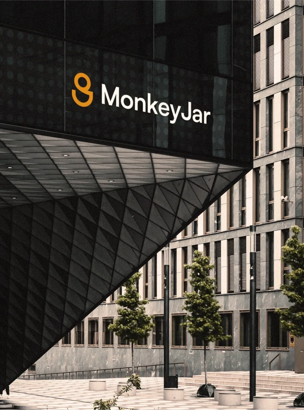
The logo refers to three main symbols: a coin, a jar and a fragment of a monkey — in this case, the monkey's tail.
Final logo
The final “Here we go!” was uttered. We chose a linear version of the signet that does not spell out its symbols — a thoughtful and apt choice for the target audience.
The signet is dynamic yet minimalist and unique. We also prepared a logo animation and intro to be used in future MonkeyJar tutorials and promotional materials.
Logo with tagline
During the work, the need arose for a version of the logo with a tagline. We quickly prepared several options, and the final choice was the classic, most readable and most responsive version.
Based on it, we prepared versions for MonkeyJar Agent, Admin and Architect.


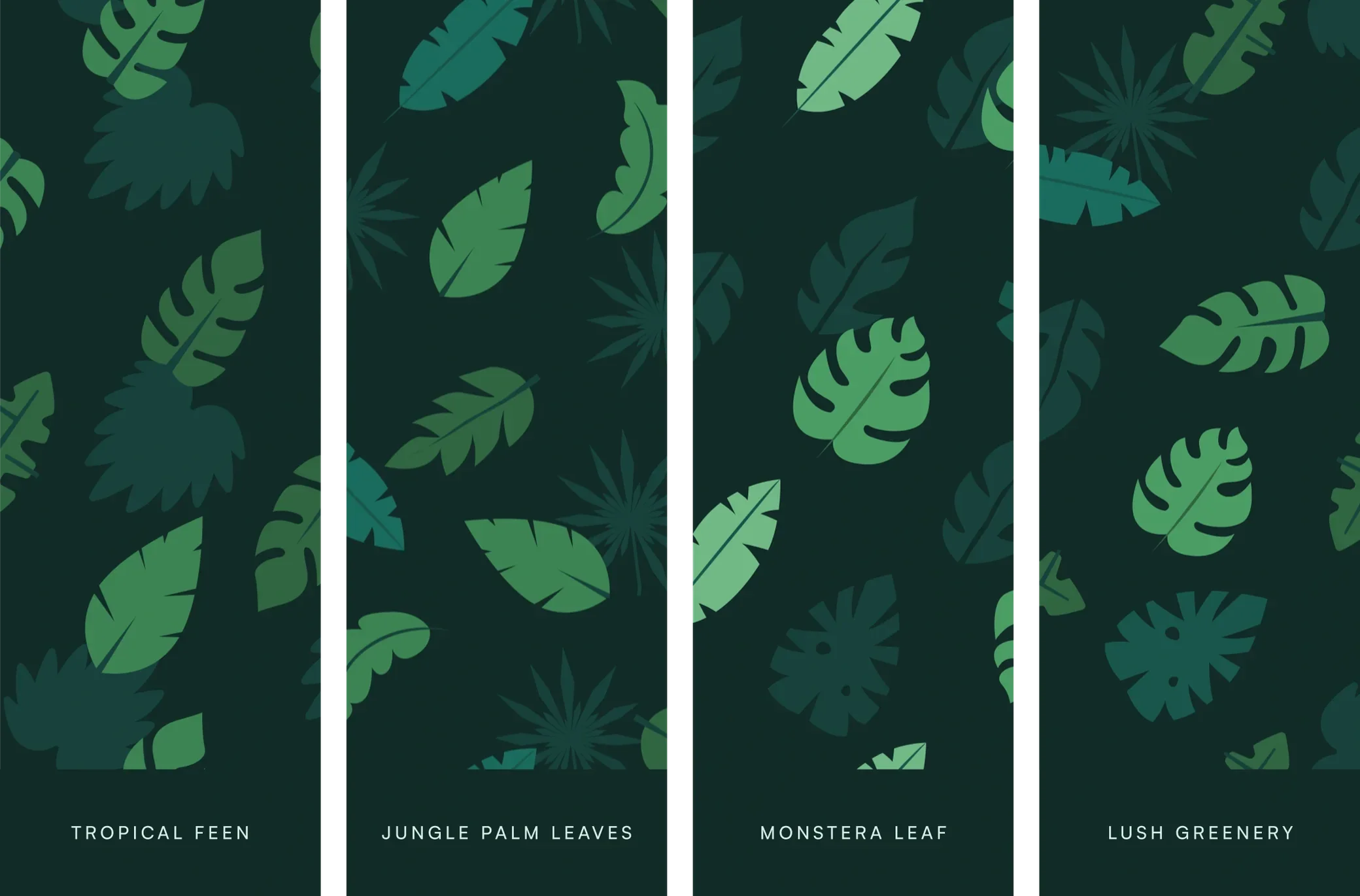
Patterns
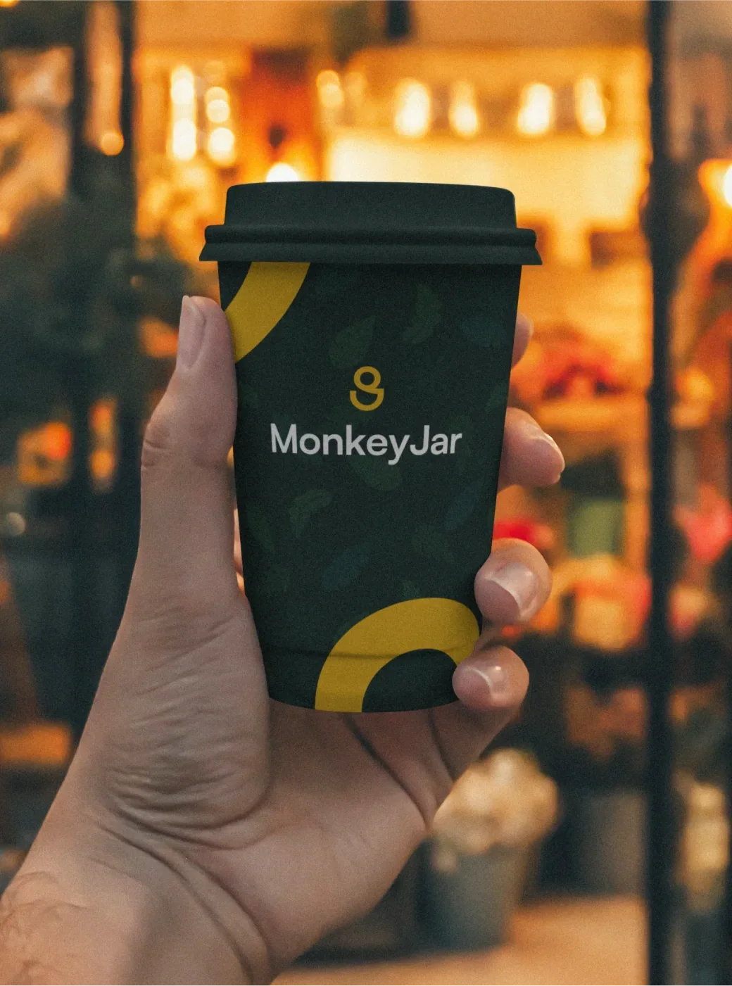
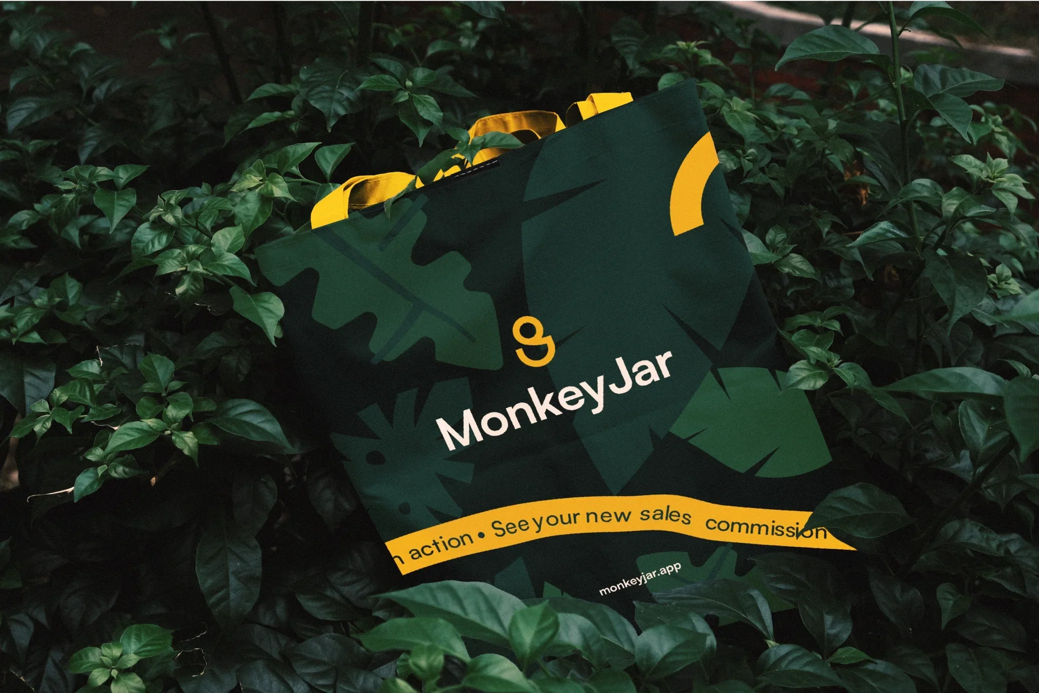
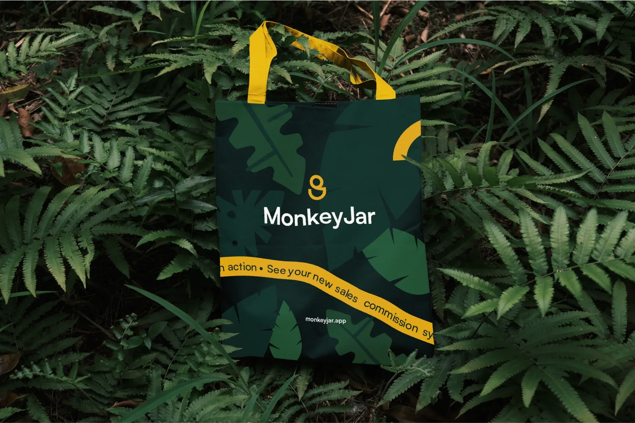
Patterns are one of the main elements of MonkeyJar's leading theme. We created four patterns made of exotic, tropical leaves in the brand colours.
They give the brand a unique and unmistakable character, and are used in the background with appropriate transparency or as decorative fragments.
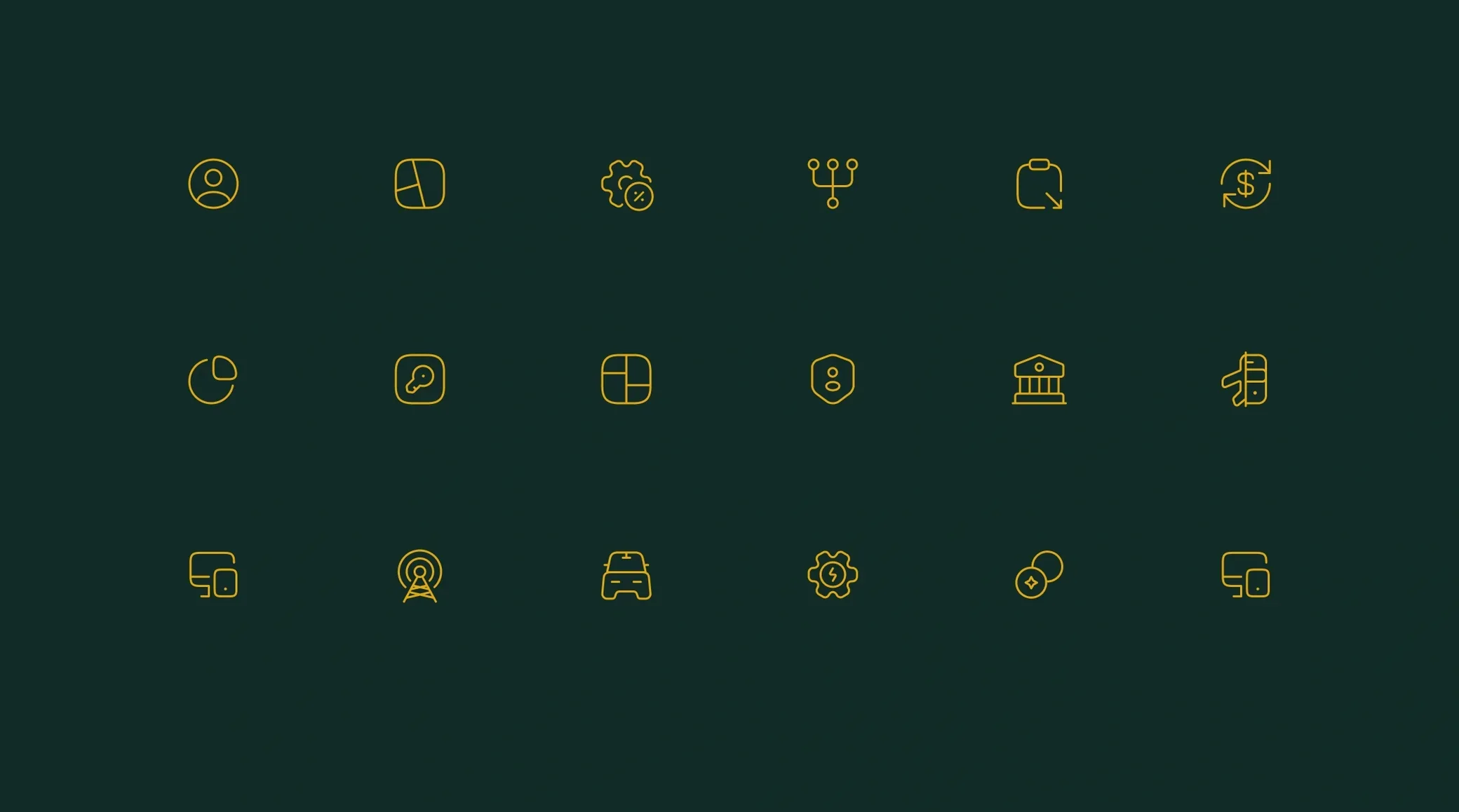
Icons
We designed icons presenting mainly the functions of the app and the industries it targets.
To emphasise a more unique style, we placed selected leaves from the patterns under the icons.

Accents and other
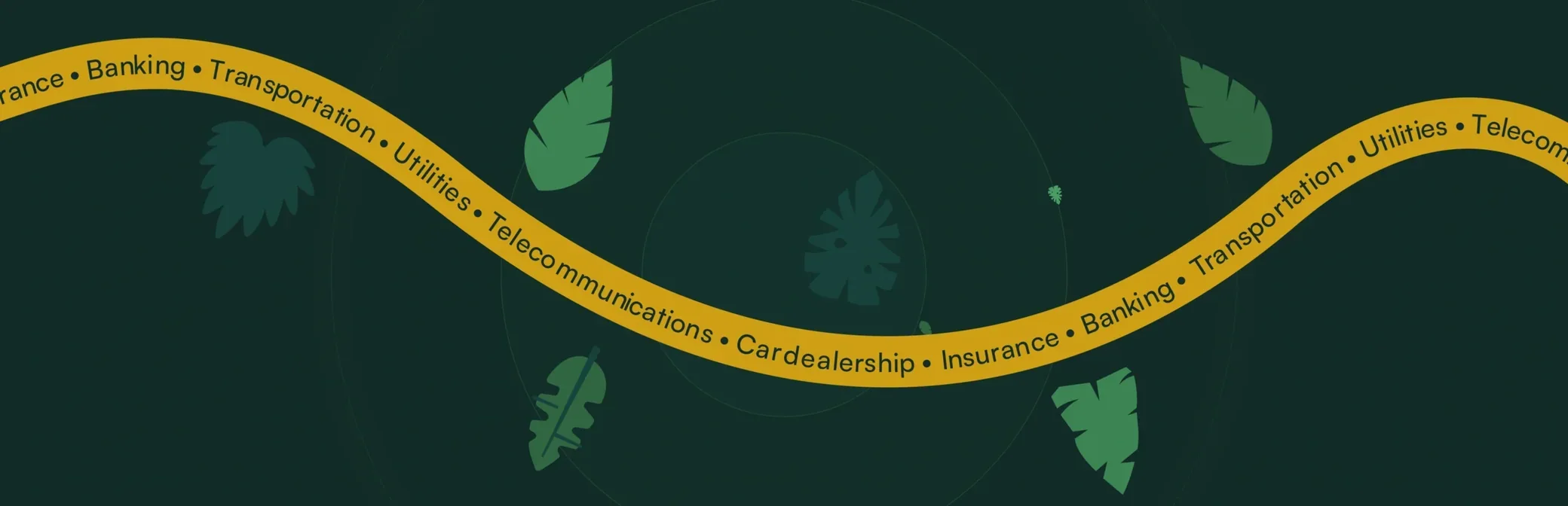
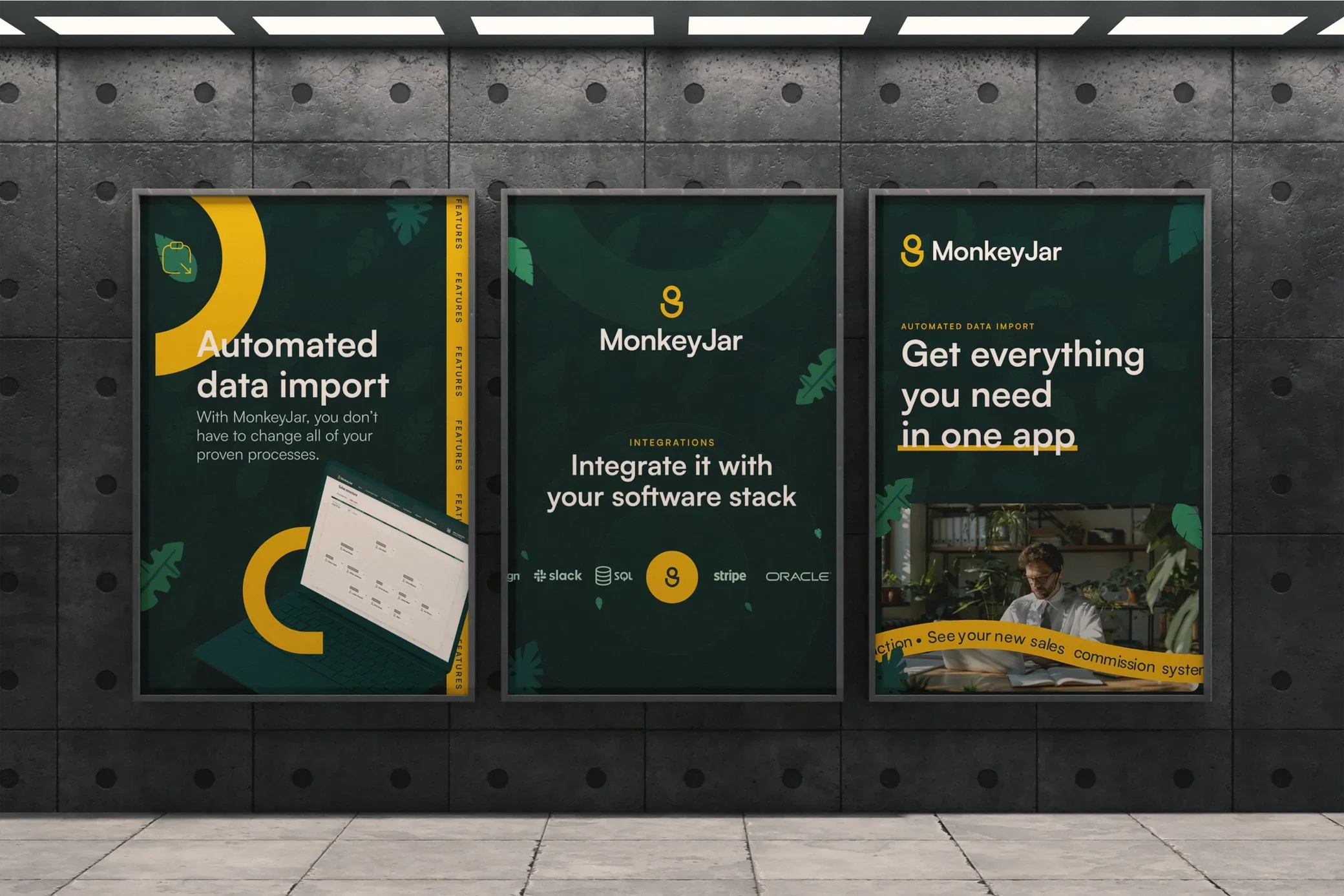
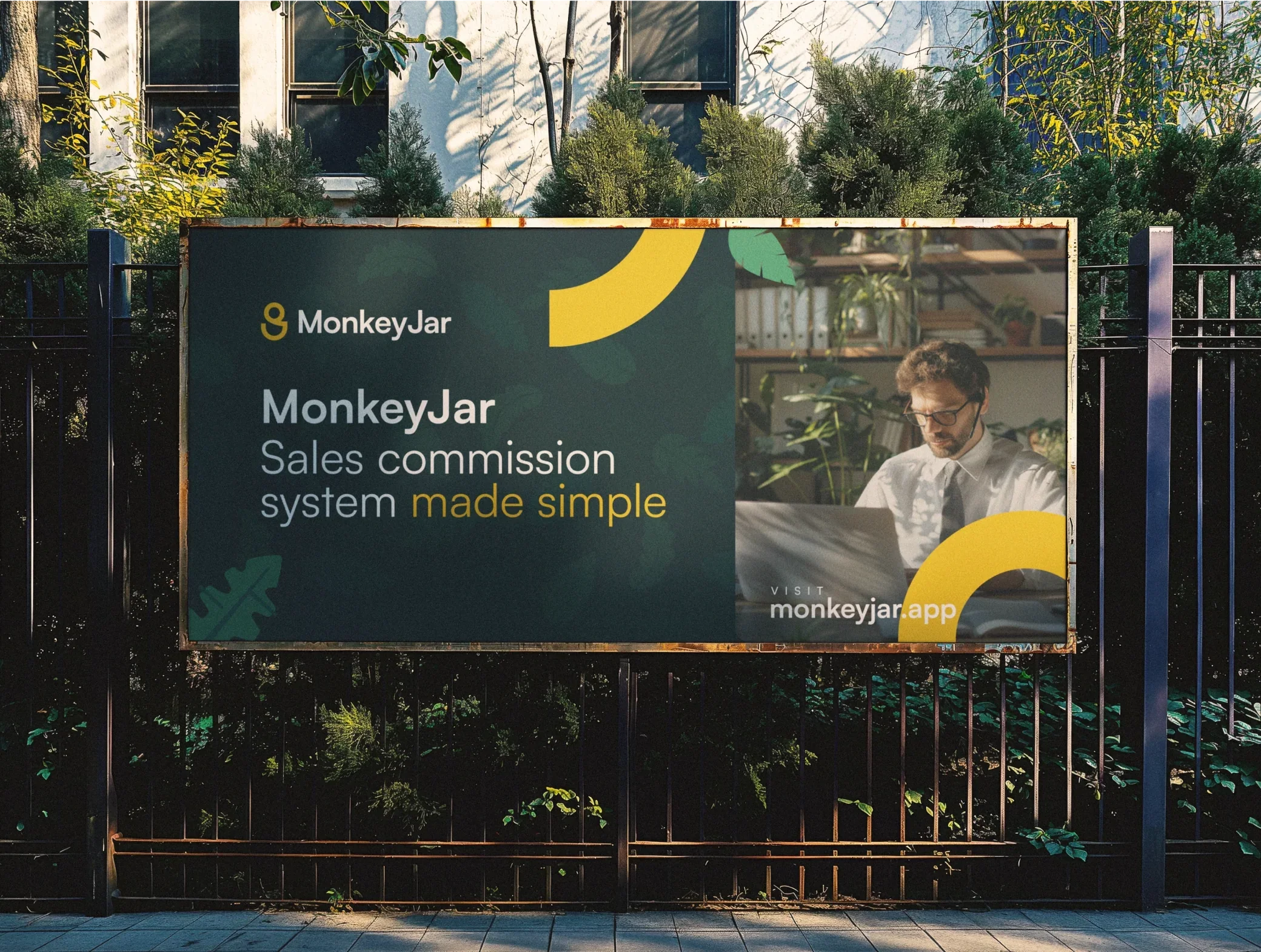
We also designed graphic accents made of lines and leaves, lushly shaped like a monkey's tail, on which we placed slogans related to the brand's activities.
Social media assets
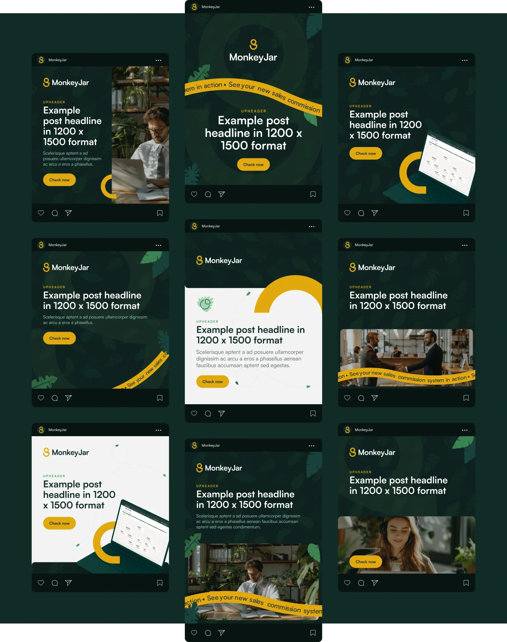
After finalising all designs, we were asked to prepare a set of templates for social media: Facebook, Instagram, LinkedIn and X.
We quickly designed dozens of templates in various formats and configurations, so the client could freely edit their content in the program of their choice.



Testimonial
They have a strong understanding of our needs and always respond quickly and effectively.
Agata Synowiec
Marketing Specialist, Pretius

More projects
All projects

A revolution in preventive healthcare
Case study coming soon
- Healthcare