
International wholesaler of hard-to-access medicines
Branding + a website rebuild, with ongoing design and development support.
Challenge
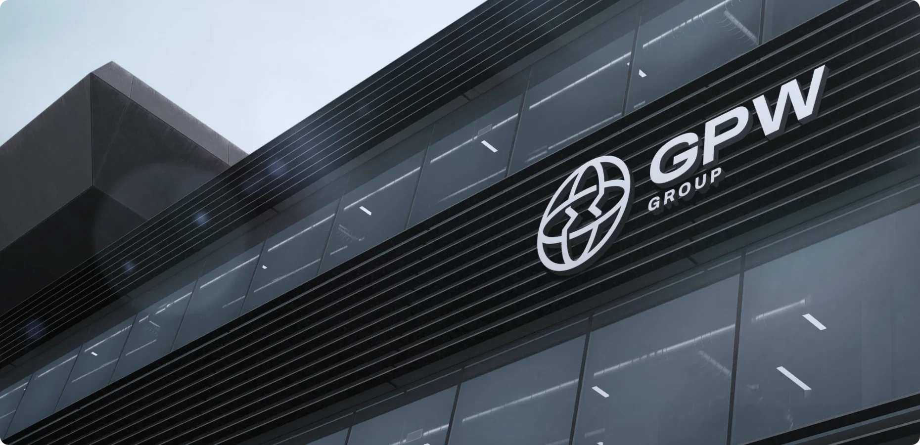
GPW Group is a trusted partner in sourcing and distributing unlicensed, hard-to-access and named-patient medicines. Based in Germany, the largest pharmaceutical market in Europe, the company has supported clients in importing and exporting pharmaceutical products for over 60 years.
GPW Group was merging several brands into one group under a shared name. Our task was not only the rebrand, but also a consistent treatment of the company’s other branches: GPW Germany and GPW International. The project covered:
- Designing a consistent identity that is easy to scale
- Building a multilingual website tailored to each market
- Designing and supporting marketing and promotional materials
- Technical and creative support
Process
We started working with the client with a brand sprint workshop, which helped us understand the brand’s personality, its business, purpose, values and beliefs.
Once the details were agreed, we prepared a moodboard of concept inspirations to understand the client’s visual expectations. At the same time we worked on the logo concept, the homepage hero and the visual direction, which made choosing the final concept easier.
Logo
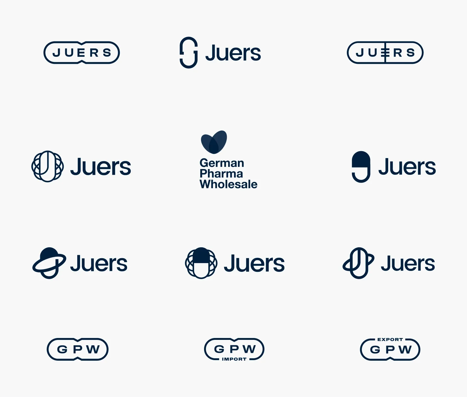
We prepared more than a dozen logo versions based on the brand sprint findings. Initially the brand was to be called Juers, but following the client’s final decision we turned it into GPW (German Pharma Wholesale).
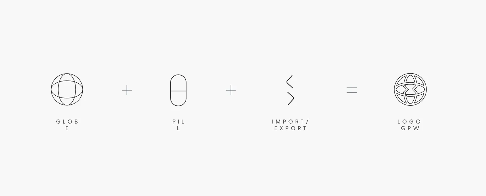
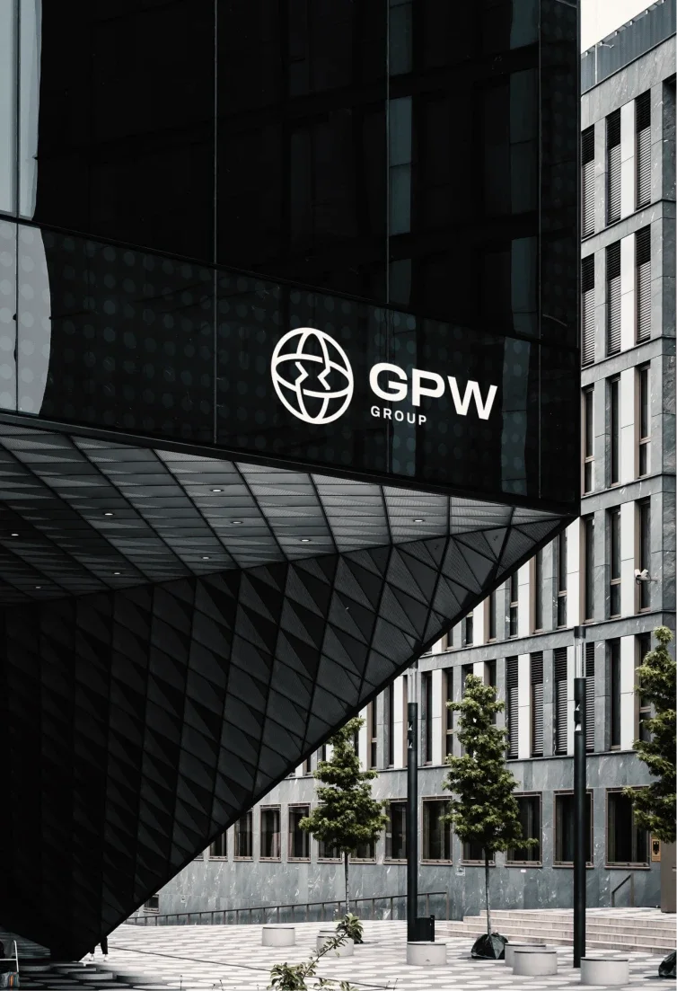
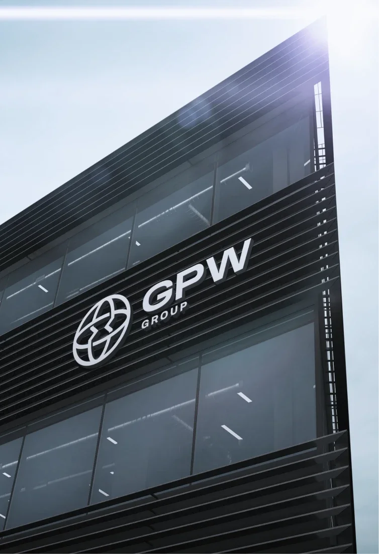
The final choice was a symbol based on a globe. To keep the design from being too obvious, we engraved arrows referring to import and export into it, and a pill can be seen in its vertical part. We paired the symbol with a wide, modern typeface so the whole reads as a complete sign.
GPW branches
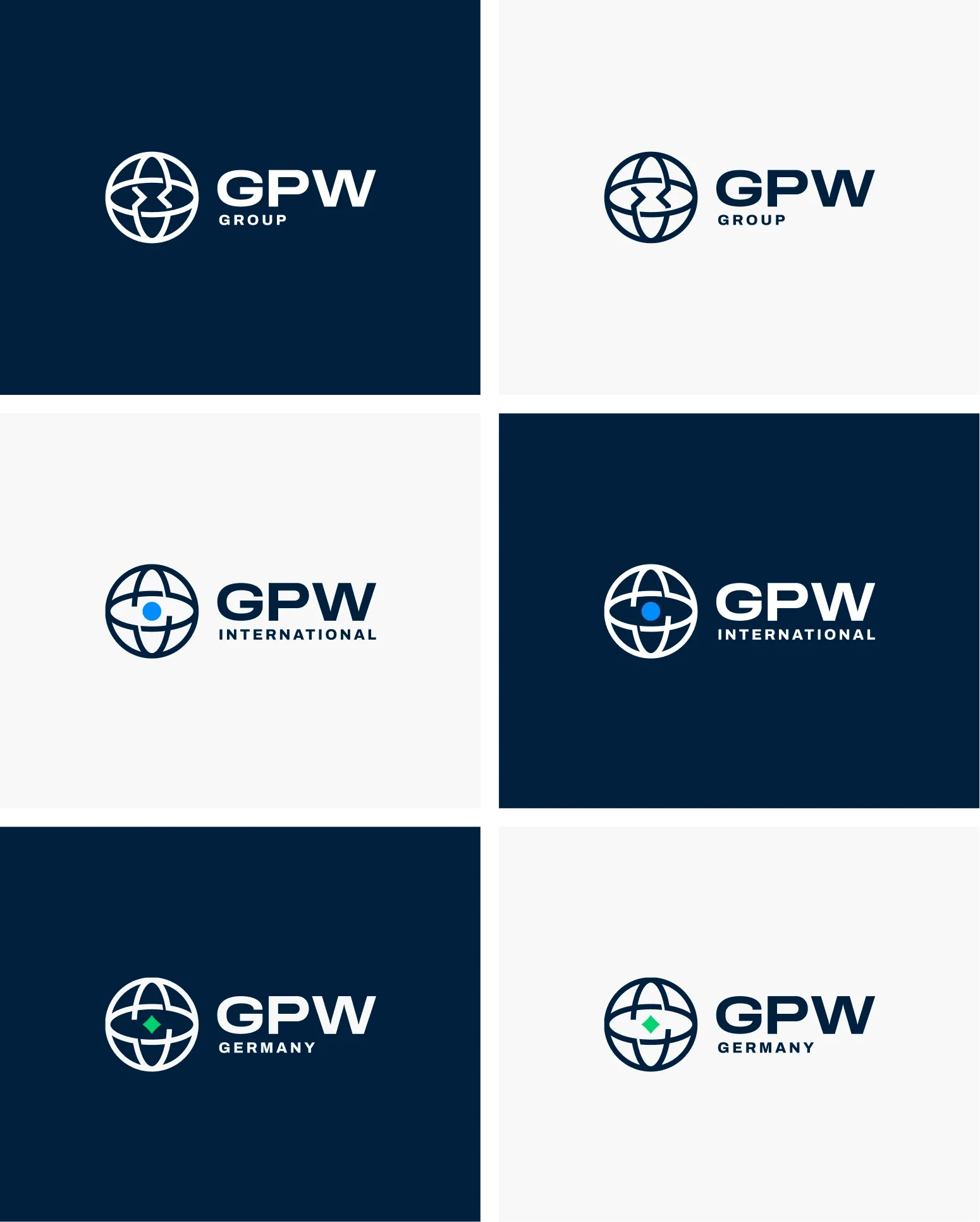
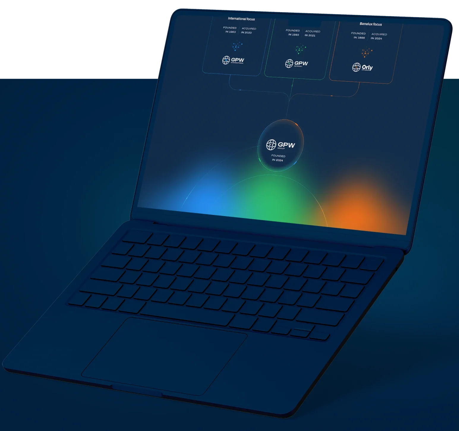
A key factor in designing the main GPW logo was building the symbol so that marks for future branches could be created freely.
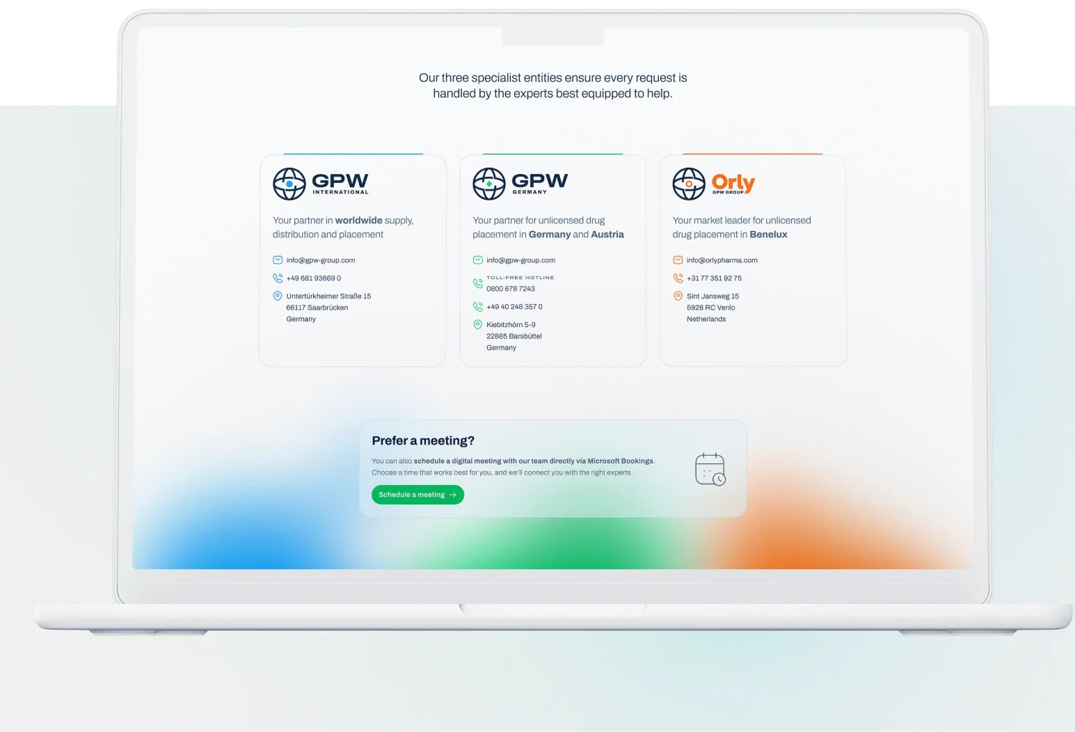
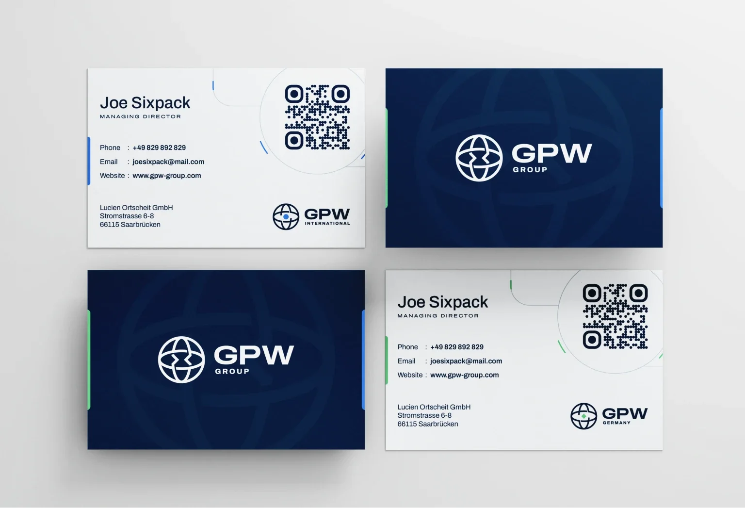
GPW plans to grow in this direction, so we kept it in mind from the very beginning. In the branch logos we slightly modified the central part, removing the import/export arrows. This made room for a simple symbol that tells the branches apart. We also decided to distinguish the symbols with colour – each branch has its own. This way the brand doesn’t have to worry about a growing number of branches in the future.
Website
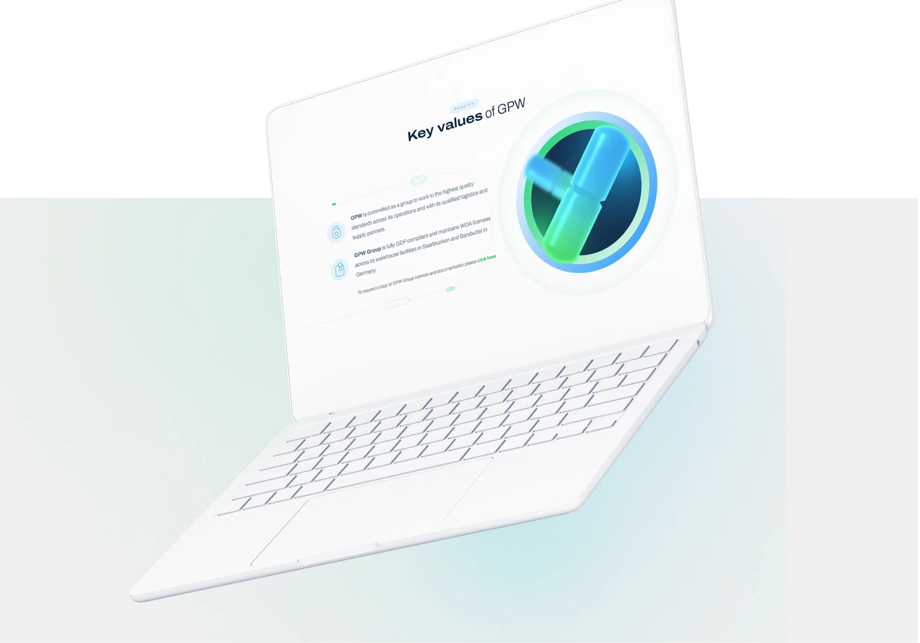
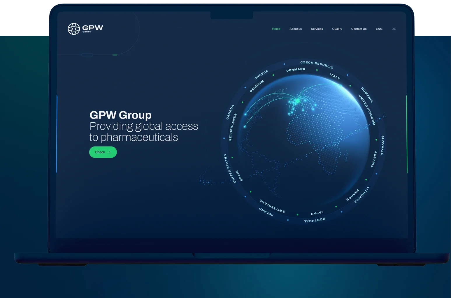
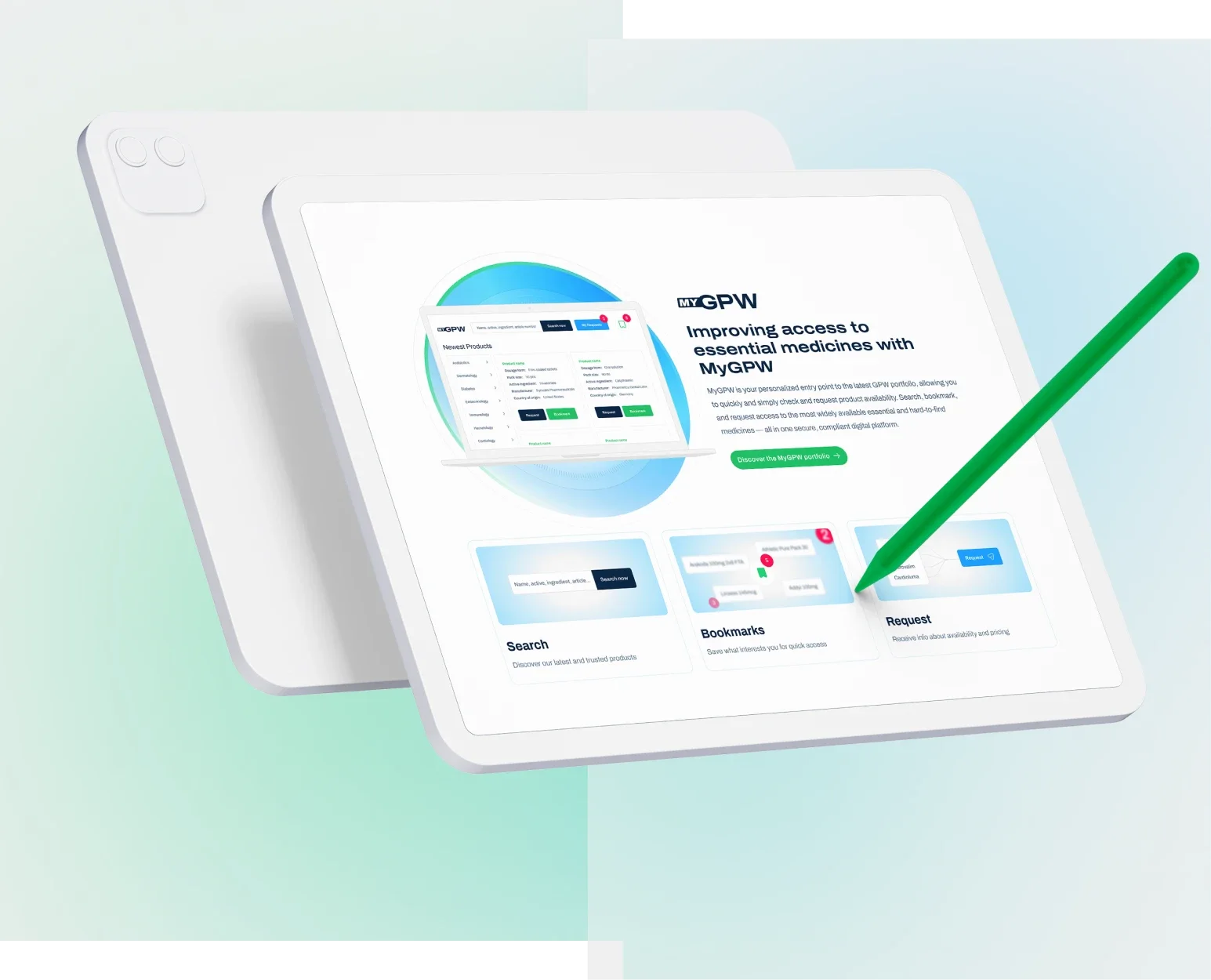
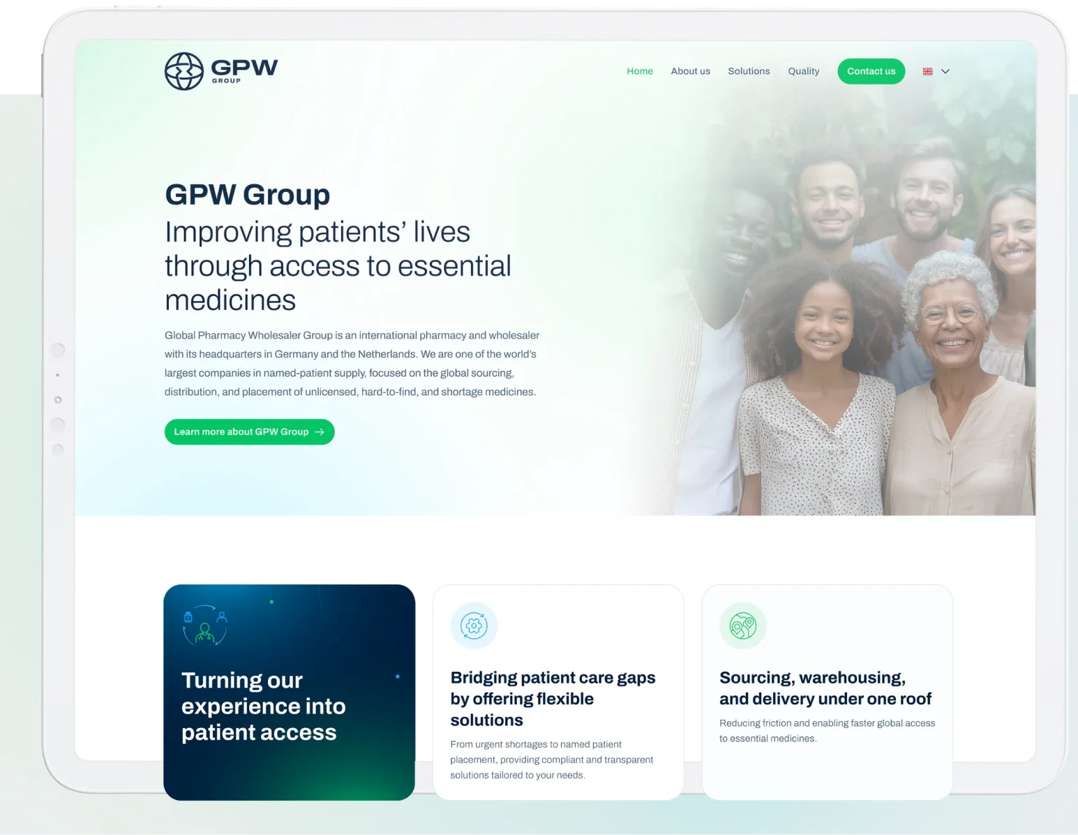
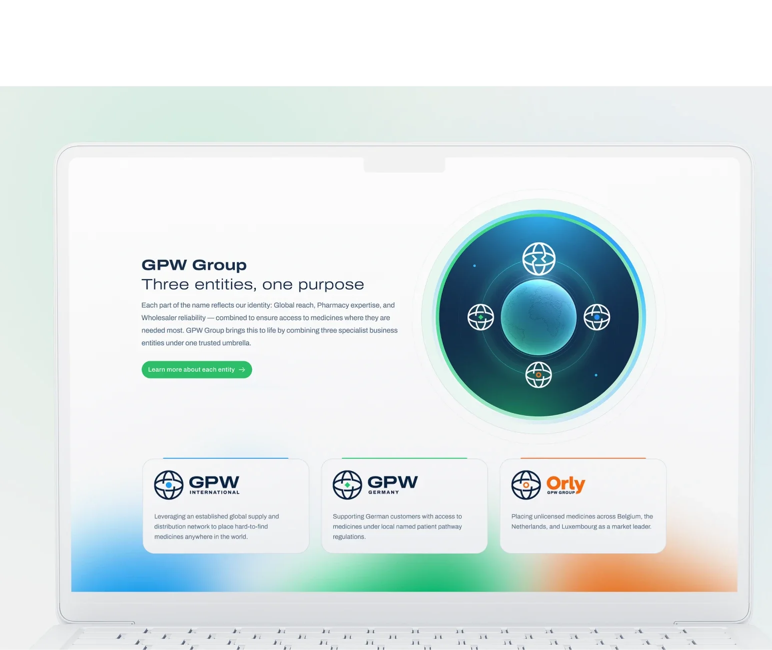
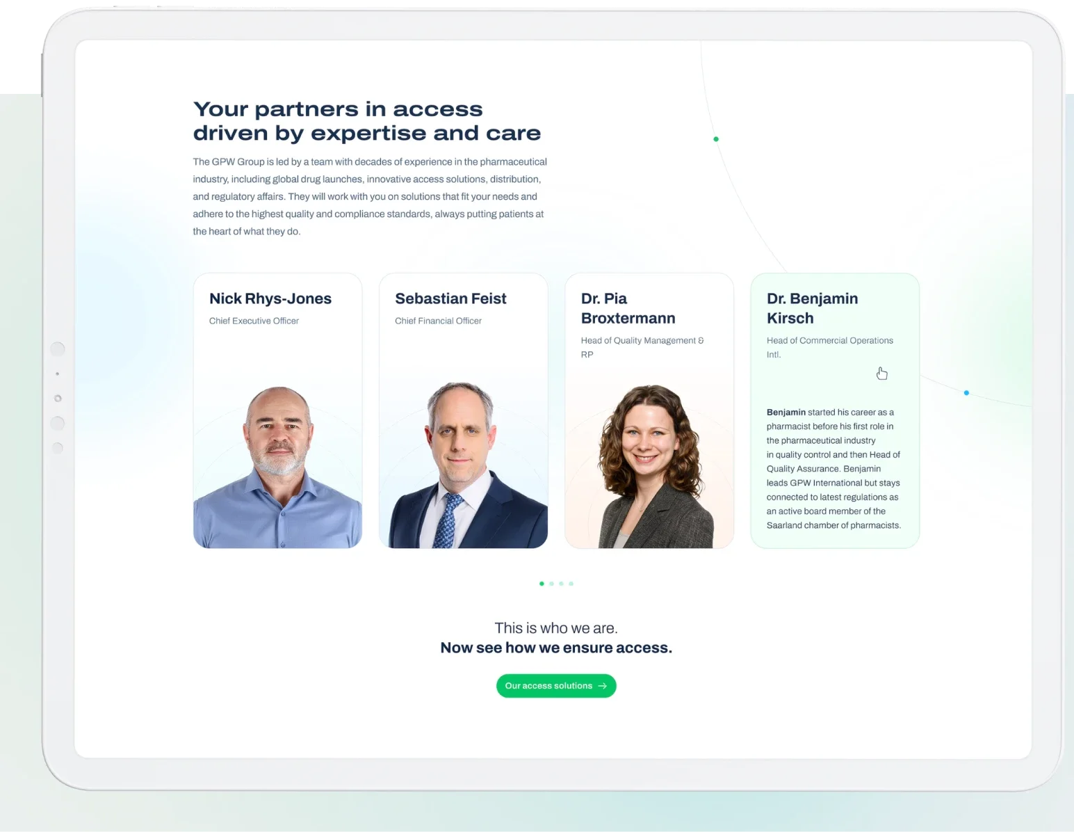
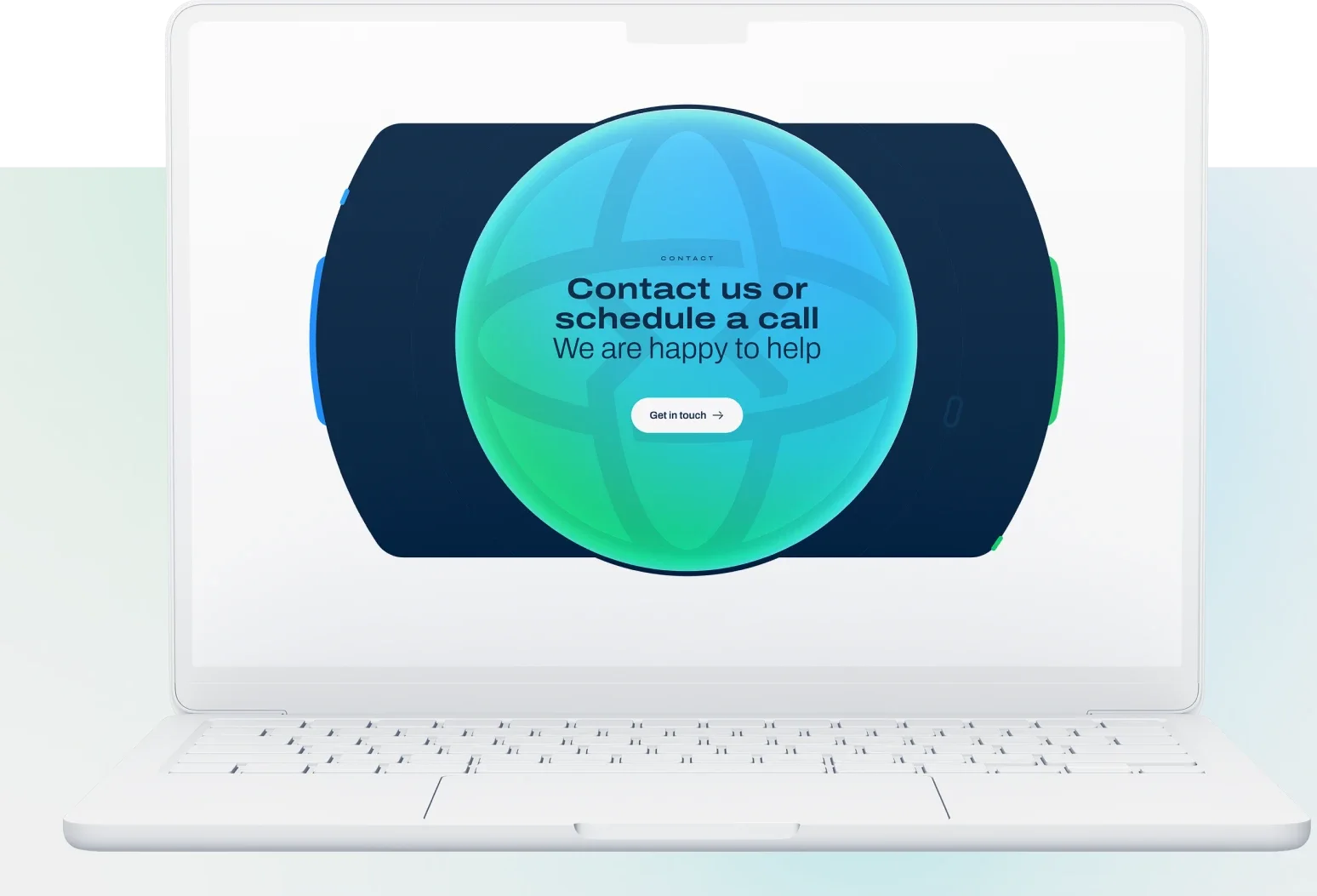
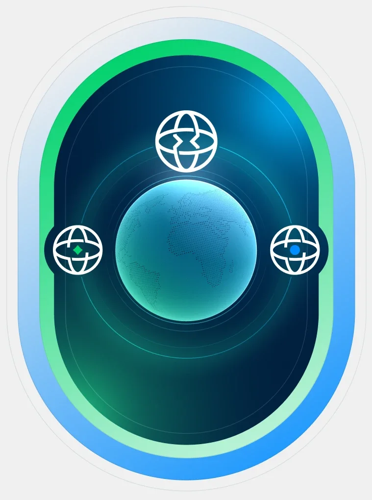
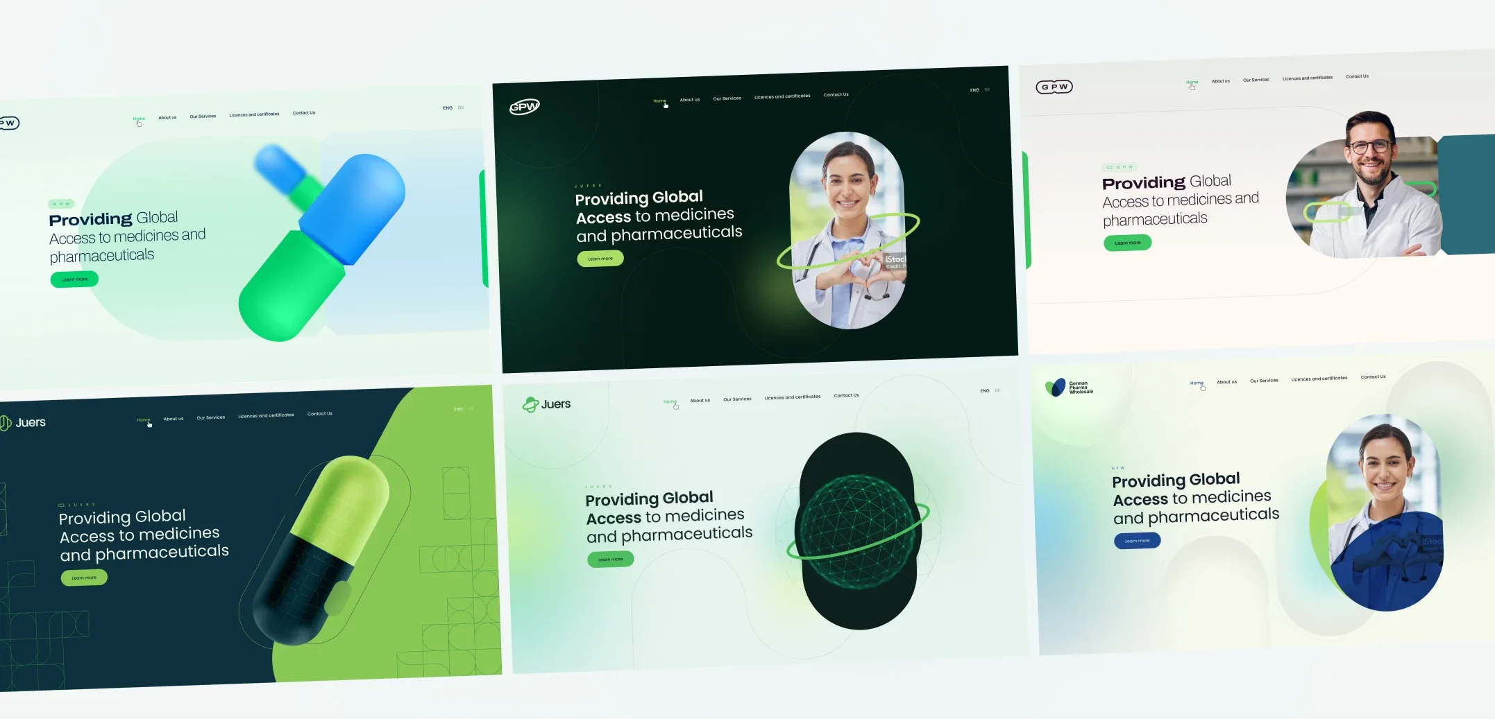
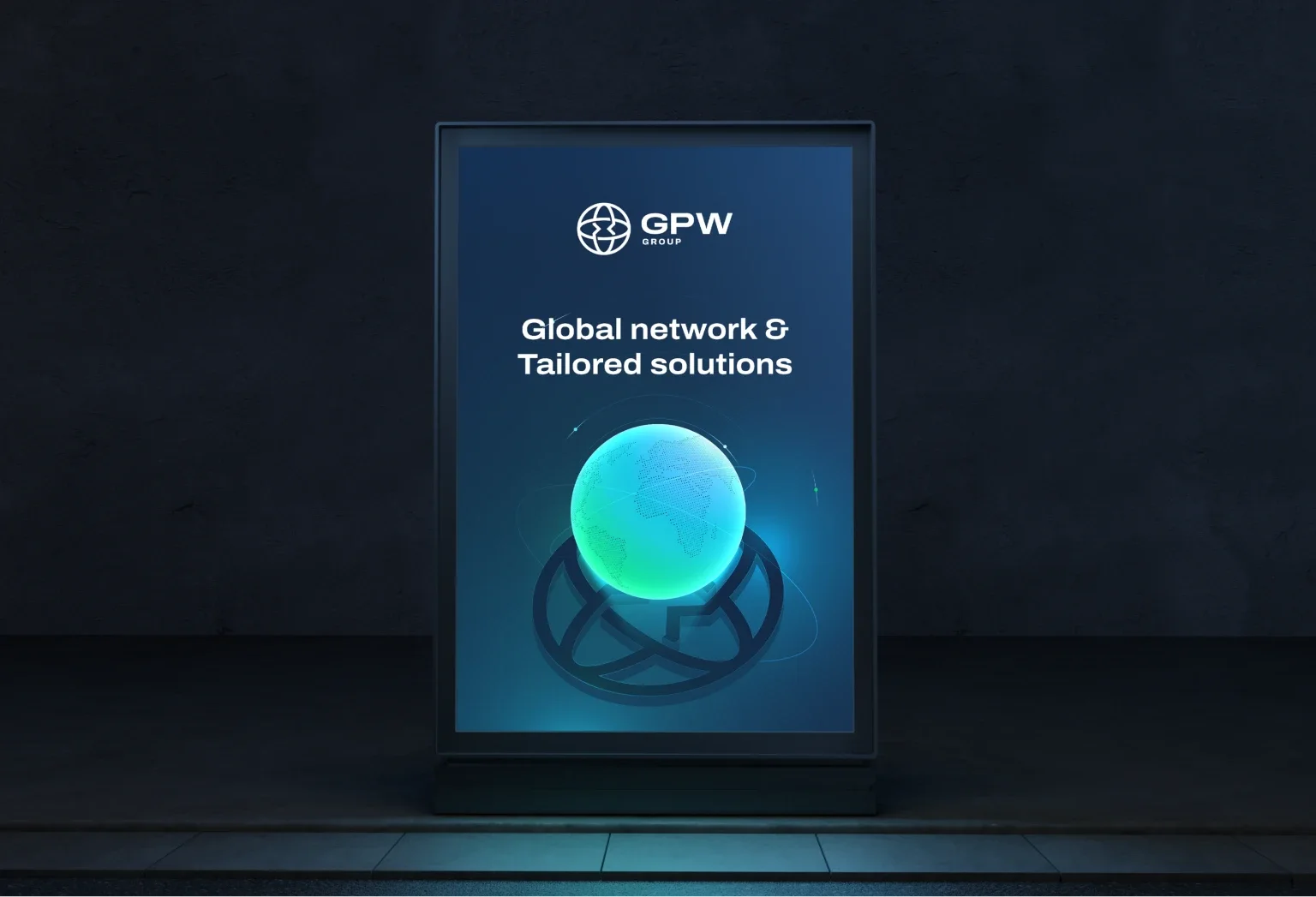
The goal was to create key visuals that would guide the design of the whole website. Initially the main motif was to be a 3D pill in the brand colours, with a recess in the middle referring to the GPW symbol, but while creating the materials we developed the globe motif – which became the main theme of the homepage.
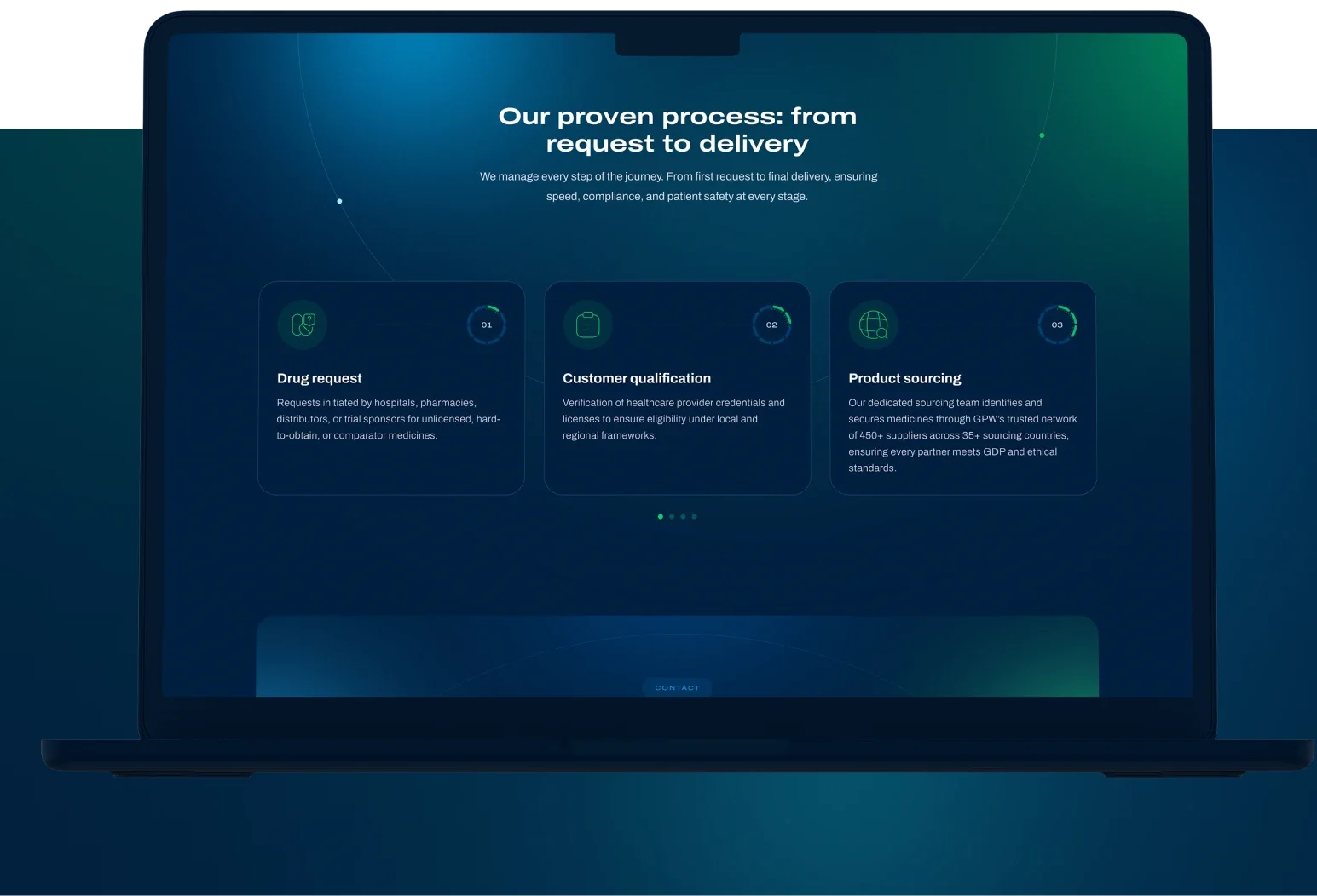
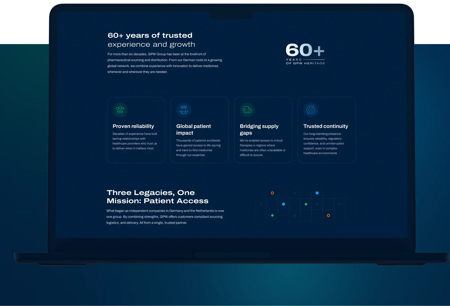
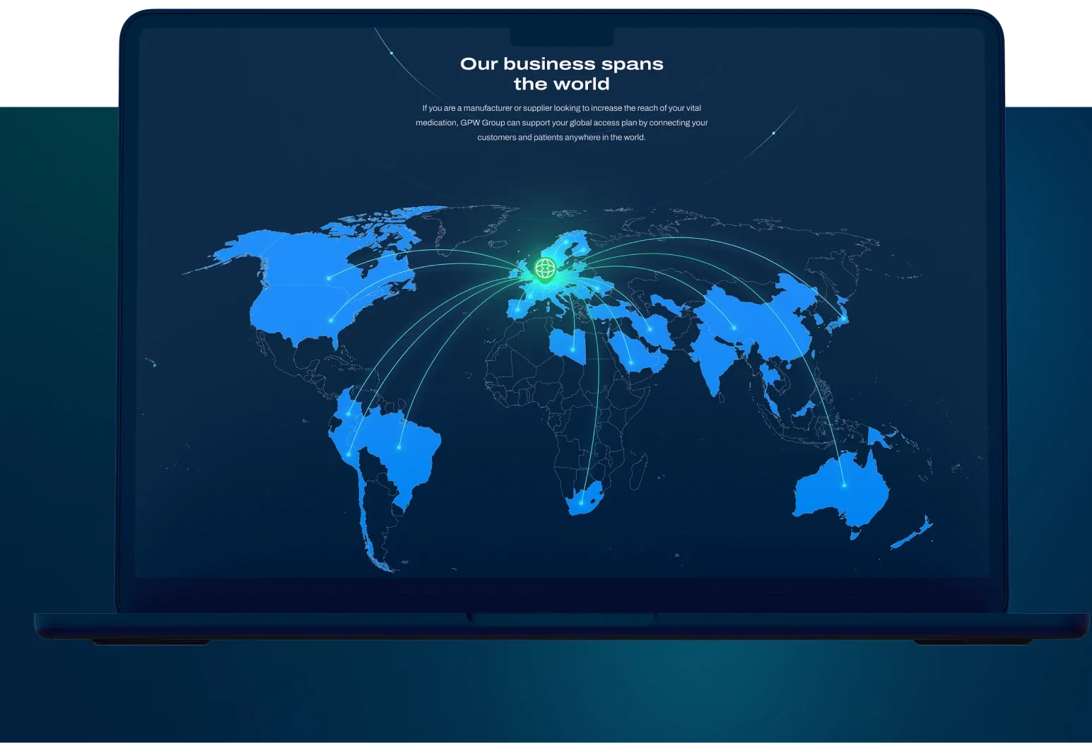
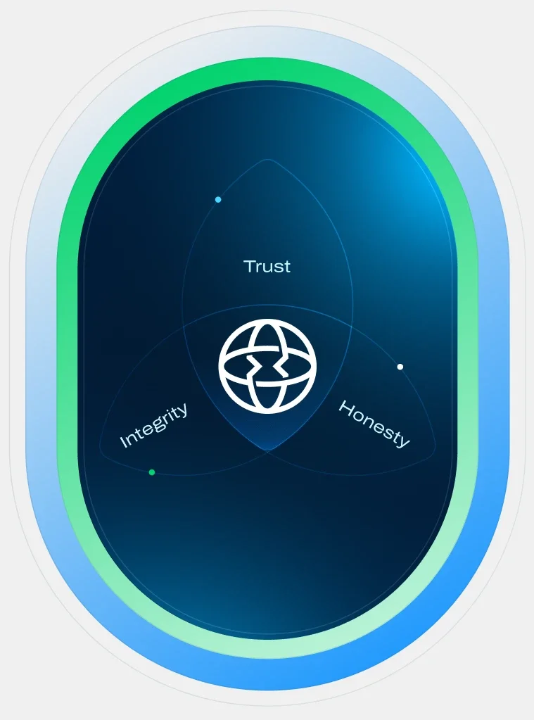
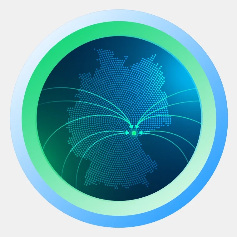
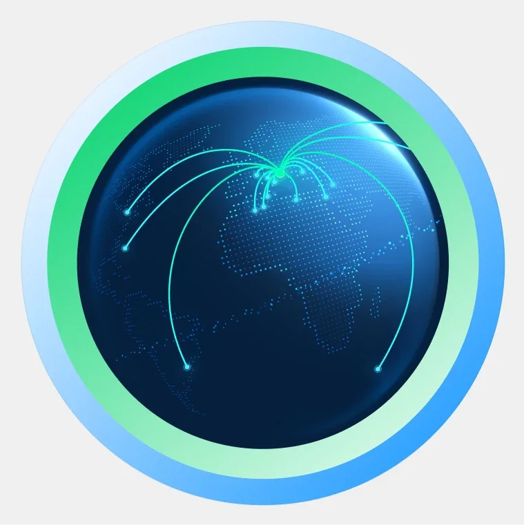
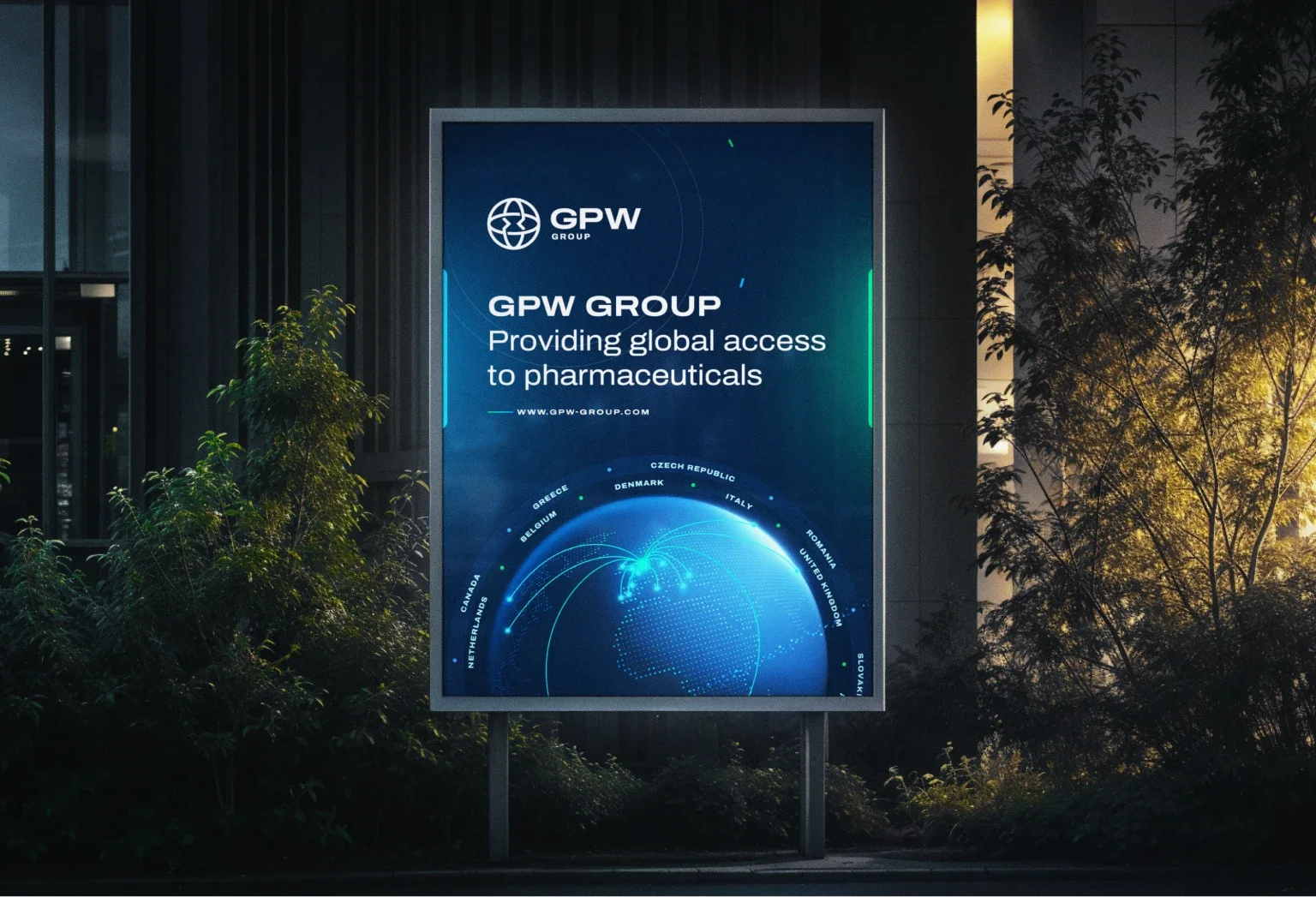
The globe on a dark blue background with light effects shows the far-reaching scope of GPW’s services. Around the globe we listed all the countries GPW Group serves. After the homepage we designed the remaining pages and launched the website.
Other concepts
While developing the homepage concept we came up with many creative ideas. Here are some of them:
Design support
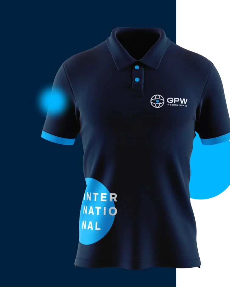
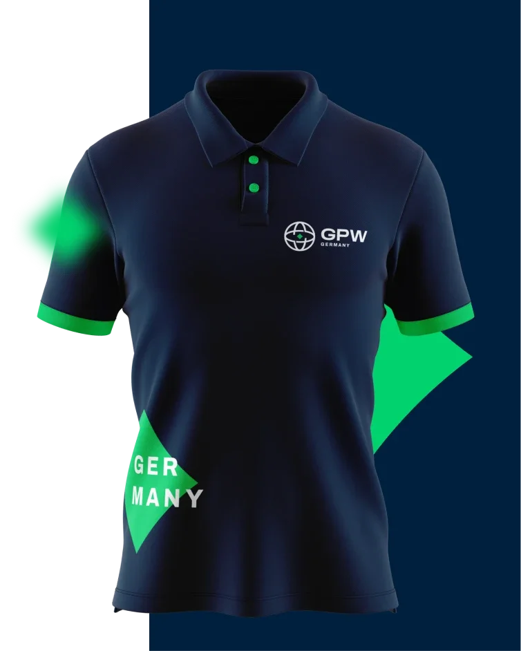
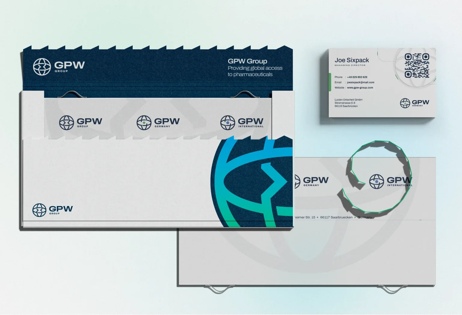
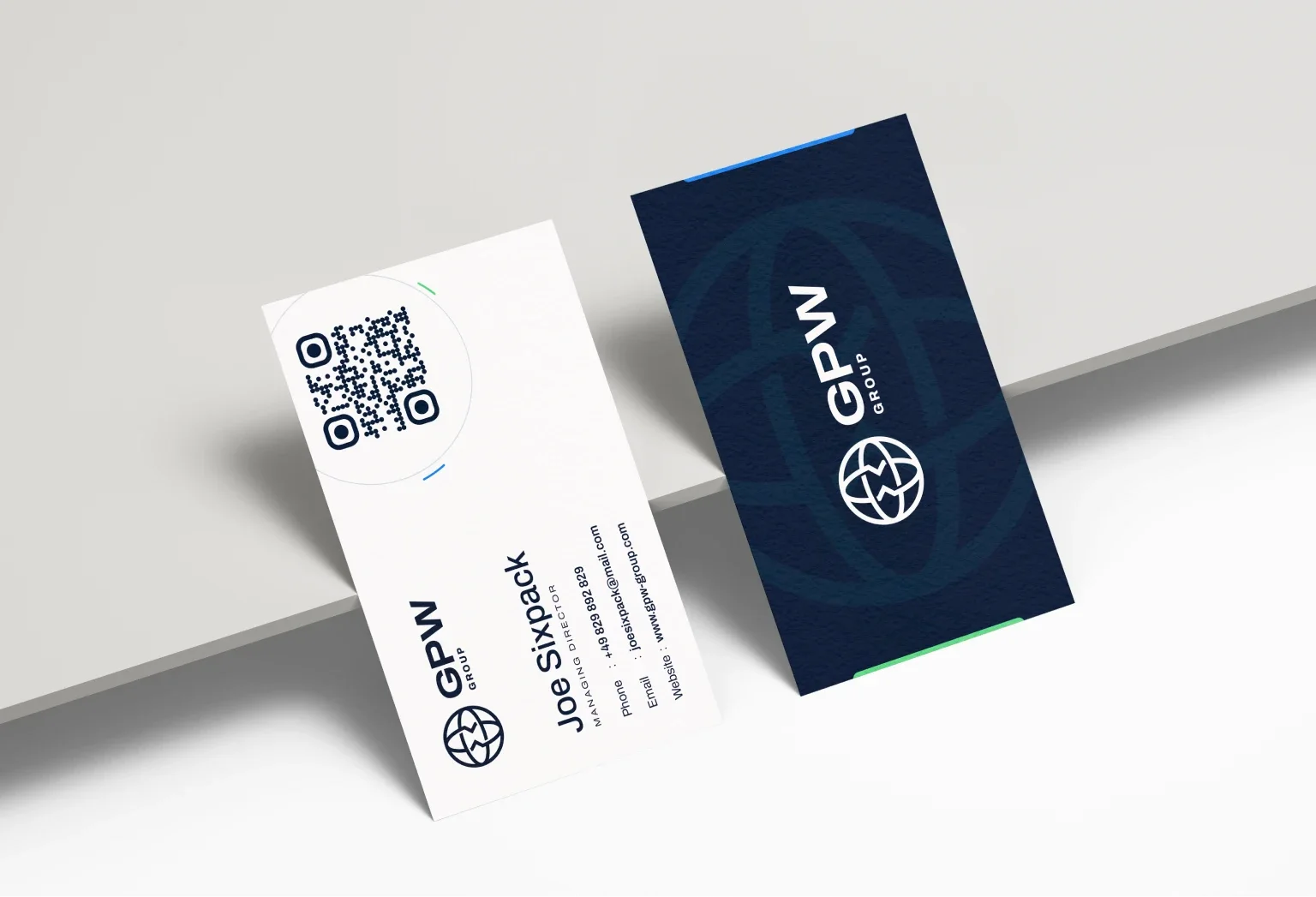
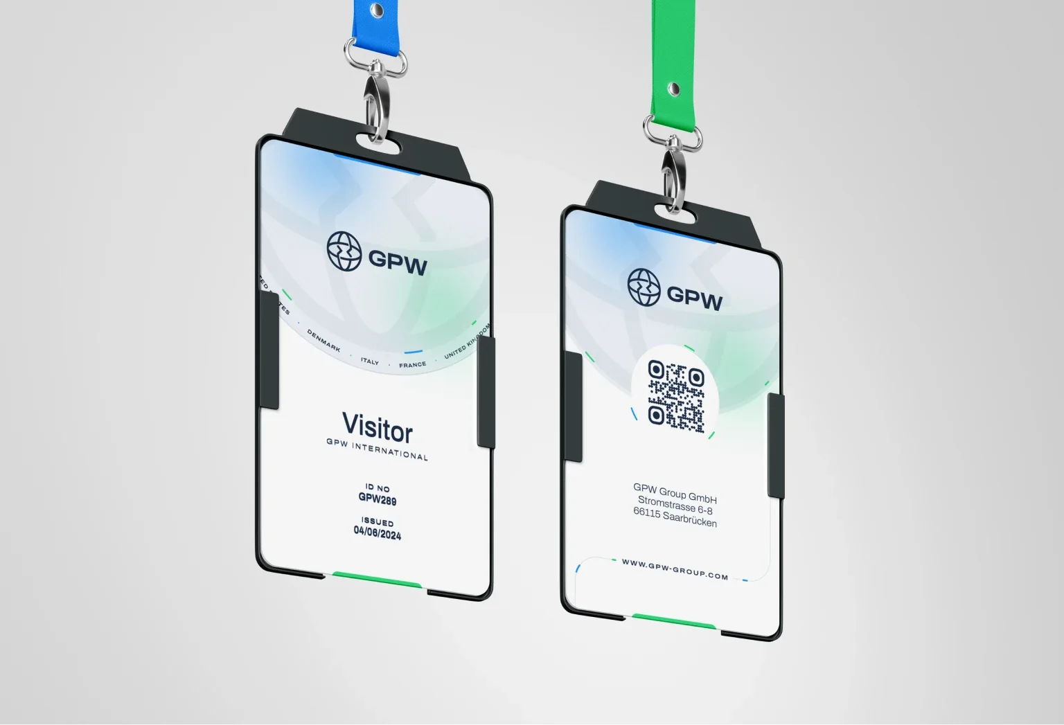
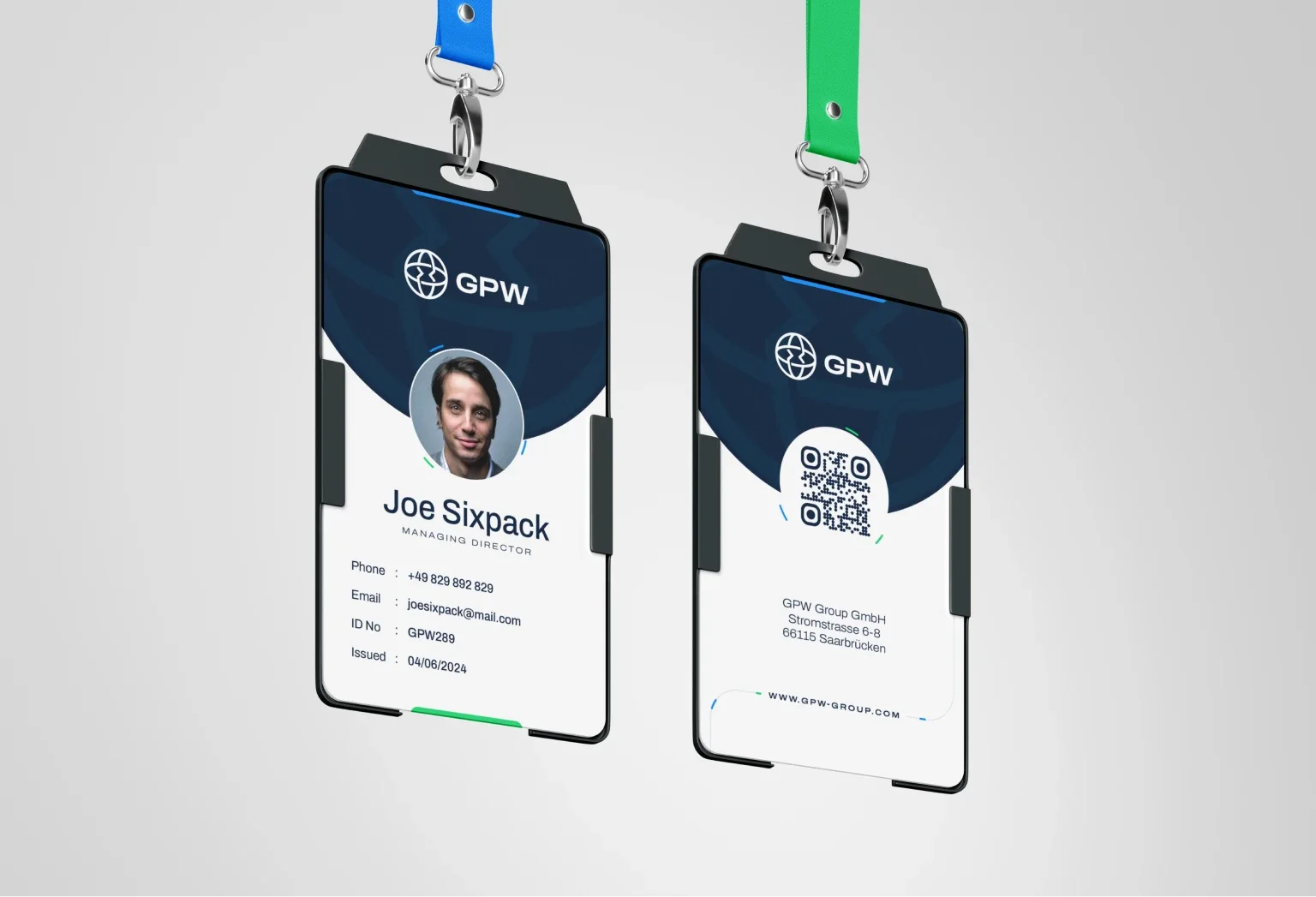
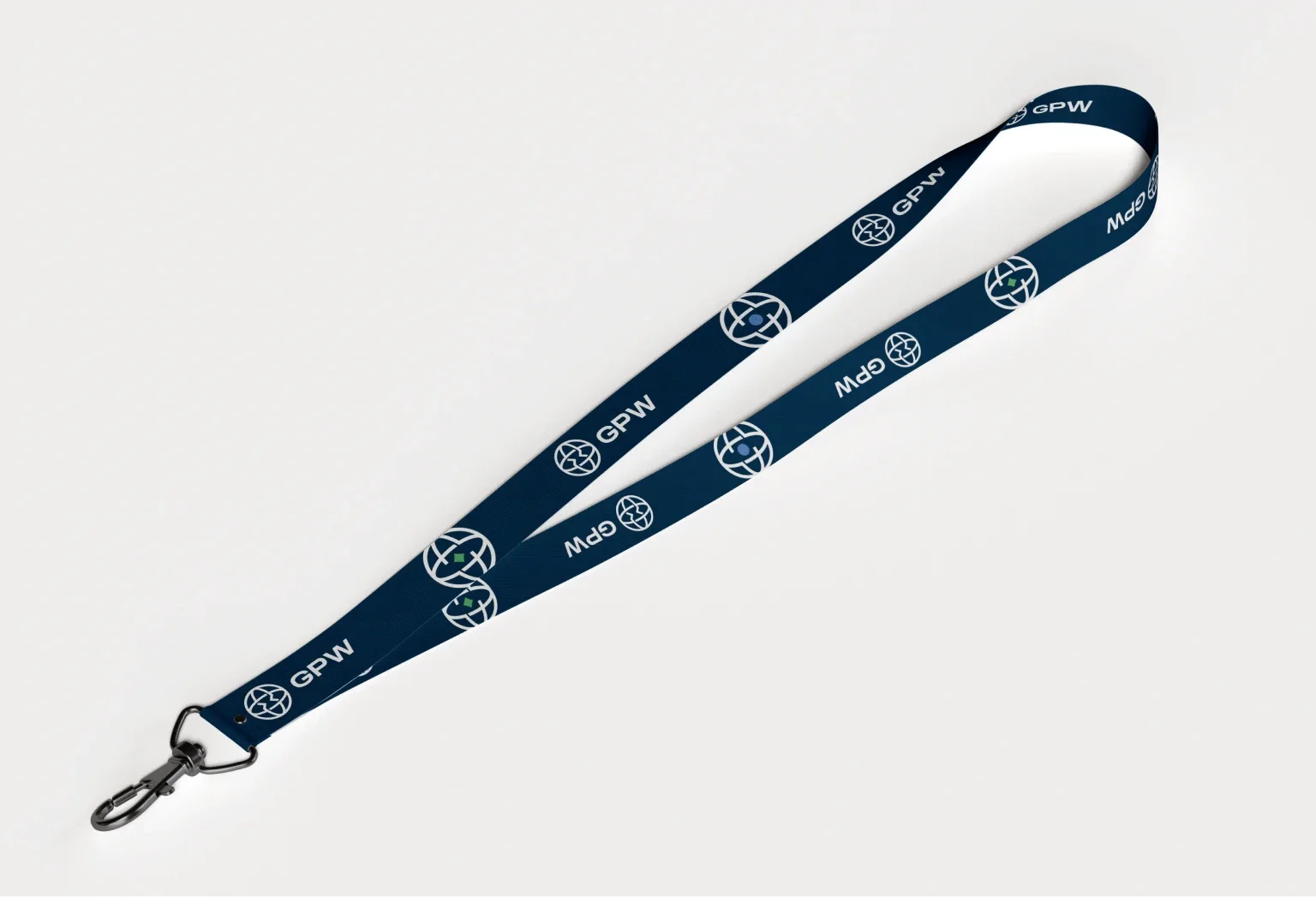
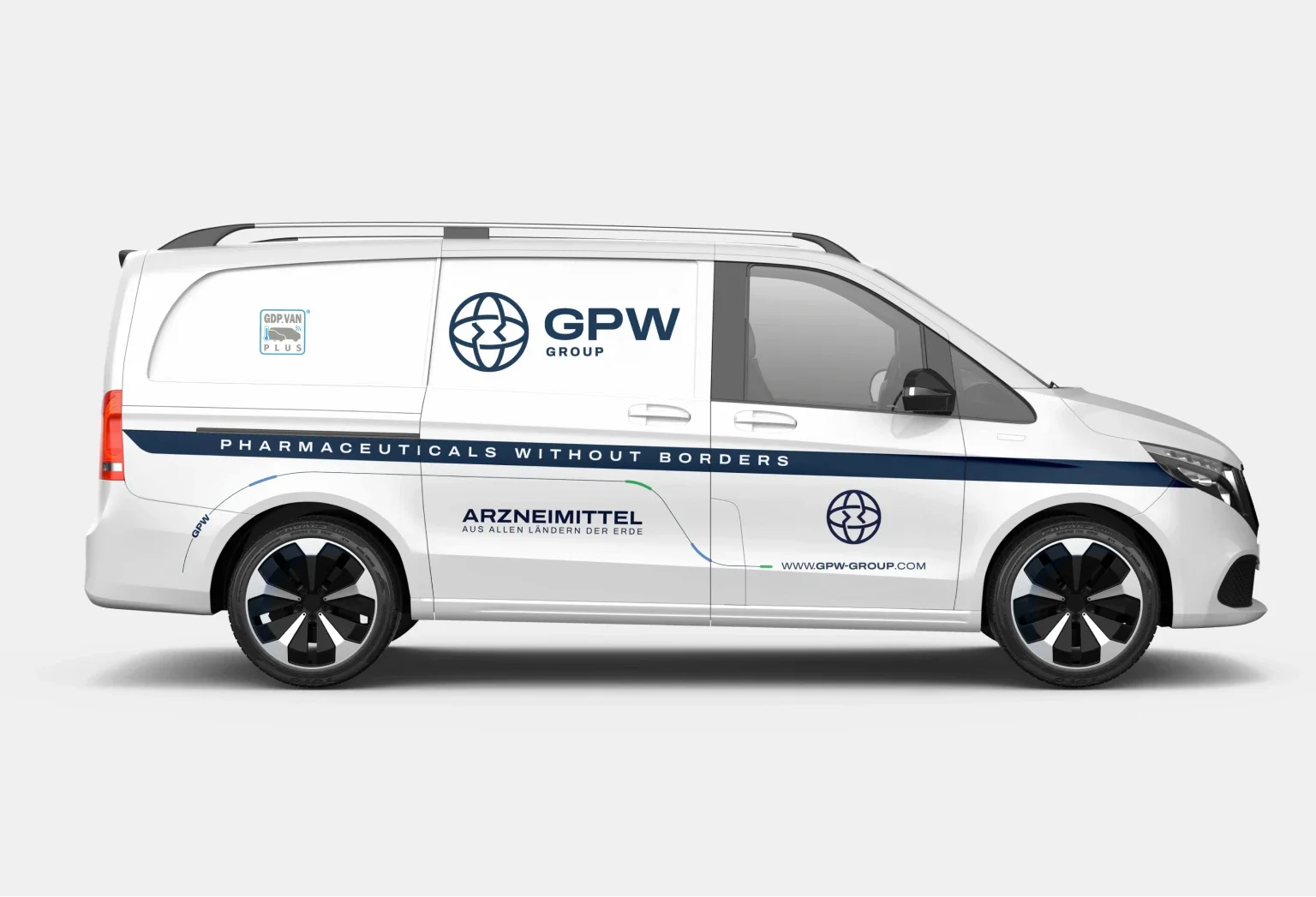
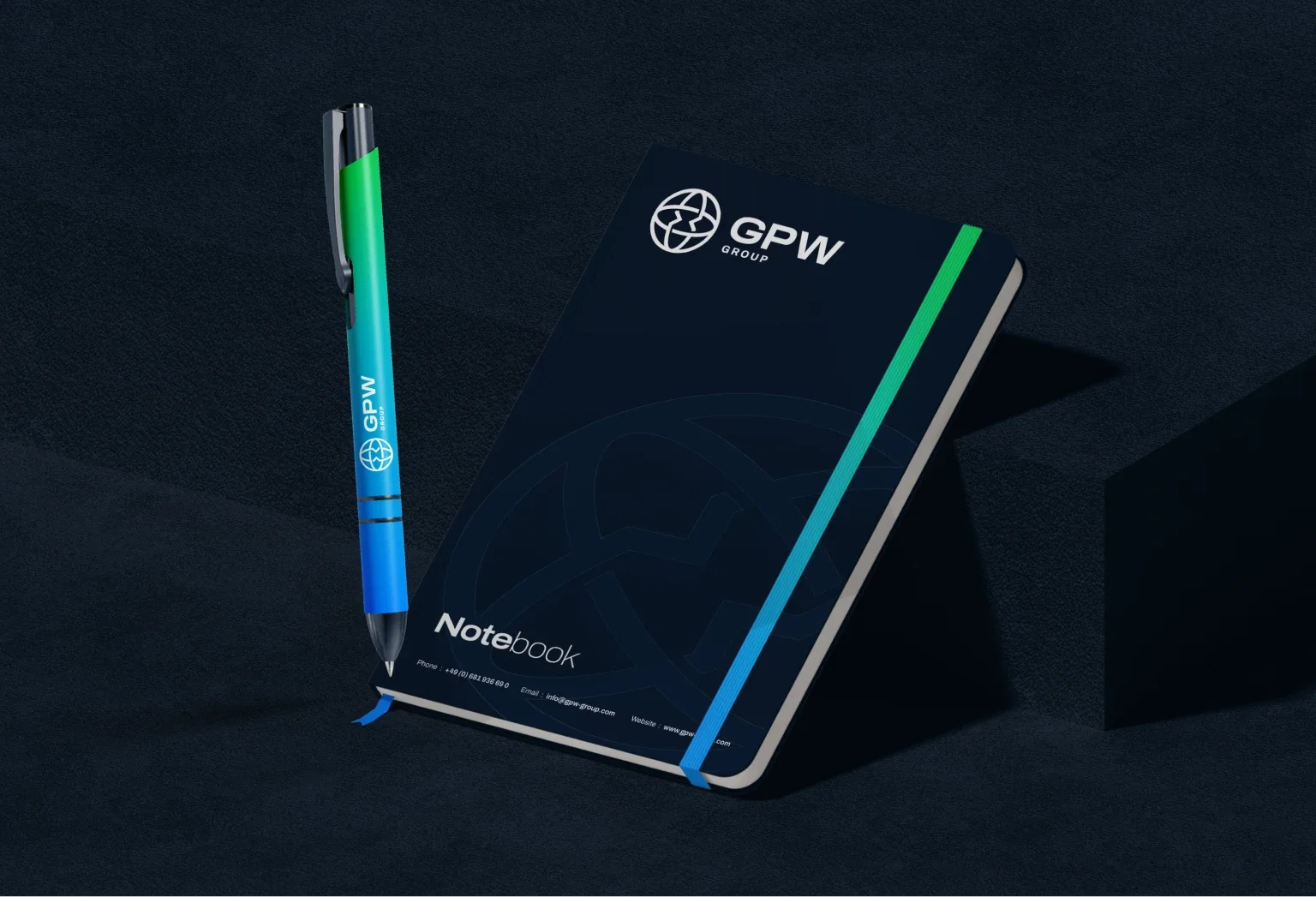
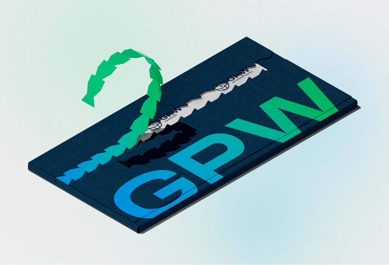
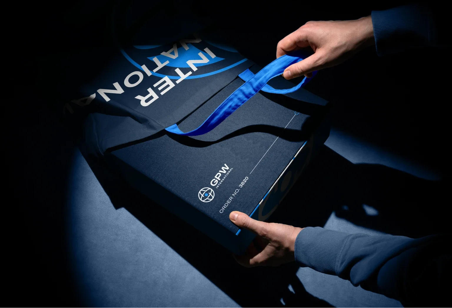
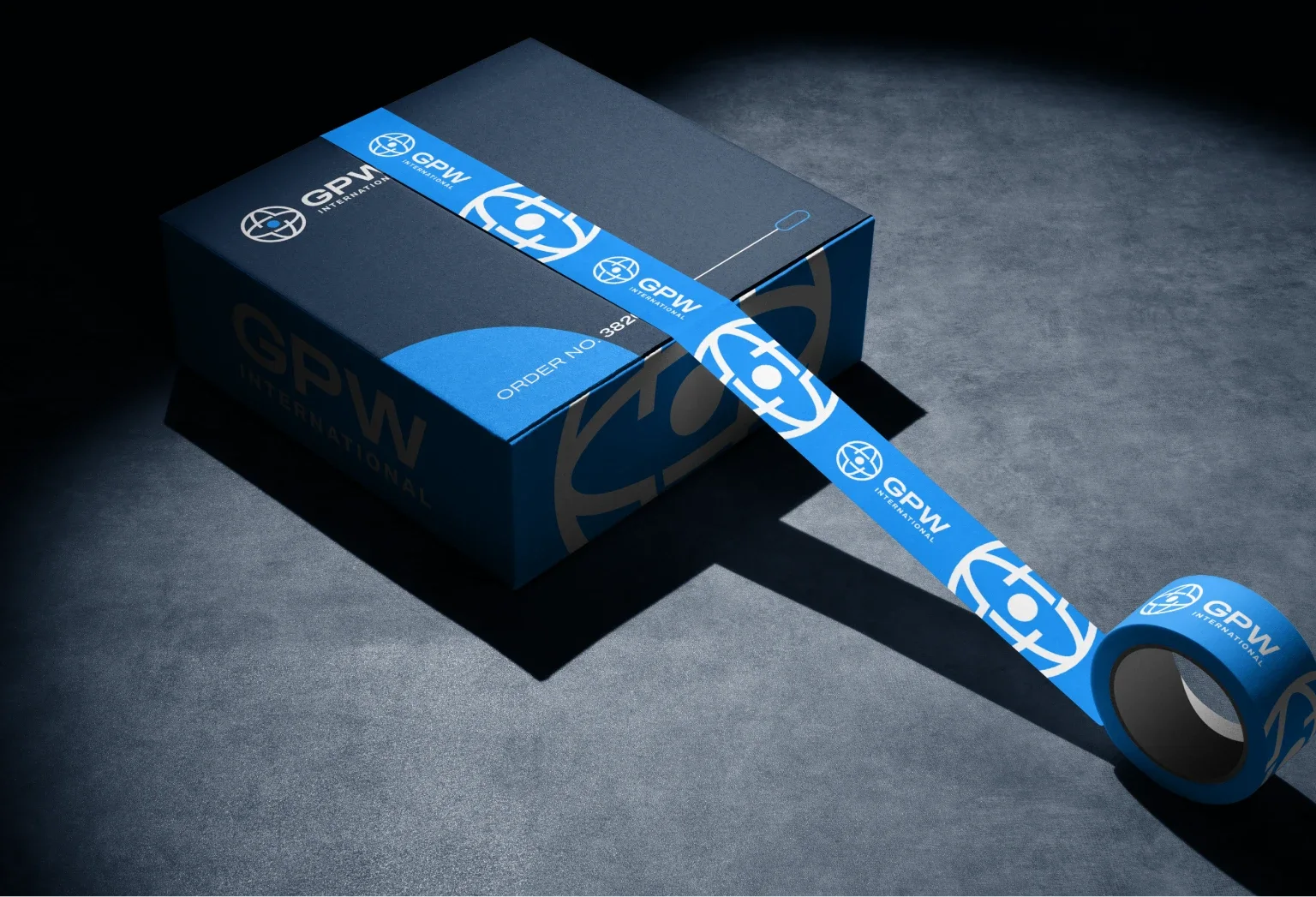
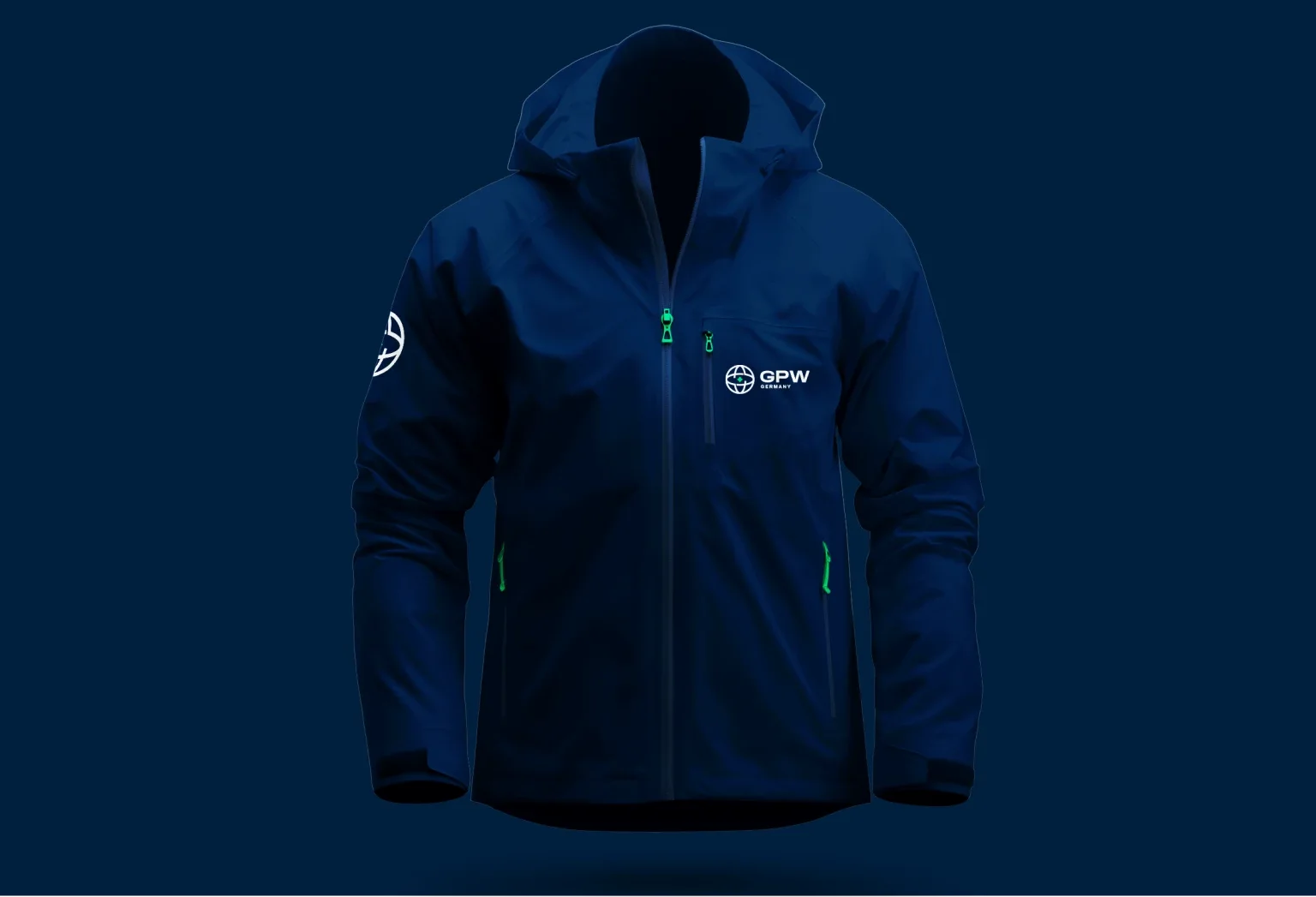
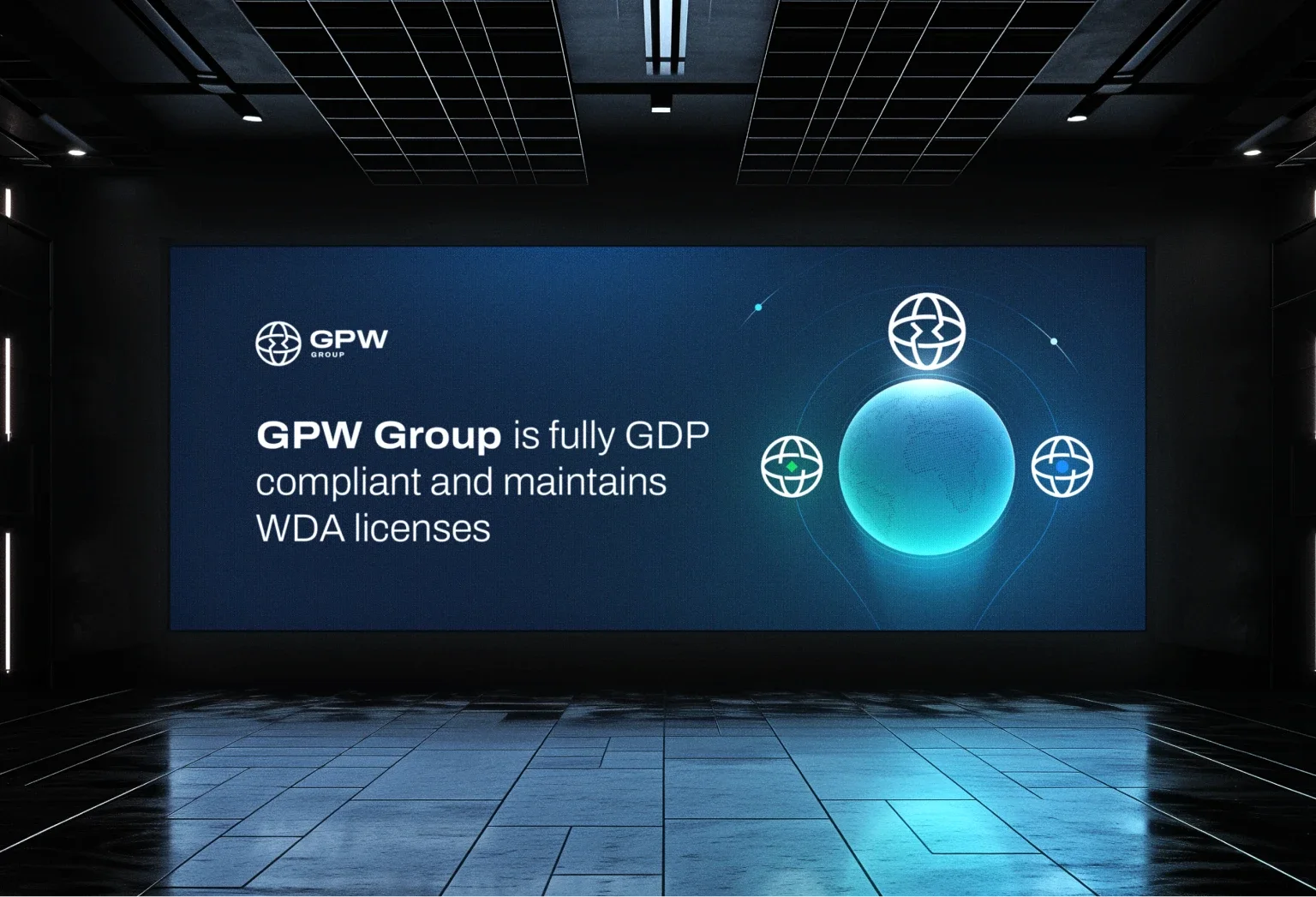
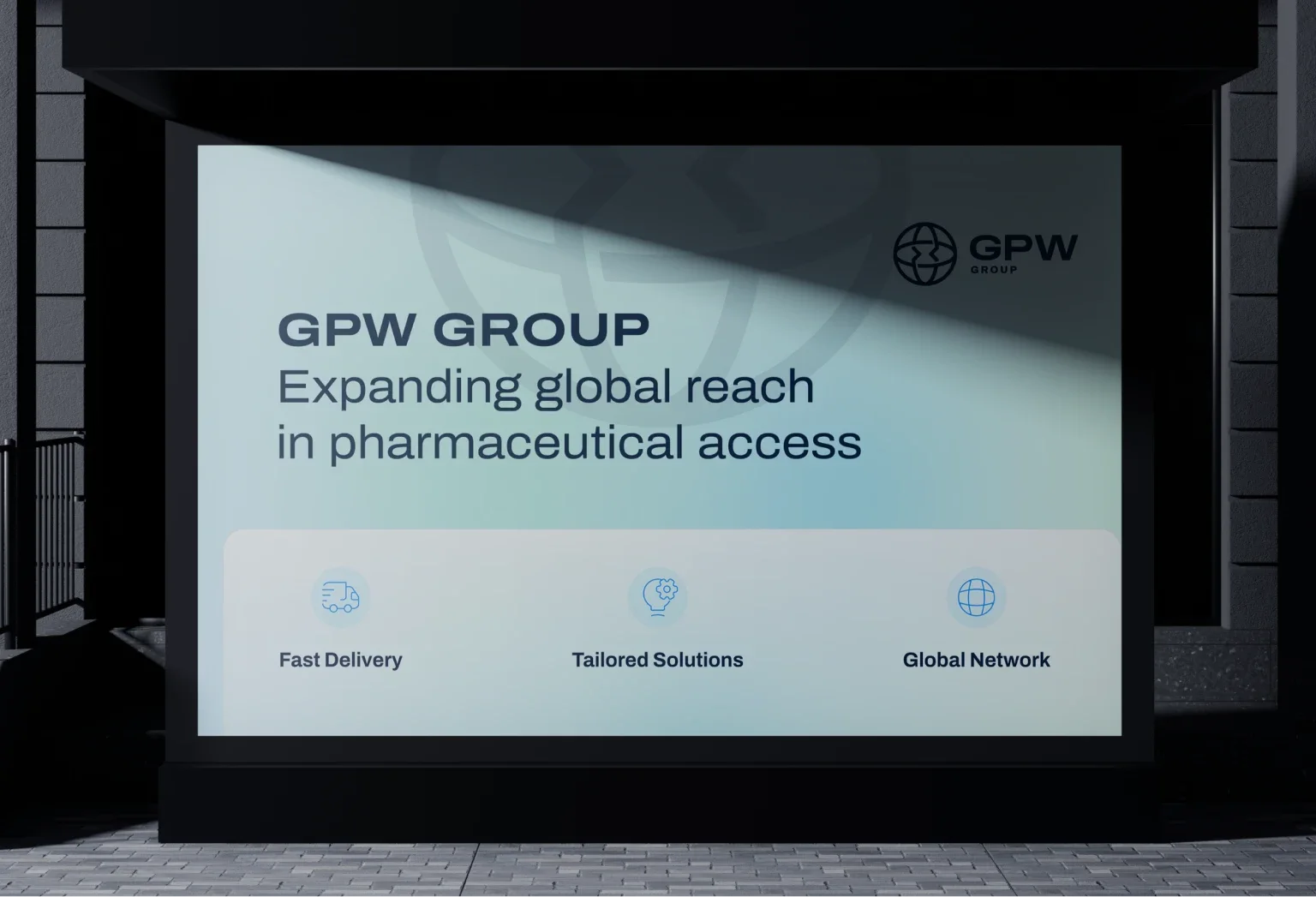
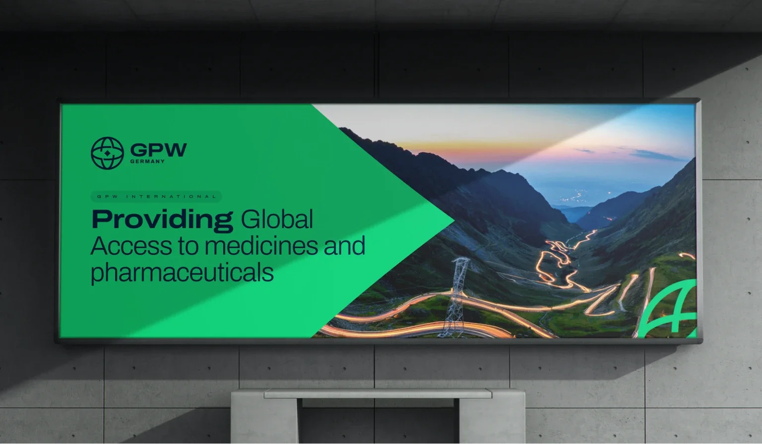
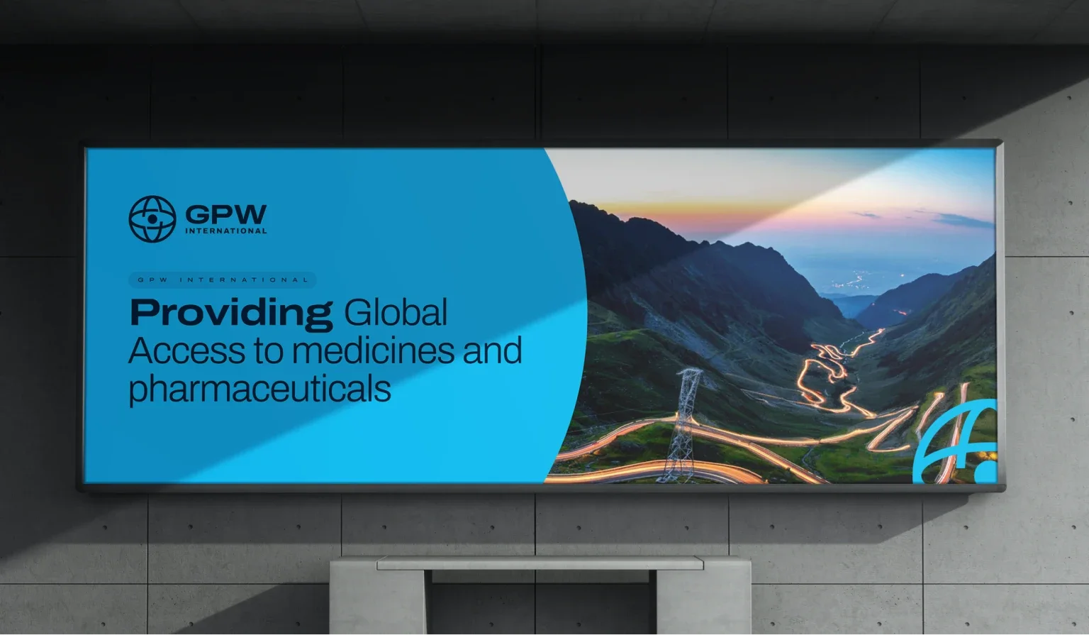
GPW also asked us to prepare additional brand identity materials such as letterhead, general business cards, business cards for the German and international divisions, as well as printed materials: a van wrap, polo shirts, badges for guests and employees, and a lanyard.
Testimonial
g&co - design studio’s work received positive feedback from the client, resulting in increased LinkedIn page views and followers. The team discussed and briefed all elements with the client, provided regular updates and feedback, and demonstrated flexibility when ideas changed.

Nicholas Rhys-Jones
CEO, GPW Group

More projects
All projects
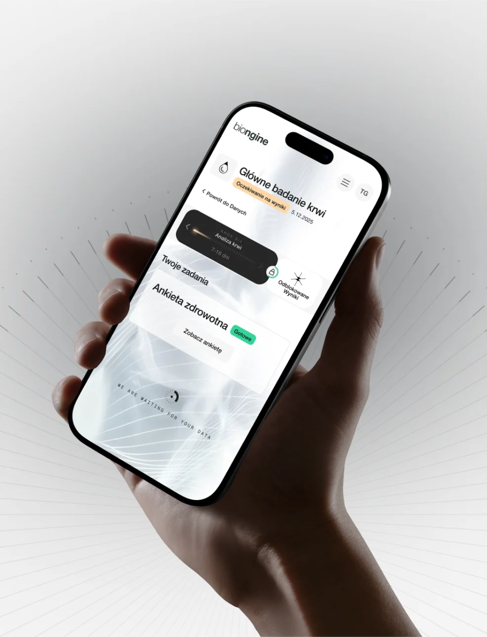

A revolution in preventive healthcare
Case study coming soon
- Healthcare