
International hearing and speech centre
A new website with an improved booking system for a network of 15 medical facilities. In cooperation with Dogtronic.
The need
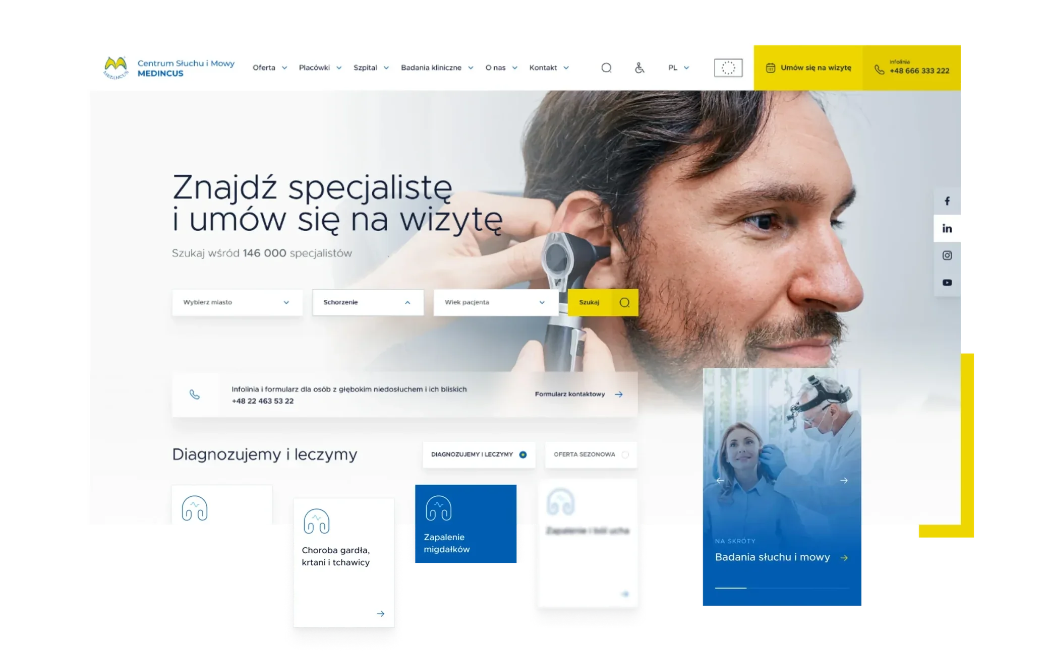
The MEDINCUS Centre of Hearing and Speech is a network of medical facilities providing highly specialised services in otorhinolaryngology, audiology, phoniatrics, rehabilitation, speech therapy, psychology, physiotherapy and biomedical engineering. Comprehensive care for patients with hearing and speech problems is provided in 15 facilities throughout Poland.
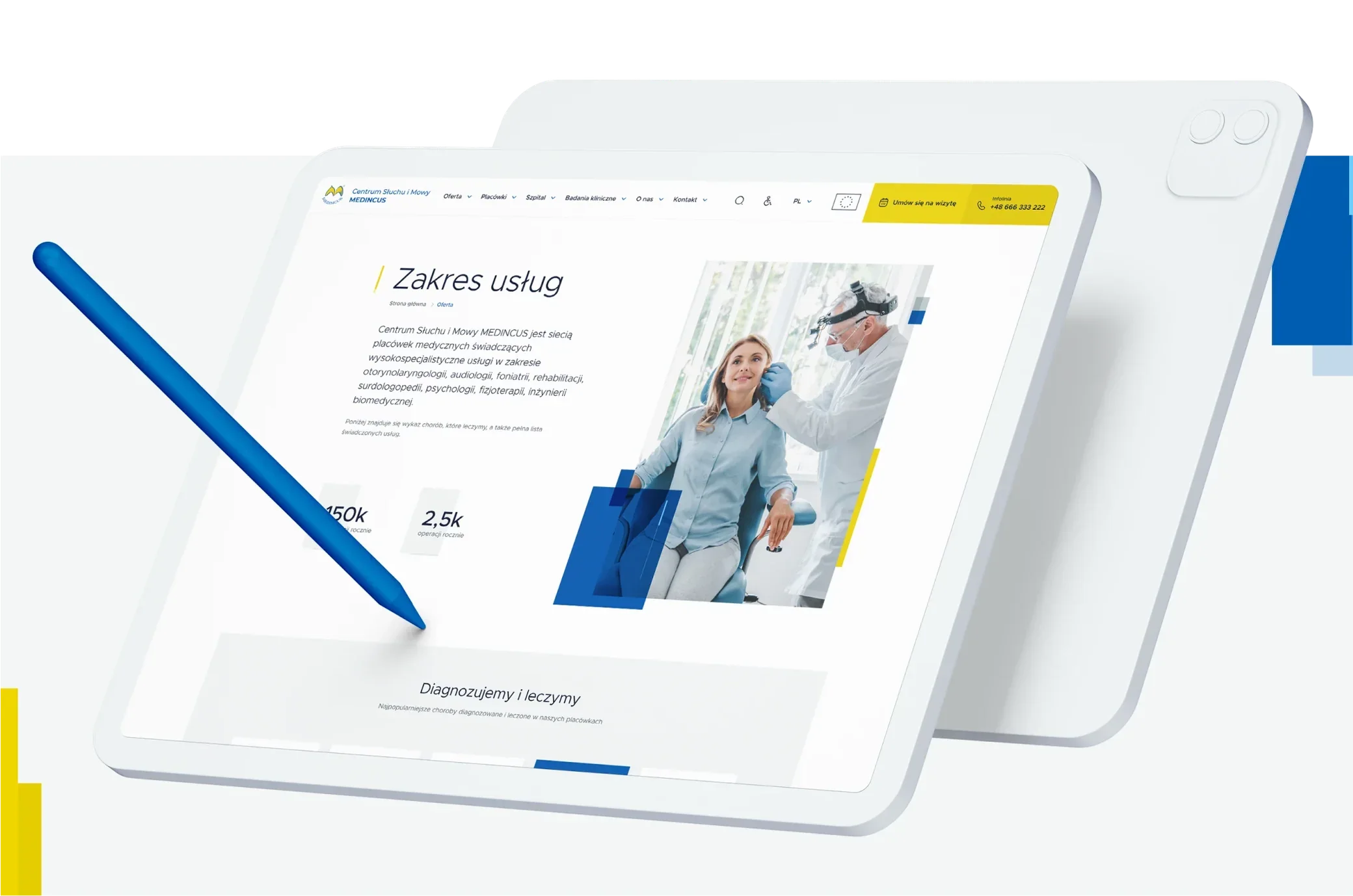
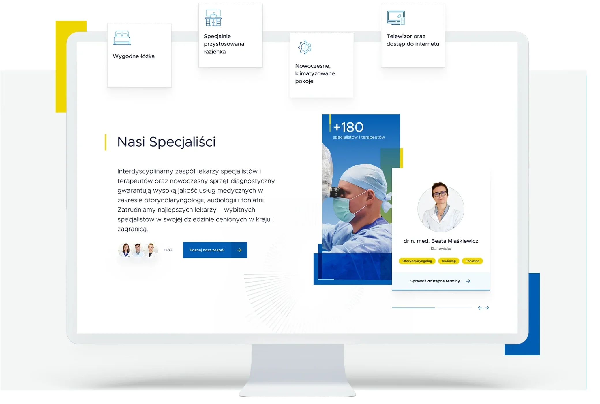
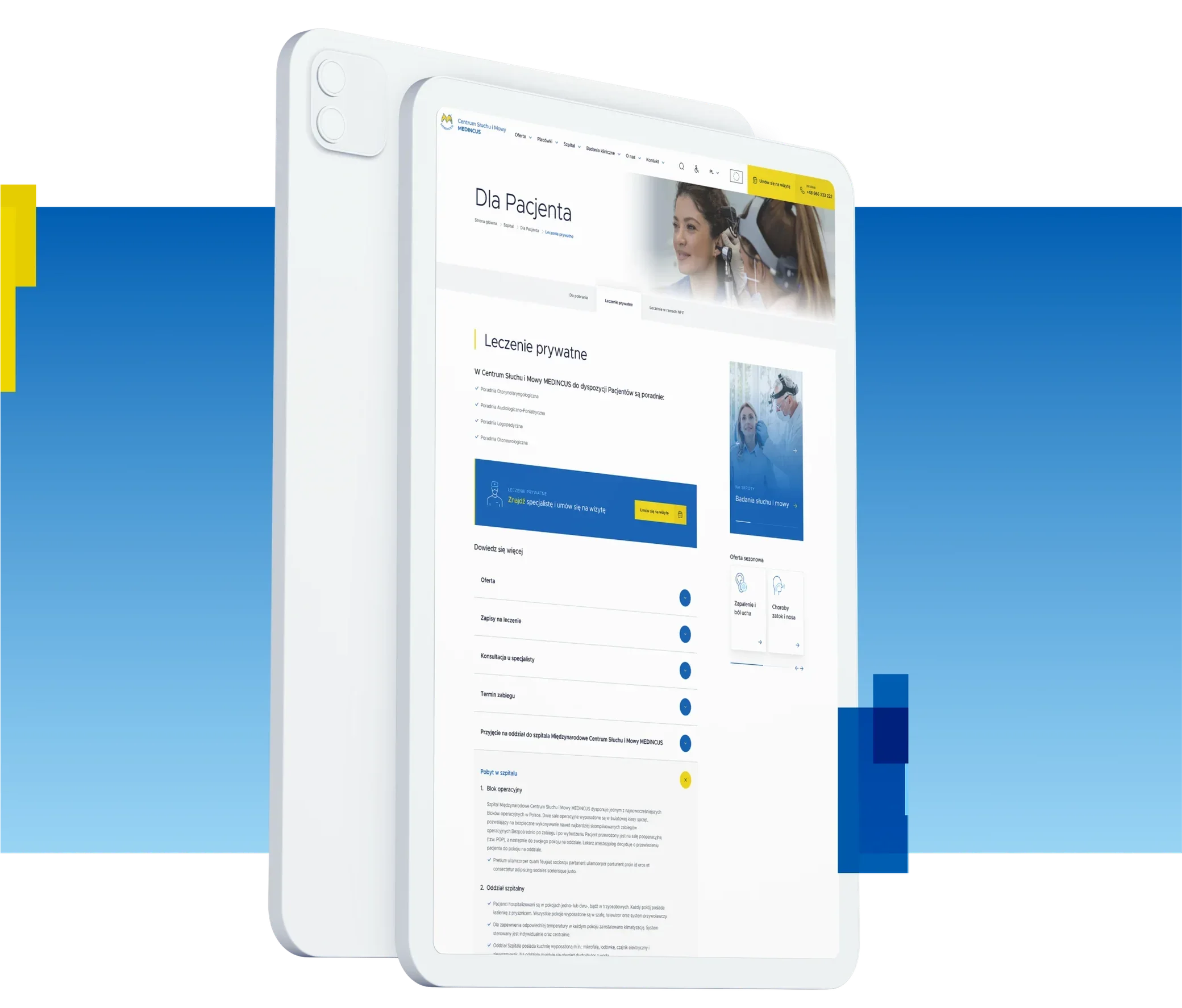
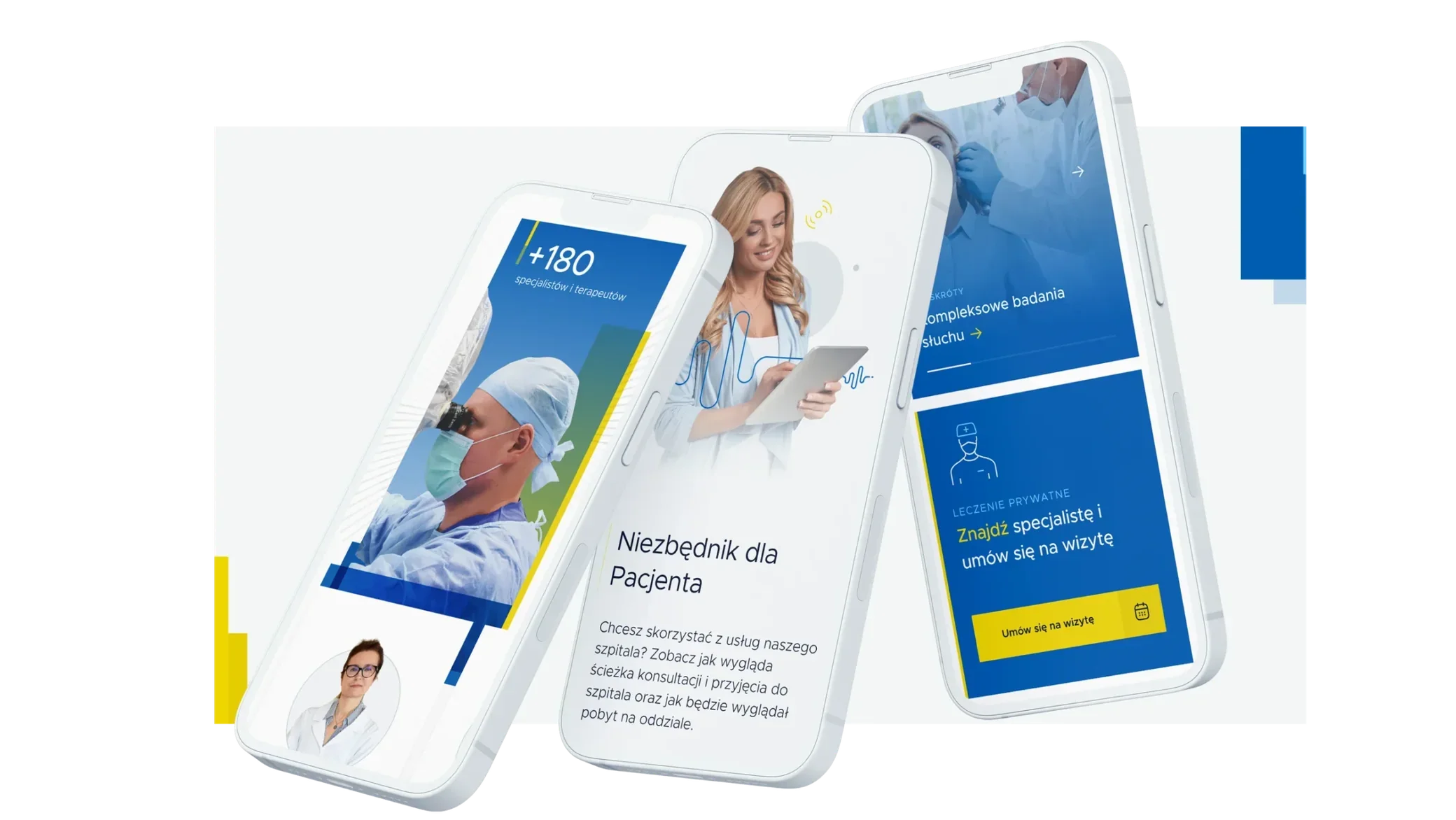
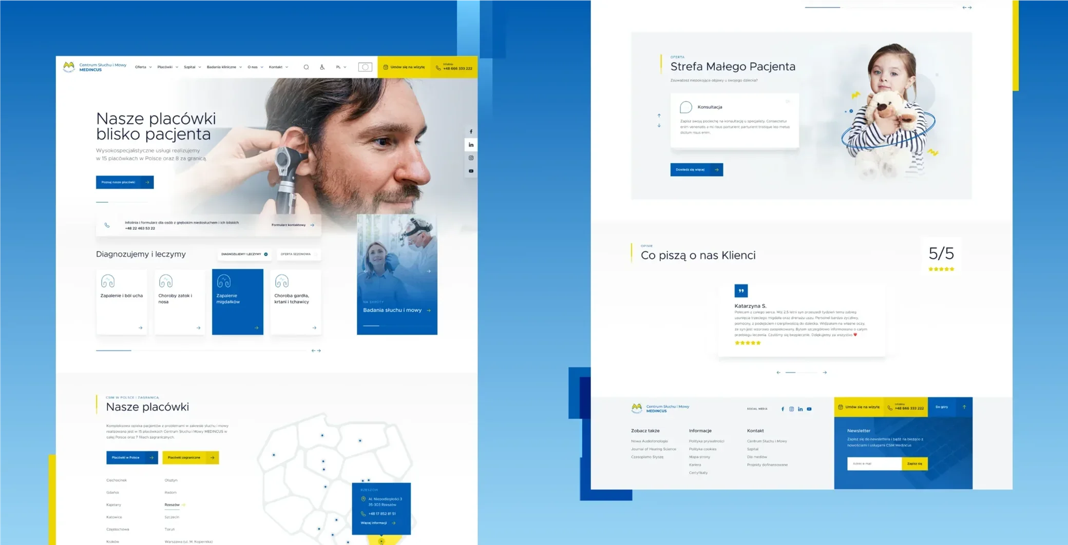
The goal was to design a new, refreshed website useful to patients of all ages. Along with the new look, we implemented new functionality, improved the booking system and made the site easier to navigate, refreshing the design to new standards and the client's assumptions. The project included:
- UX workshops
- Development of the visual direction
- Functional mockups and a website prototype
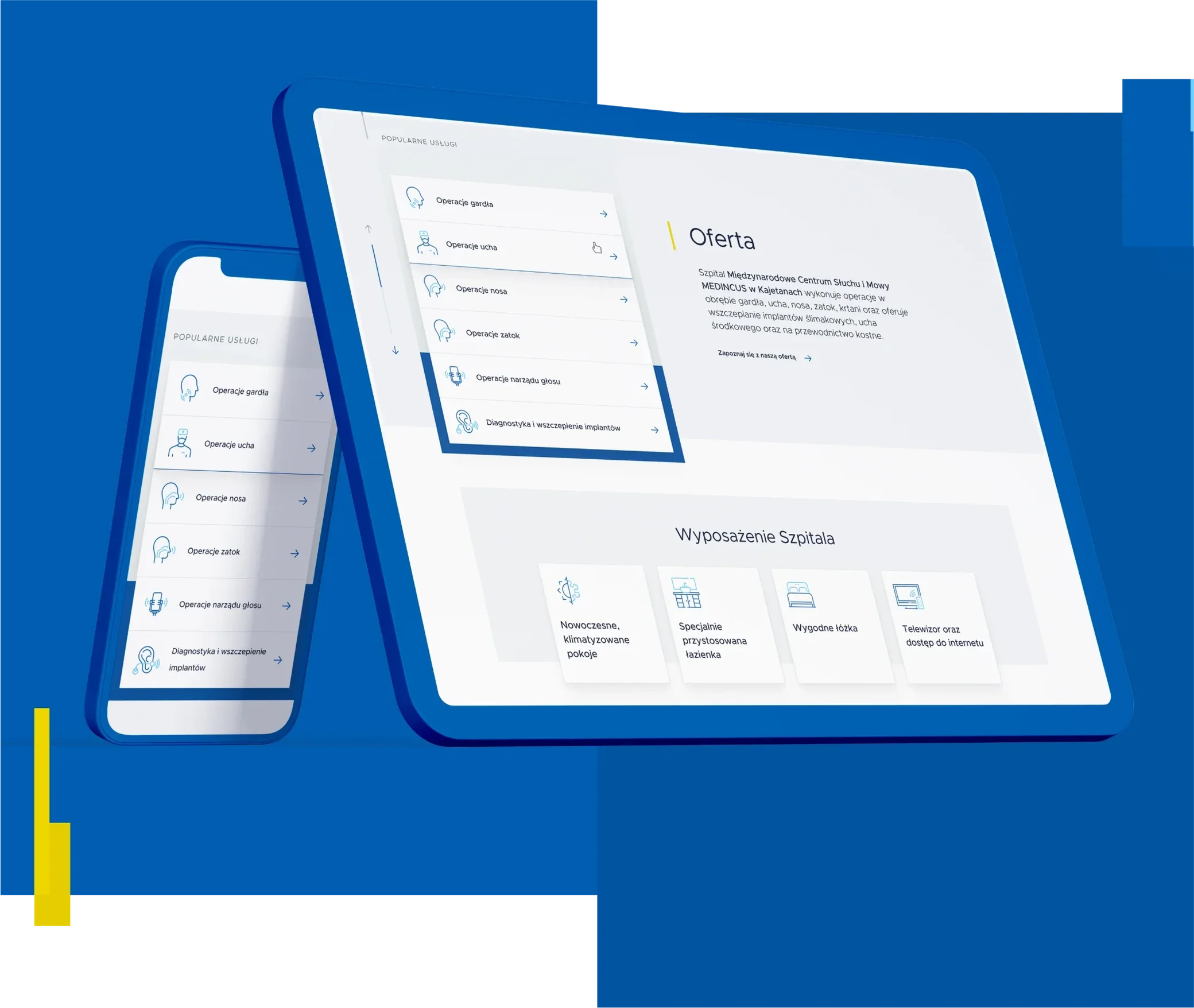
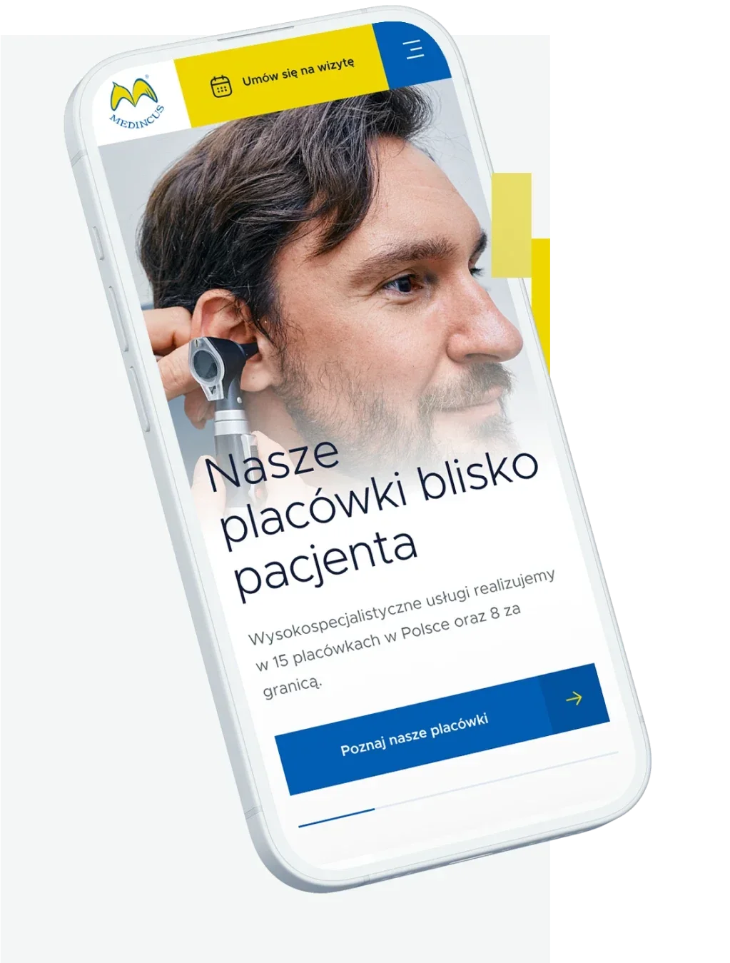
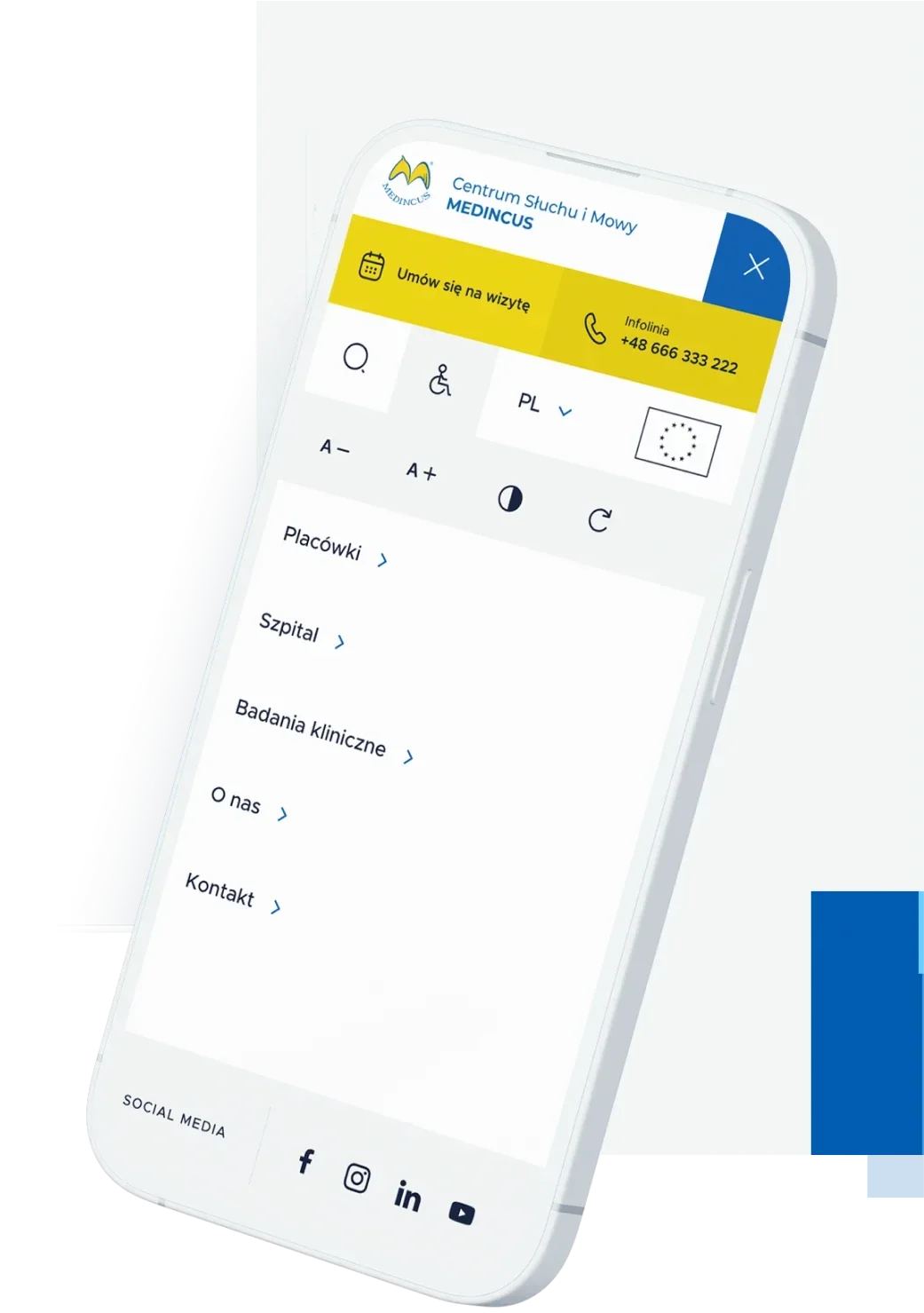
- Desktop and mobile interface design
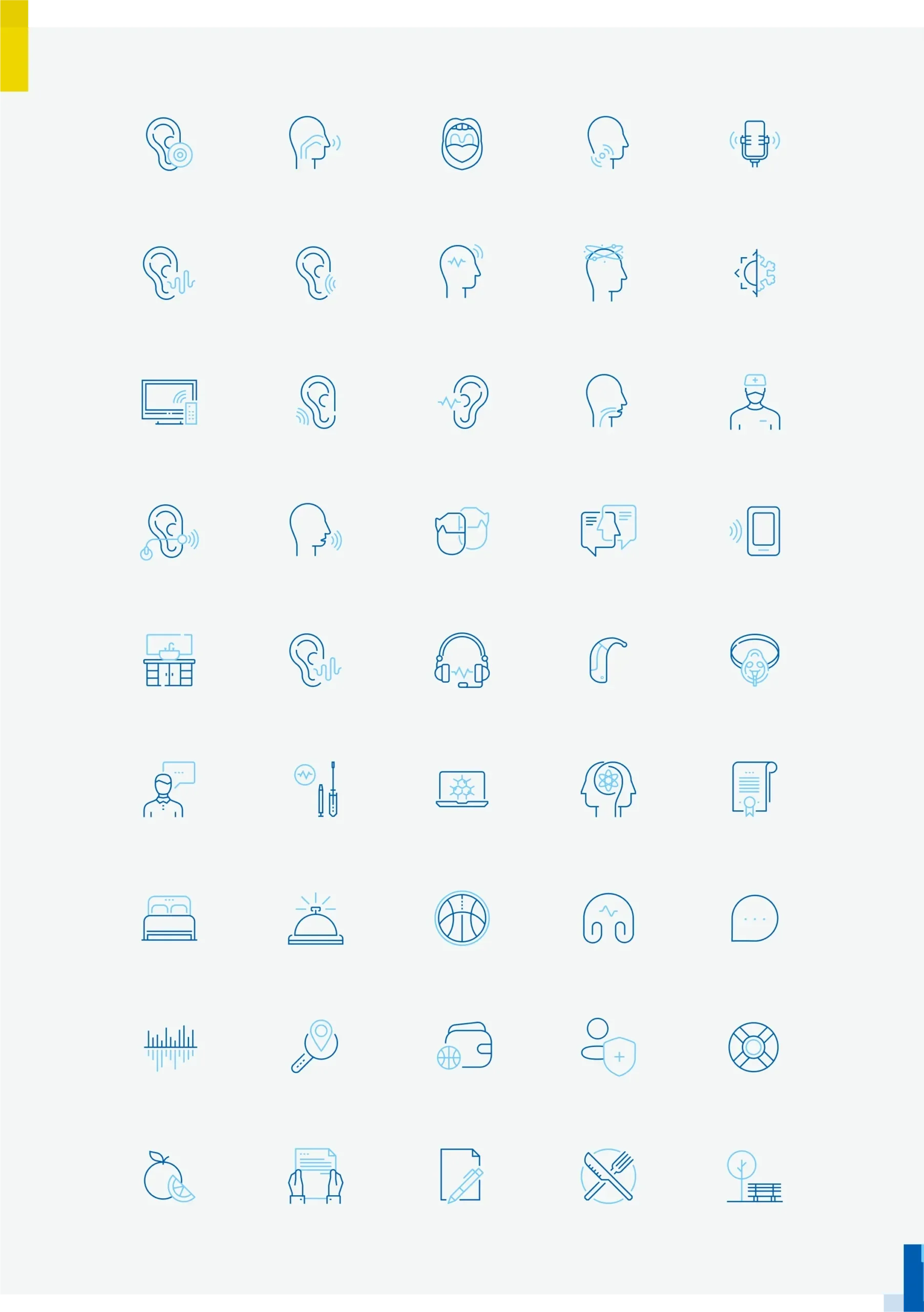
- Set of icons and illustrations
- Graphic support for new subpages and features
Discovery
We started by preparing a new site map and agreeing on the key features, so users can easily navigate the site, quickly find information and easily book a visit.
Then we looked for the ideal visual style: we examined the market, the design of similar services and the target audience. Step by step, creating completely new concepts, we arrived at a design that perfectly fits the company's identity.
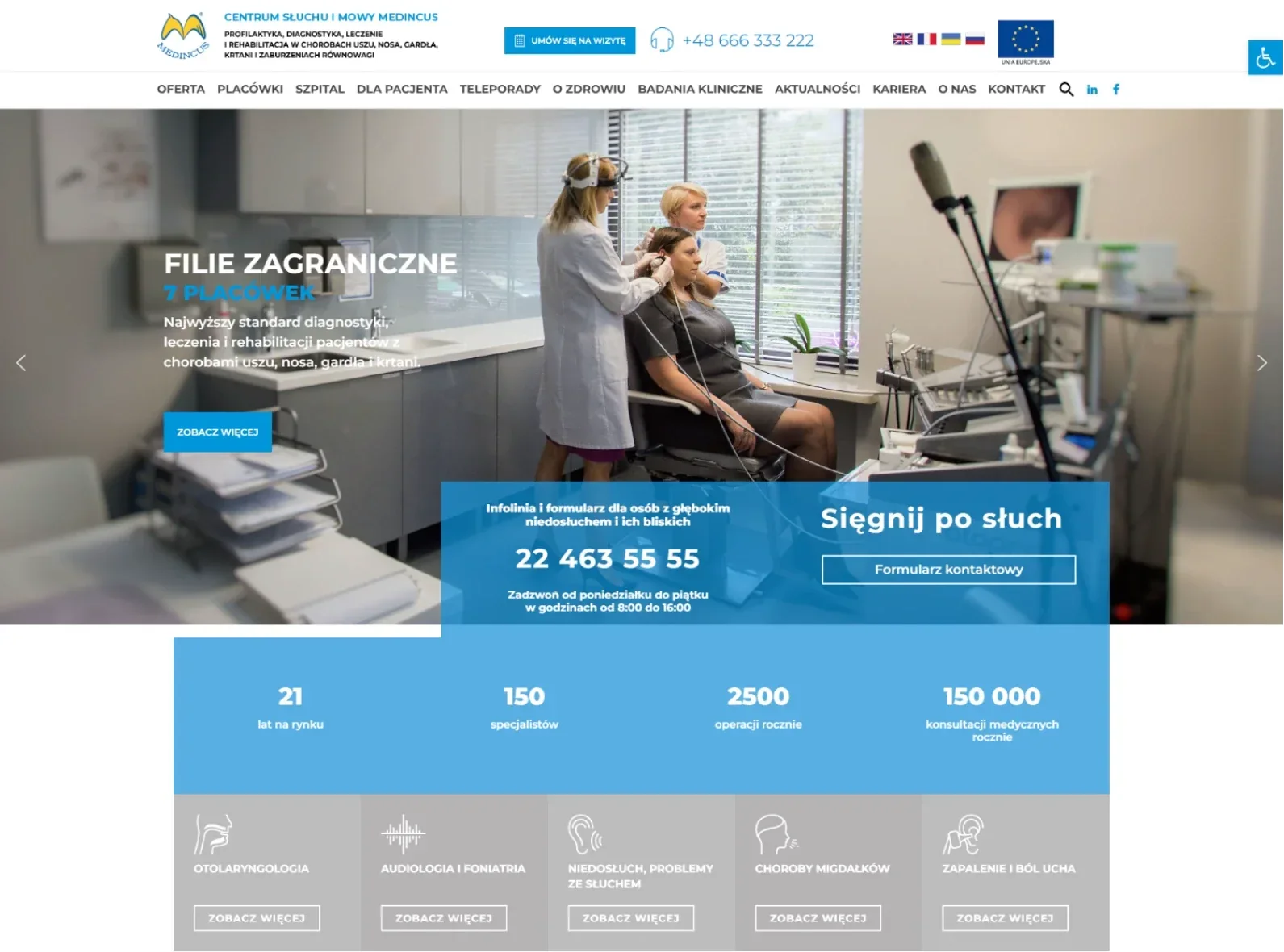
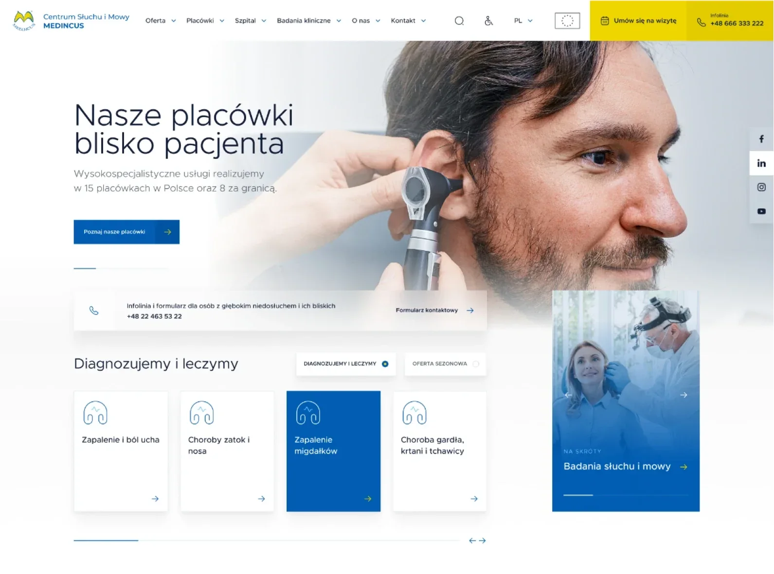
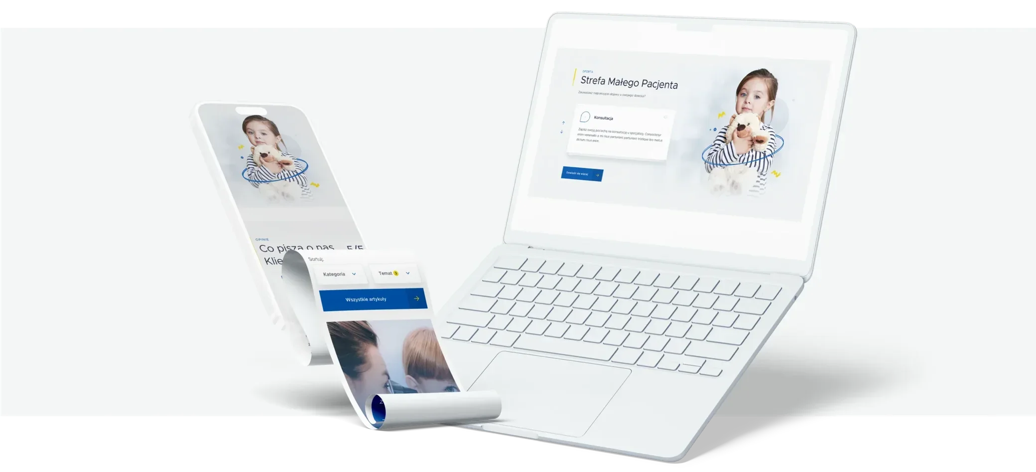
Website concepts
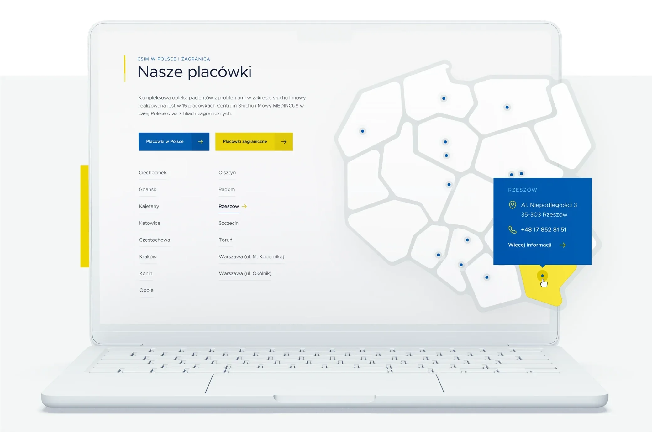
We made more than a dozen concepts and dozens of variations before arriving at the final look.
Along the way we went from pleasant, rounded shapes and warm colours to sharp shapes with more subdued colours. We tested various colour and typographic variants, ultimately staying with shades that match the brand's identity.
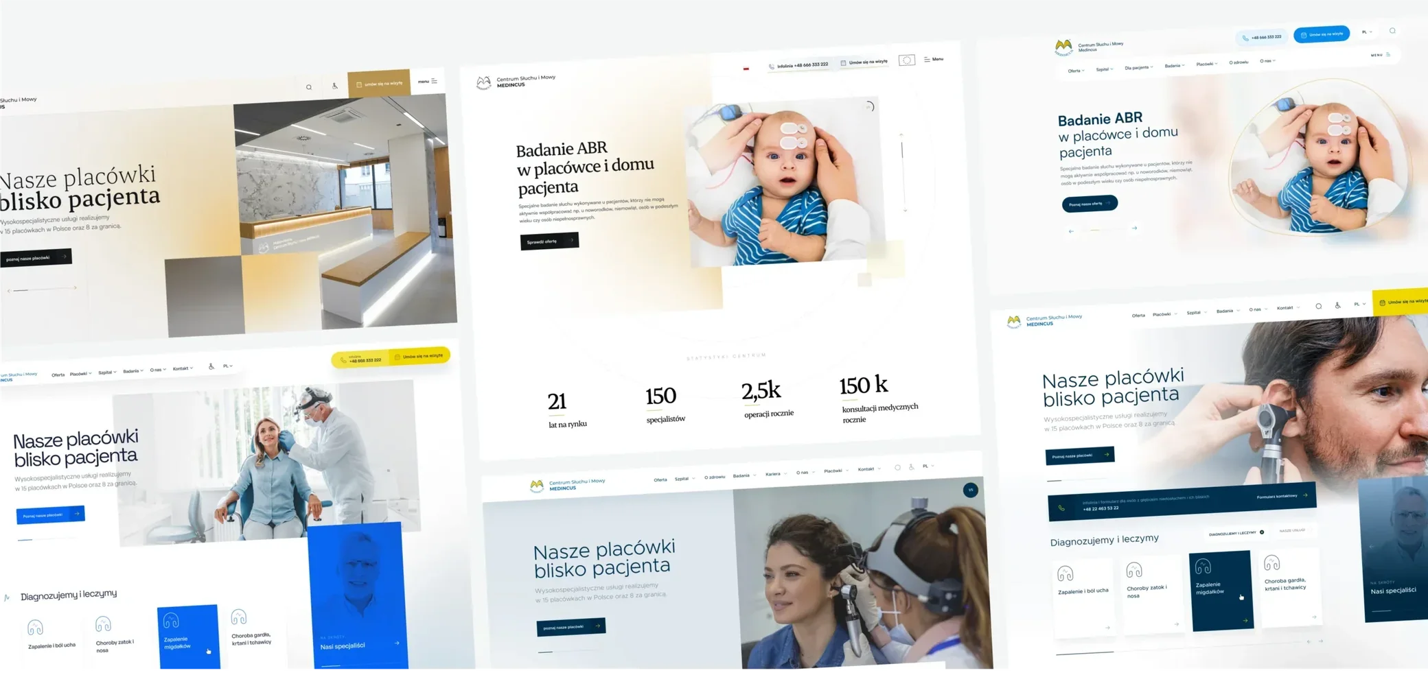
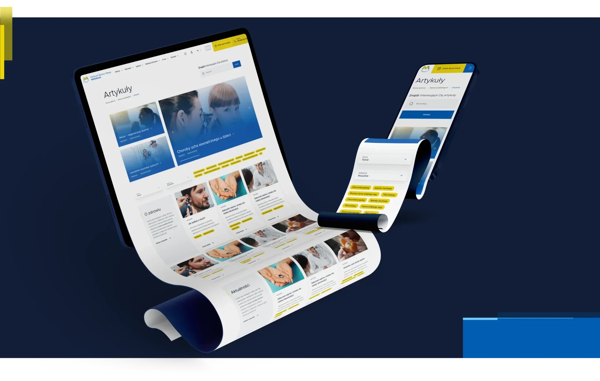
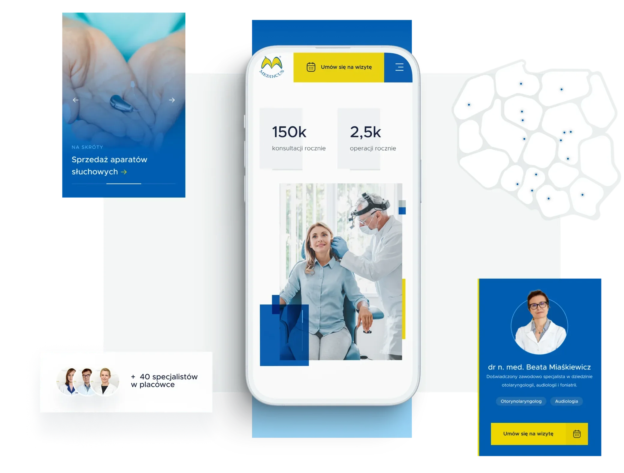
UX/UI design
While designing the website, we also looked for leading motifs to make the brand unique. The results are below.
Icons
Along with the website, we developed a consistent set of icons for conditions and services, among other things.
The icons are simple, linear and two-coloured to make the website more attractive.
More projects
All projects

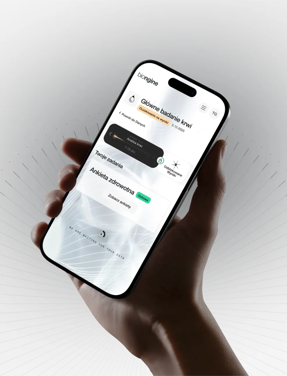

A revolution in preventive healthcare
Case study coming soon
- Healthcare