
Adam Kapuściński
Senior designer
Adam Kapuściński
Senior designer
The numbers look good: visits are growing, campaigns are running, the site shows up in search. And yet the enquiry inbox stays silent. The first reflex is usually: “we need more traffic”.
More often, what you need is a website that does something with the traffic you already have.
The person landing on your site isn’t looking for your company. They are looking for an answer to their problem, and they quickly judge whether they will find it here. If the answer is unclear, hidden or takes effort, they go back to the search results. You see a visit in your analytics; they see a question nobody answered.
At every step between landing and messaging you, someone drops off. So the question isn’t “how do we get more visits”, but “at which step do we lose the most people”.
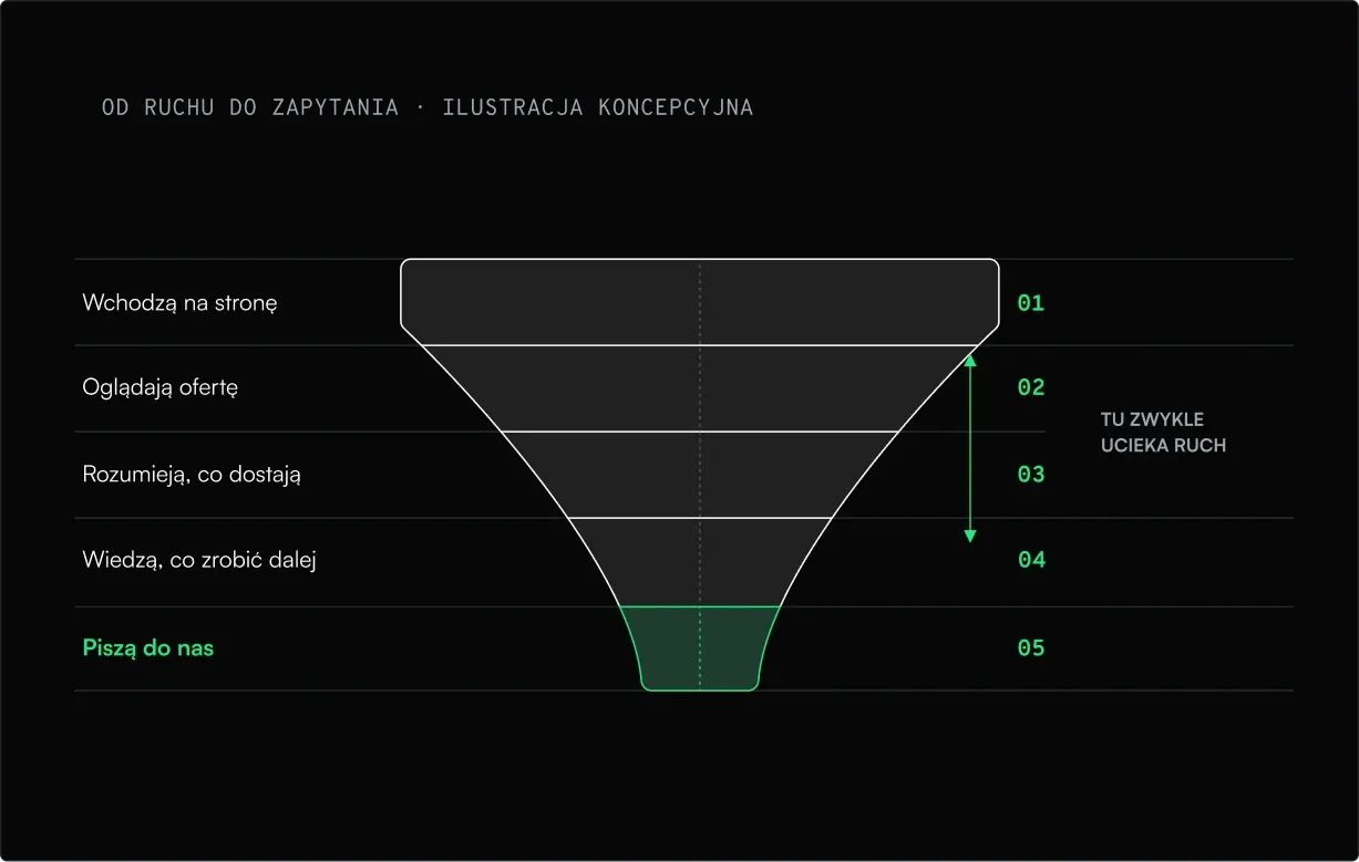
A lack of enquiries usually comes down to a few recurring causes. Each of them can be fixed:


A good website answers three questions, in this order: where am I and what is this company, what’s in it for me, and what should I do now. If any of the answers is unclear, visitors usually don’t ask — they leave.
That is what communication is, not decoration: the first screen, the headings, the order of sections and one clear next step.
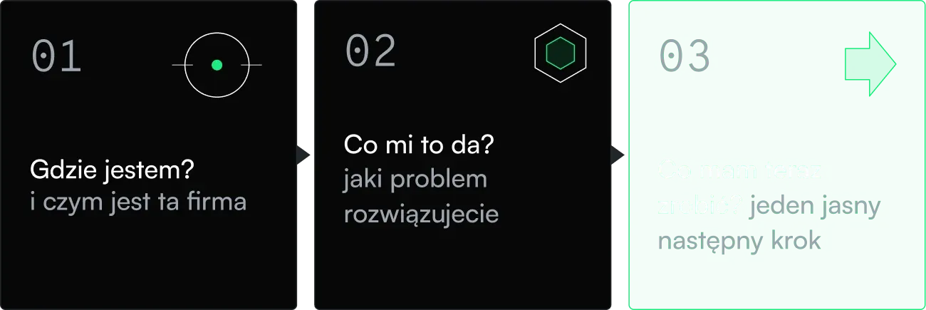
If any answer is unclear, the visitor leaves.
A beautiful website with an unclear message doesn’t convert. Good copy on a chaotic layout doesn’t either. An effective website is three things that have to work together:
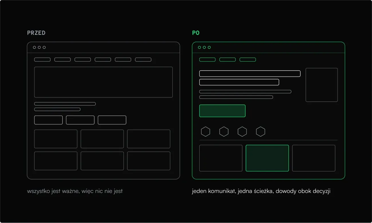
The illustration shows the same content in two versions. On the left everything shouts for attention at once; on the right the page leads to a single decision.
Redesigning a website blind is guesswork. That’s why we start with questions: where the traffic comes from and what those people are looking for, which pages attract it, where visitors end their journey and whether the way to the form or contact is visible at all.
Our services include SEO and GEO optimisation and goal analytics, so we look not only at how the site looks, but also at what users actually do on it.
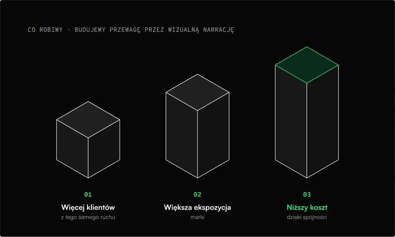
That’s how we describe what we do: we help people understand the offer, make the decision easier and make using the product simpler. For a website that gets traffic but no enquiries, three outcomes matter:
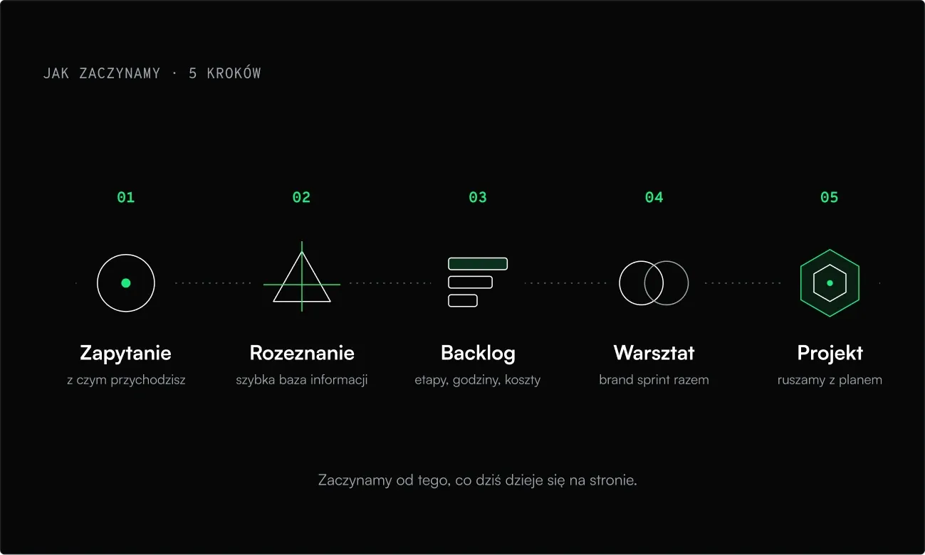
We don’t start with the logo. We start by asking where the company is today and where it wants to be.
In the end you get a working solution, not just a presentation. We build in no-code among other tools, so you can edit the site yourself.
Pretius shows this well: a Polish software house with more than 15 years of experience delivering custom systems for large, well-known companies. When Pretius launched a new Low-Code division, the idea came up to refresh the website and tidy up the brand image.
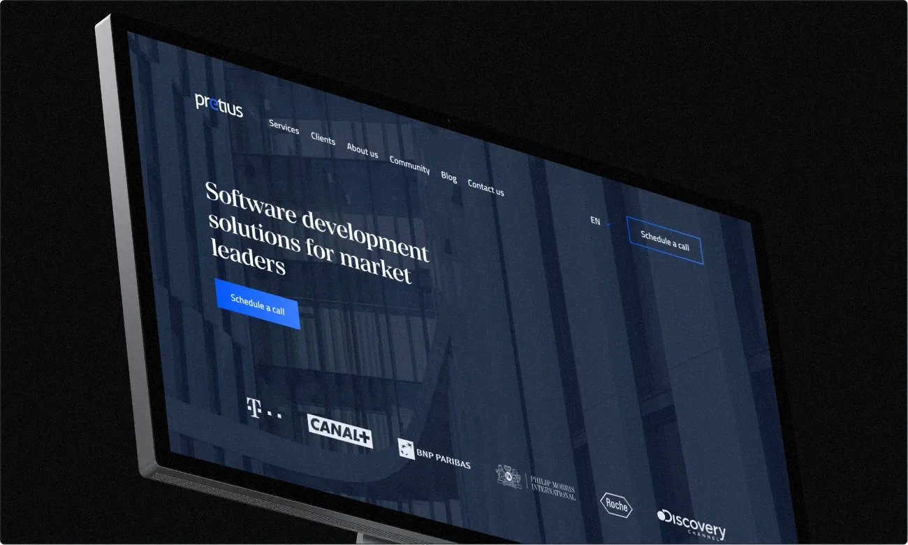
We began with UX workshops where we chose the information architecture, and the functional wireframes became a prototype. The key assumption was about the audience: a mature, conservative user who values effectiveness, a clear message and proof of competence and of the ability to deliver, not flashy style. So above all the website had to present Pretius as a credible partner, and the new Low-Code division as a separate brand within the group. On top of that came a complete website redesign, the interface, icon and illustration sets, and graphic support.
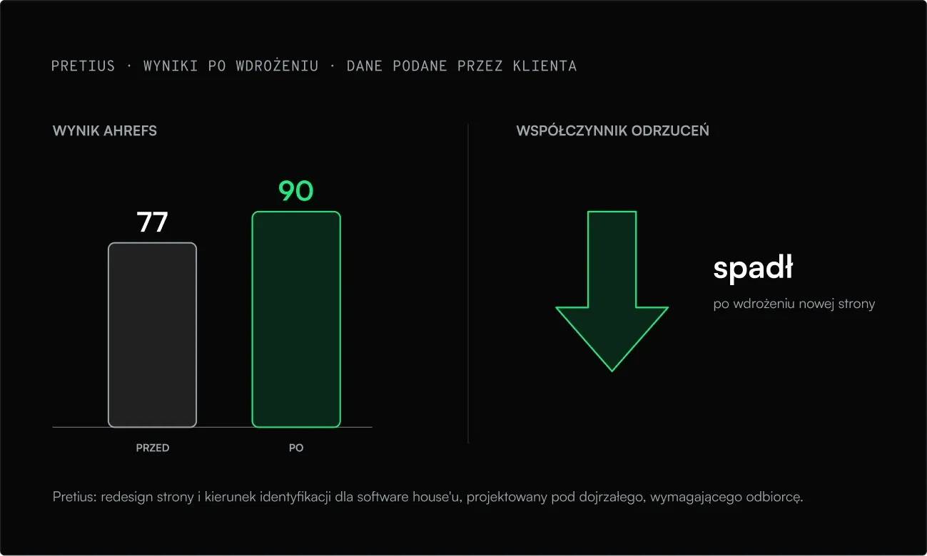
It’s a good illustration of the principle in this post: when a website starts with what the visitor is looking for and clearly shows competence, fewer people leave straight away.
“After a successful launch the Ahrefs score immediately rose from 77 to 90, the new UX/UI designs were praised, and the bounce rate went down.”
Traffic is a valuable resource, but it only turns into enquiries when the website quickly answers the visitor’s questions and leads them to a single decision. Before you invest in more ads or content, it’s worth checking how much of what you already have actually works.
Adam Kapuściński
Senior designer

Tomasz Gawłowski
Designer, Founder
Tomasz Gawłowski
Designer, Founder