
Adam Kapuściński
Senior designer
Adam Kapuściński
Senior designer
Why modern brand consistency is not about copying the same designs.
Many companies think about visual communication in a very simple way.
A new website.
A new catalog.
A new campaign.
A new trade show booth.
The problem appears a few years later.
As the brand grows, there are:
And this is exactly when it turns out that the biggest challenge is no longer creating individual marketing materials.
The biggest challenge becomes maintaining a consistent brand character despite the enormous diversity of communication.
This is a topic that is particularly visible in our more than 10-year collaboration with CBC Poland Group. CBC is a global brand designing, supplying, and implementing security solutions, mainly in the area of CCTV and GANZ electronic CCTV devices — from compact cameras and security monitors to recorders and remote monitoring software.
The brand’s products are used not only in security systems, but also in machine vision, traffic control, and advanced monitoring systems worldwide. Our collaboration began with the redesign and implementation of a new website.
The main goals of the project were:
The new website included:
Over time, a single project evolved into long-term creative support covering practically the entire communication ecosystem of the brand.
And this process perfectly shows what modern visual consistency really is.
Most companies do not lose consistency suddenly. It is a process that appears gradually.
First, individual materials are created.
Later, additional departments create their own communication.
A new product line appears.
A new sub-brand.
A new campaign.
After a few years, the company begins to function in several different aesthetics at the same time. And this is not always the result of mistakes. It is often a natural effect of growth.
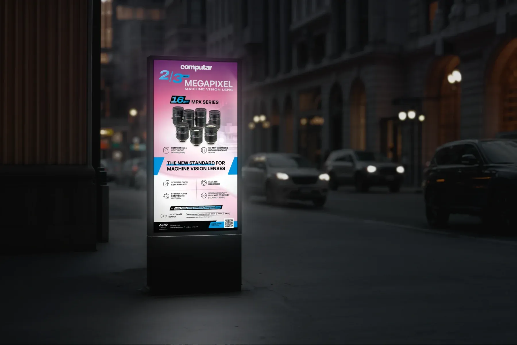
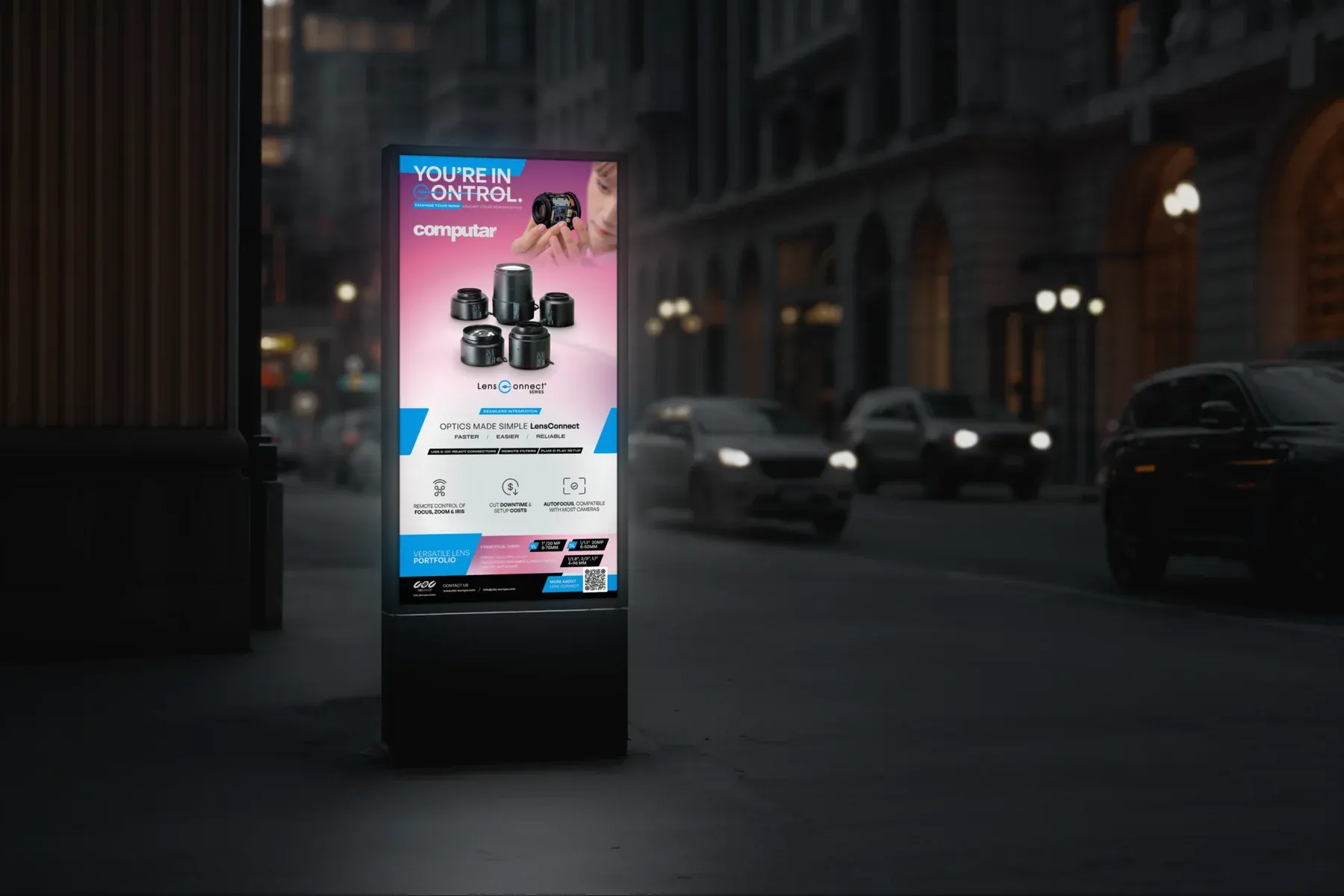
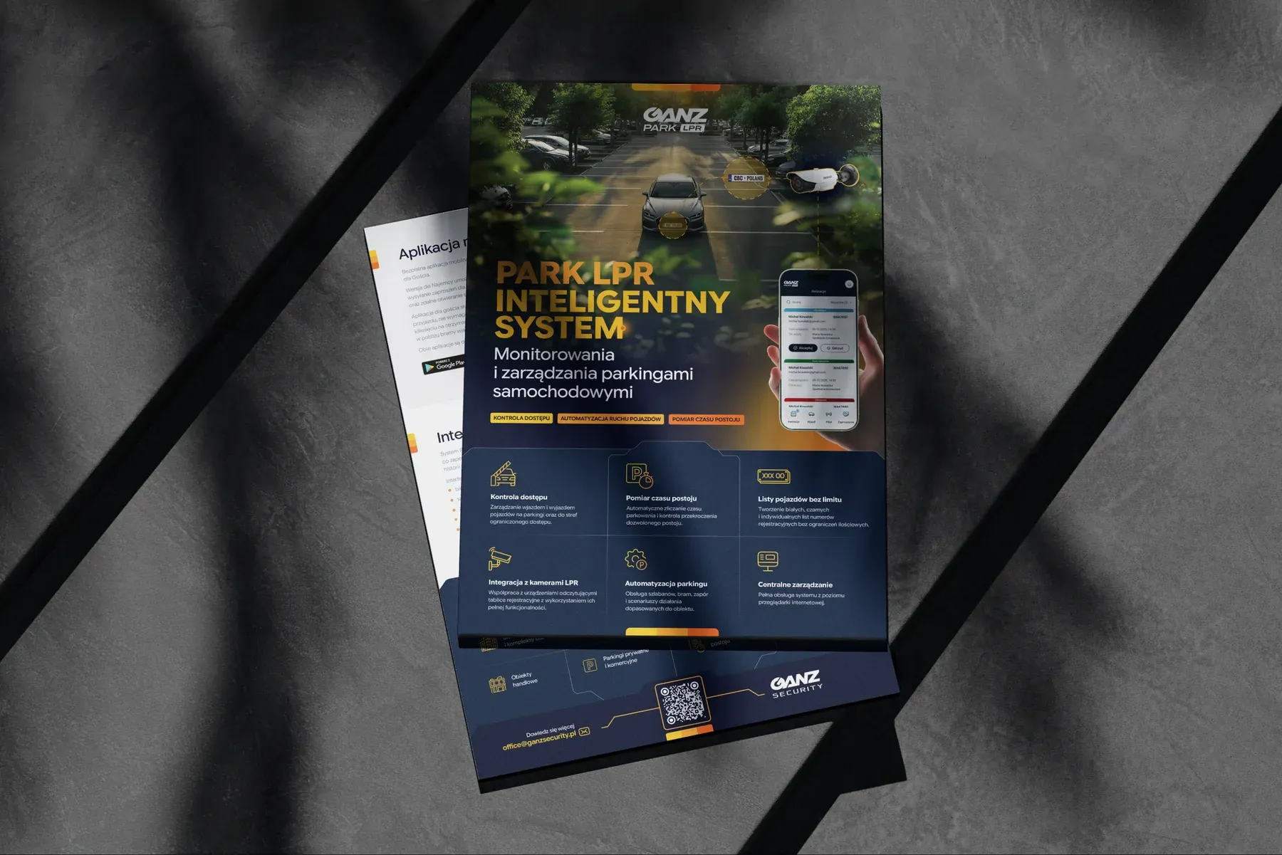
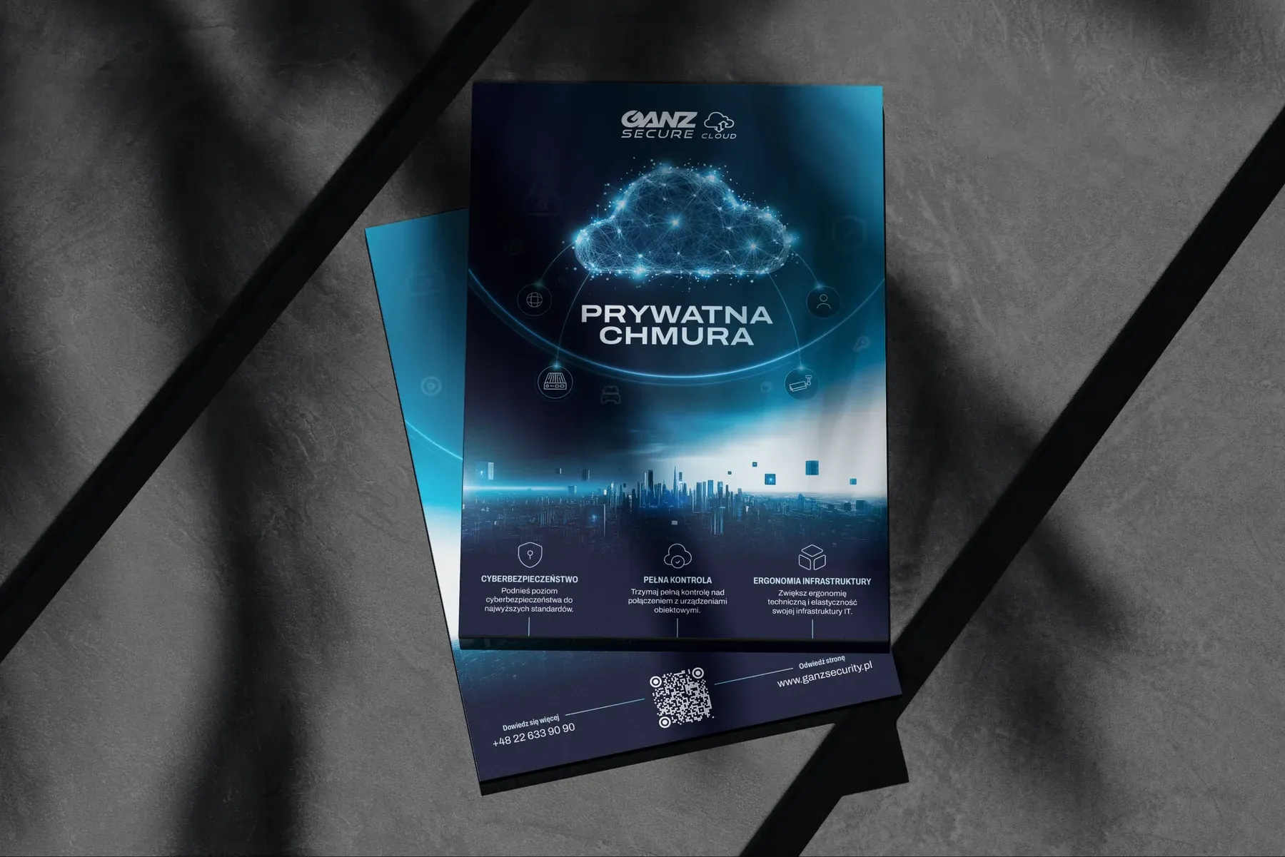
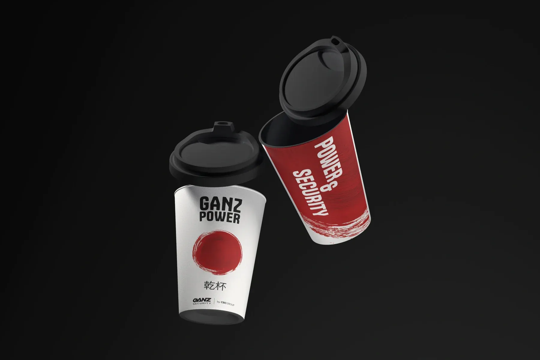
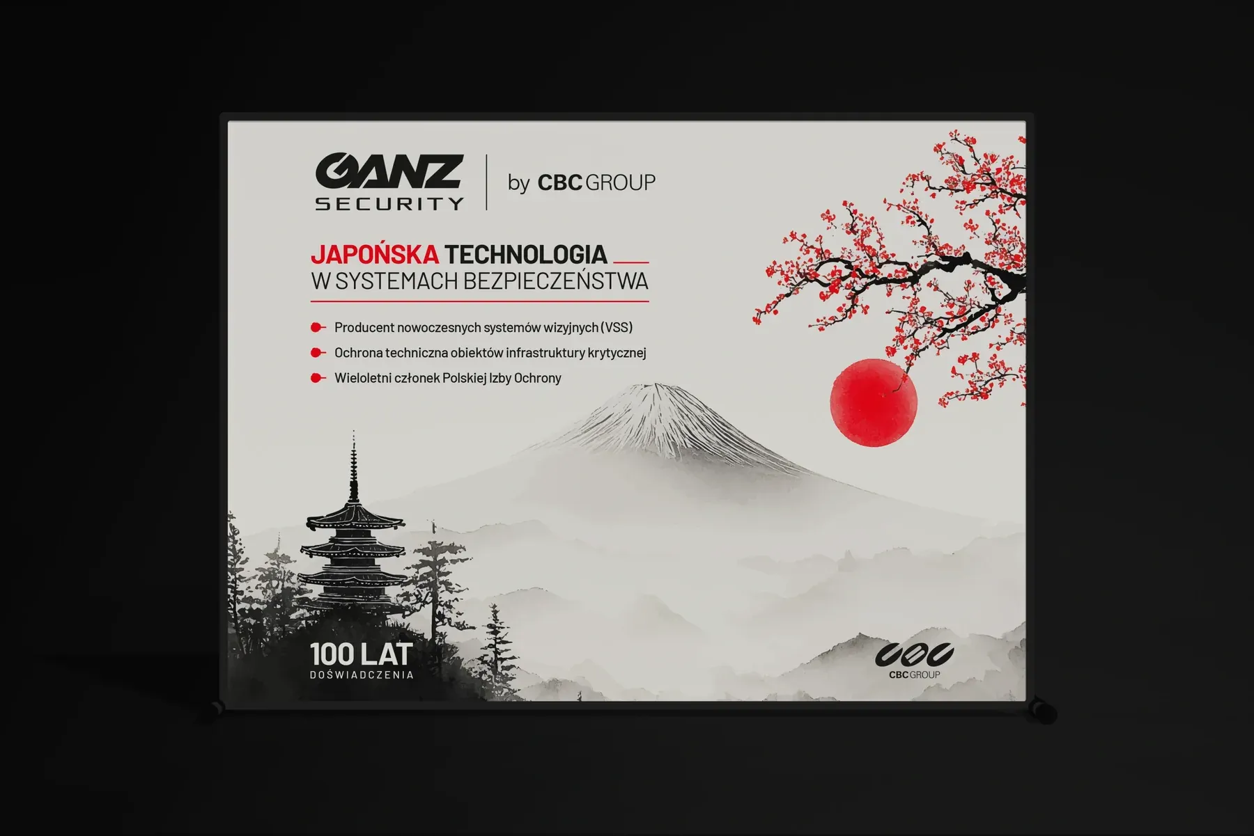
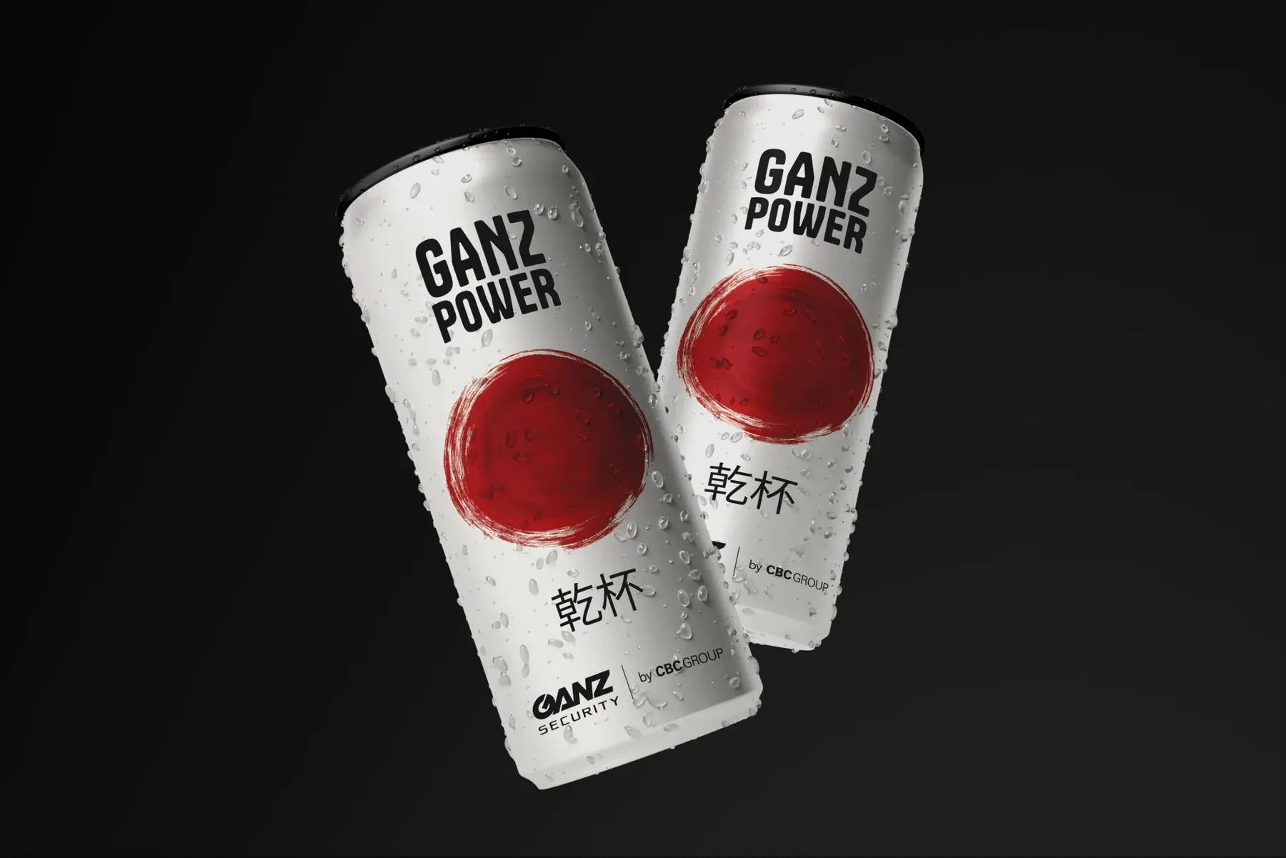
In the case of CBC Poland, what was particularly interesting was that as the company developed, new sub-brands and new business areas emerged, for which we created completely new communication styles.
Each of these brands needed its own character. At the same time, all of them had to remain part of a larger visual ecosystem.
This is where true strategic design begins.
One of the biggest mistakes in thinking about visual identity is the belief that consistency means sameness. In reality, modern brands need much greater flexibility.
Especially in organizations developing multiple product groups, sub-brands, and various communication areas. A good communication system should allow not only the design of different types of materials, but also the development of completely new visual styles over time.
And this is where the most difficult part of the entire process appears. A project created today for one sub-brand should still naturally coexist with a new communication line created in one or two years — even if it concerns completely different technology, product groups, or audiences.
This requires thinking far beyond a single layout. Because true consistency is not about copying the same designs. It is about building an aesthetic and design system that can evolve together with the brand.
That is why real consistency does not come from copying layouts.
It is built through:
These are the elements that make the audience intuitively feel that all materials belong to one brand world.
Even if they concern completely different products and were created several years apart.
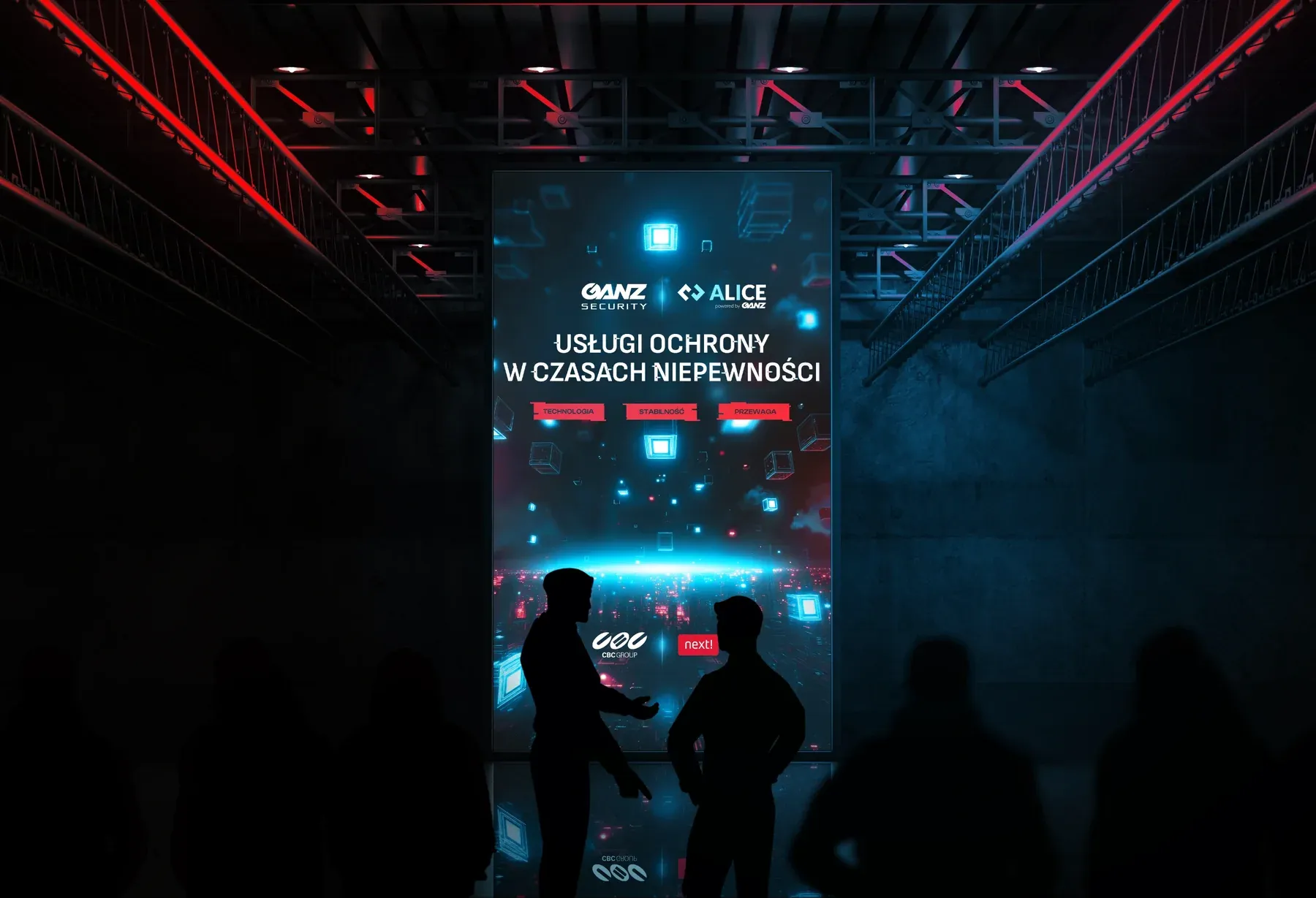
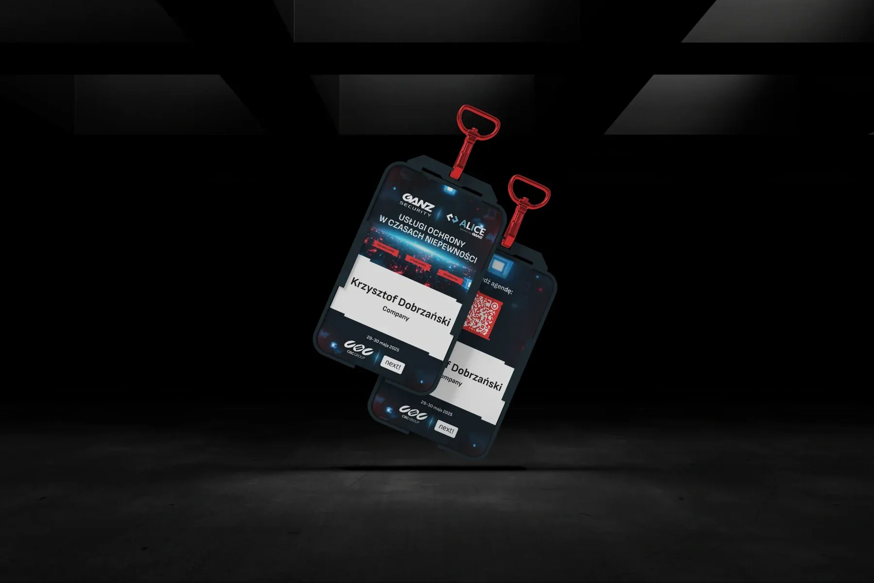
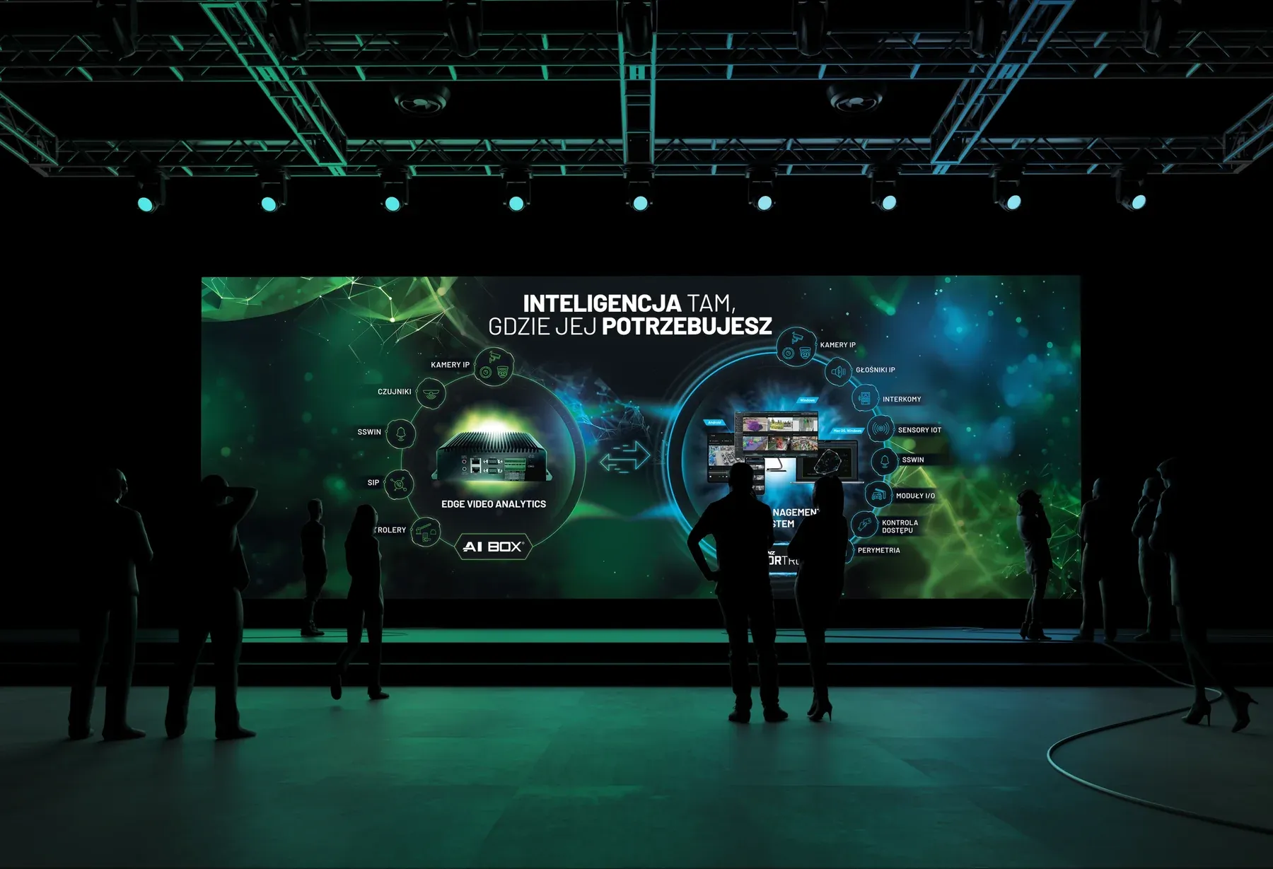
This is one of the most difficult elements of long-term creative collaboration.
New sub-brands very often require:
At the same time, moving too far away from the main brand aesthetic can create chaos. That is why designing for growing organizations should work similarly to system architecture. Each part can have its own character, but all should operate according to shared principles. And this was one of the most interesting aspects of our collaboration with CBC Poland. Over the years, new sub-brands, product groups, and communication areas emerged — often very different visually. Some materials required a more technological and minimalist character. Others needed a more sales-oriented or event-driven approach.
You design differently for:
And yet all these elements must function side by side. This is where the real design challenge appears.
It is not only about creating individual aesthetic materials.
It is about the ability to design an entire communication ecosystem in such a way that new projects naturally complement those created several years earlier.
In practice, this means:
This is what makes it possible to create highly diverse materials without losing the overall character of the brand.
And that is why during trade shows, conferences, or promotional activities, different sub-brands and product groups still look like part of one larger organism.
Not identical. But consistent.
In the era of fast content and multiple communication channels, aesthetic fragmentation is becoming an increasingly serious problem. Different contractors often create technically correct designs. The problem is that after a few years, the brand starts looking like a collection of random projects. That is why long-term collaboration provides an advantage that is often not immediately visible. After years of cooperation, design stops being only about creating graphics.
It becomes based on:
This is especially important in projects covering very different communication areas.
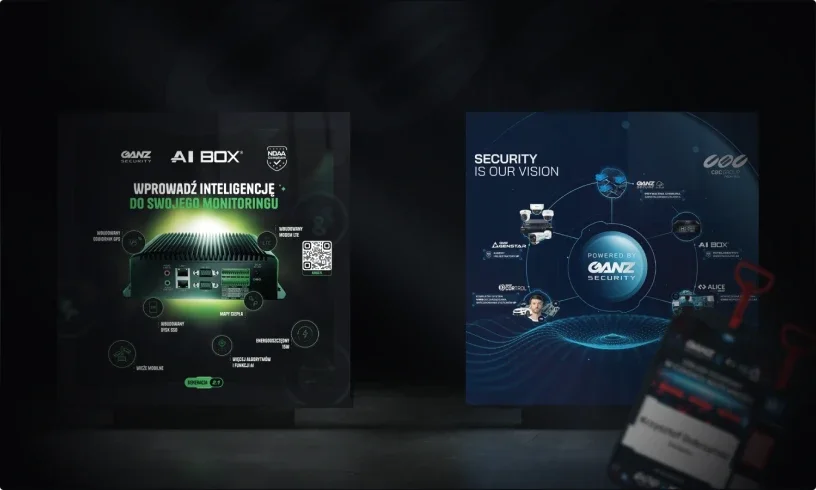
For CBC Poland, we created among others:
And with such a scale of diversity, the value of one consistent design approach becomes the most visible.
The most interesting thing about long-term collaborations is that the brand constantly changes.
What changes:
That is why a well-designed visual system cannot be closed. It must be flexible.
It should allow:
That is why the most important projects are not created in one week. They evolve over years.
In B2B design, communication durability is extremely important. Materials should not look good only at the moment of publication.
They should be designed so that they:
That is why the following become especially important:
This approach makes it possible to develop brand communication without constantly rebuilding everything from scratch.
The true quality of a visual system becomes visible only when the brand functions simultaneously across many spaces.
For example:
But an even greater challenge appears when all these materials concern different sub-brands and product groups. Because then communication cannot rely only on one graphic style. It must be more flexible.
Each product group needs its own character.
Each sub-brand communicates slightly differently.
Each type of material requires a different approach.
And yet the whole system must still feel like one consistent visual environment. This is where the value of long-term and system-based design becomes most visible. Because good visual identity is not about duplicating one style.
It is about the fact that regardless of format, subject matter, or time of creation, you can still see:
And this is what allows brands to remain recognizable despite growth and diversity.
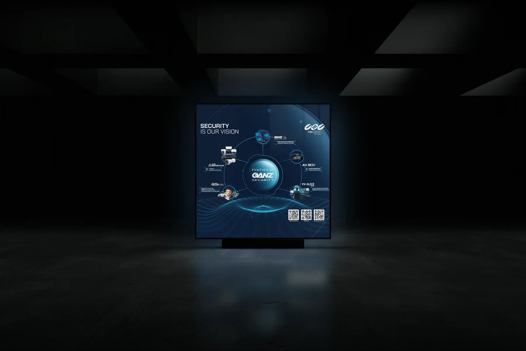
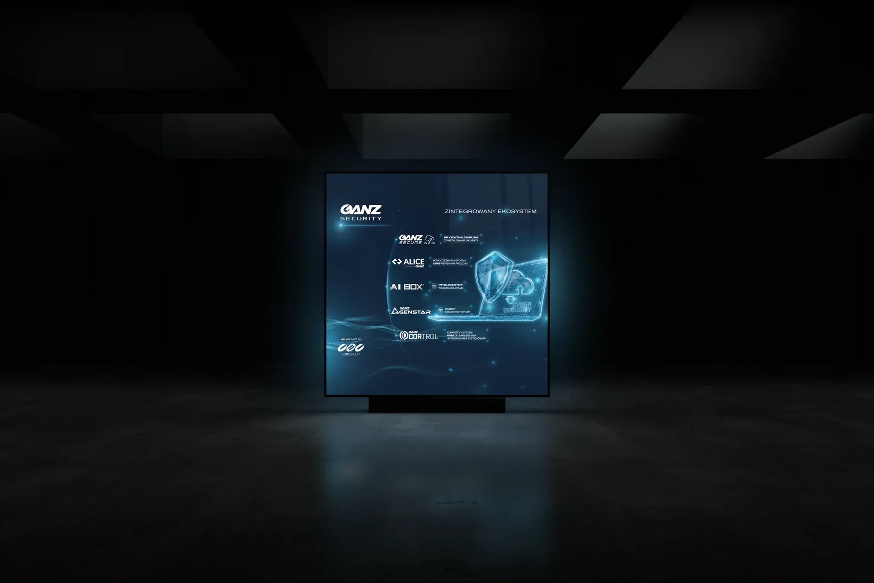
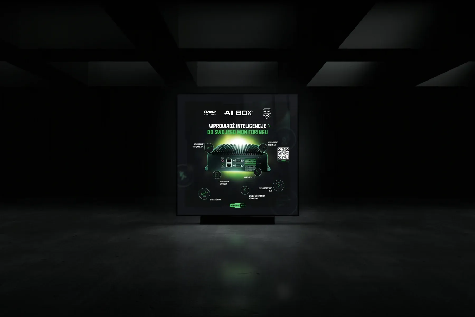
After more than 10 years of collaboration, one thing is very clear — the strongest brands are not built on individual campaigns. They are built through years of consistent communication.
And that is why:
Today, designing visual communication is no longer only about creating graphics.
It is about building an environment in which the brand can grow for years without losing its own character.
Modern brands operate simultaneously across many spaces today.
Offline.
Online.
At trade shows.
On social media.
In sales materials.
In presentations.
In product communication.
And that is why the growing value today is not a single project, but the ability to build a consistent communication system that evolves together with the brand.
In the case of CBC Poland, this collaboration over the years included dozens of very different projects — from websites and catalogs to trade show booths, animations, conference materials, and communication for new sub-brands.
Each of these projects required an individual approach.
At the same time, all of them had to maintain a shared character:
And this best demonstrates that modern brand consistency is not about creating identical materials.
It is about building a recognizable visual language that can be developed over the years — regardless of the number of projects, formats, or new business areas.
Adam Kapuściński
Senior designer

Tomasz Gawłowski
Designer, Founder
Tomasz Gawłowski
Designer, Founder