


PRETIUS
New clothes
for the software house

THE NEED
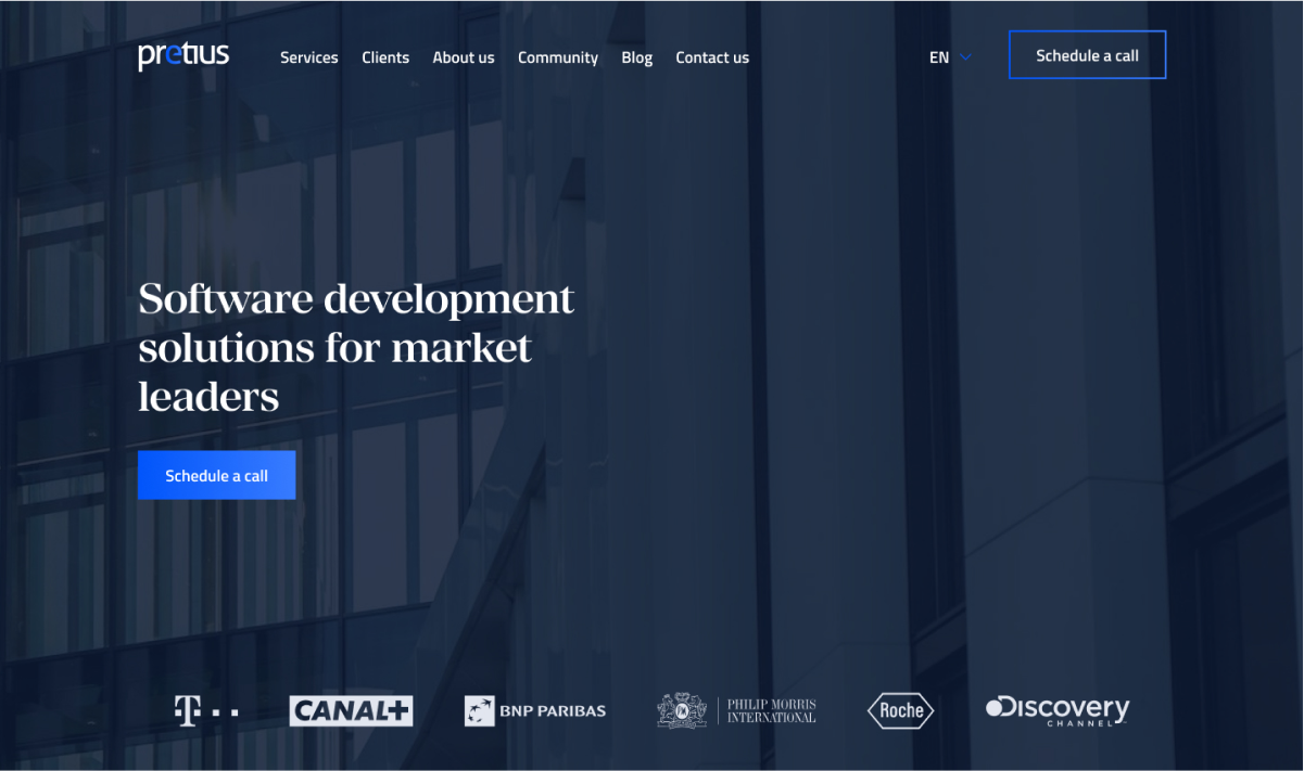
Pretius is a Polish software house with over 15 years of experience in implementing dedicated software systems - from business analysis, through design and development, to long-term support. From the very beginning, they have been cooperating with the leaders of markets that need enterprise solutions, such as Canal+, BNP Paribas, TVN, T-Mobile.
When the new Pretius Low-Code department was created, the idea of refreshing the website emerged, which would also outline new paths for building a better, more distinct visual identification of the brand.
GOALS
As part of the project, apart from a complete redesign of the website, our goal was to outline Pretius’ visual identity shape.
Our task was to design a new design, thanks to which the Pretius brand will be perceived as a trustworthy partner and will use to build its identity in the near future. In addition, we had to combine the newly established Low-Code department as a separate Pretius brand group.
“After a successful launch, the Ahrefs score instantly increased from 77 to 90, new UX/UI designs received praises, and the bounce rate decreased. The team was self-reliant throughout and collaborated through Trello and Slack. Overall, their top-notch services impressively surpassed all challenges.”
Patryk Mamczur, Marketing Manager at Pretius


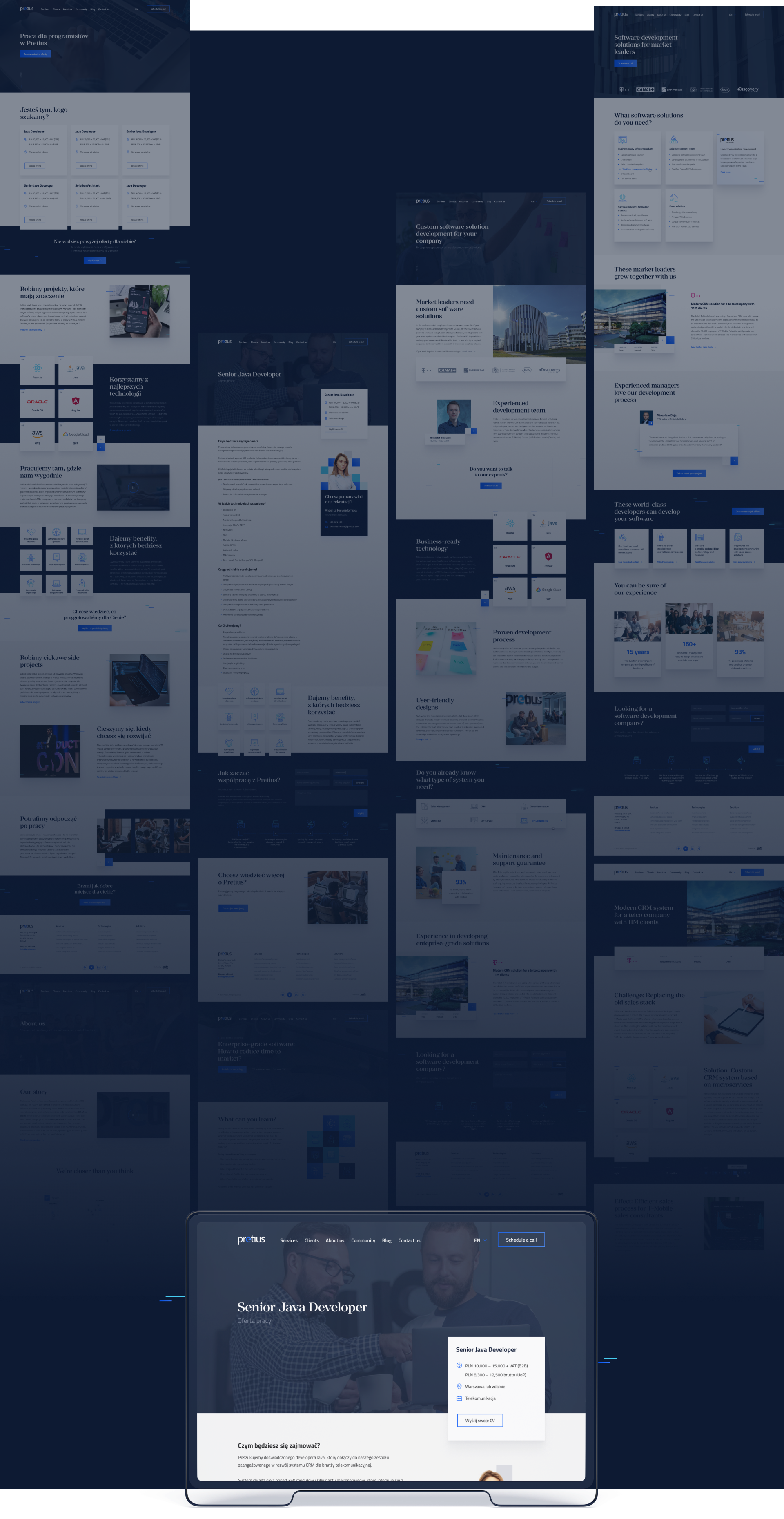
Project included
UX Workshops
Wireframes and prototypes
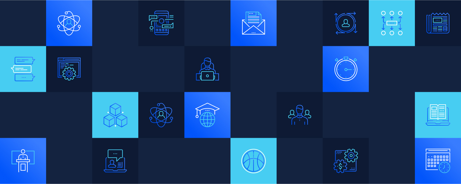
Icon and illustration sets
User interface design
Graphic support


UX WORKSHOPS
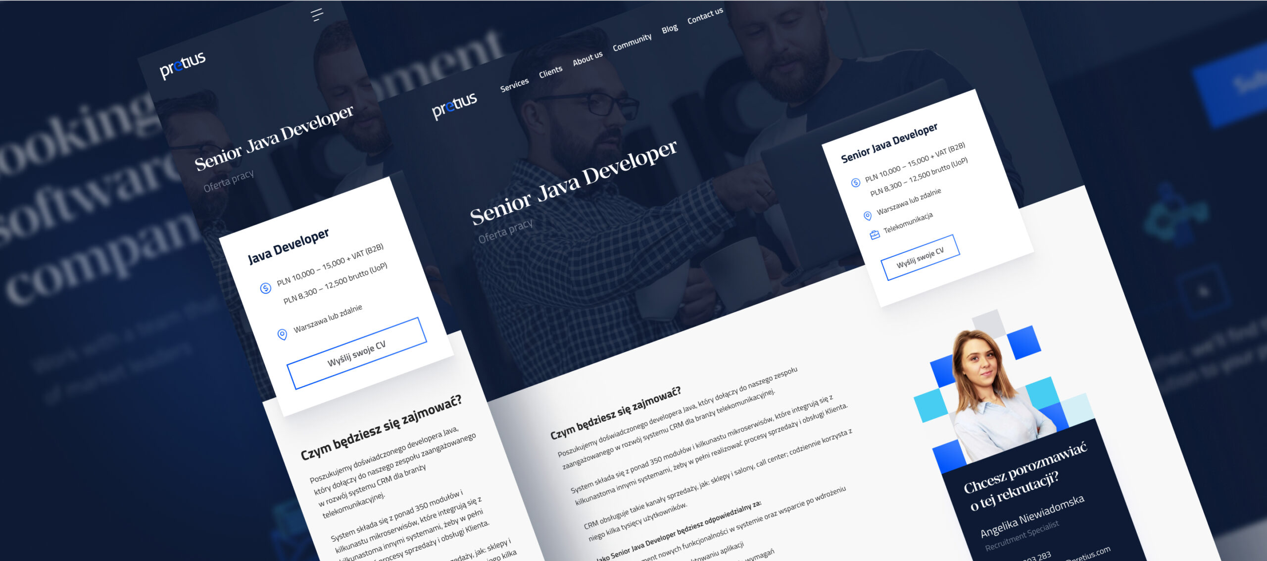
We knew that Pretius targets its services at large players, very recognizable on the market. From the very beginning, we wanted to focus the redesign on a mature, conservative user, for whom flashy style is not important. Efficiency and clear message are important. Proof of skills and experience as well as the ability to deliver the project. With this attitude and assumptions, we started the workshop where we worked on choosing the right information architecture for the website. As part of this stage of work, a prototype was created from functional mock-ups.


LOOK & FEEL
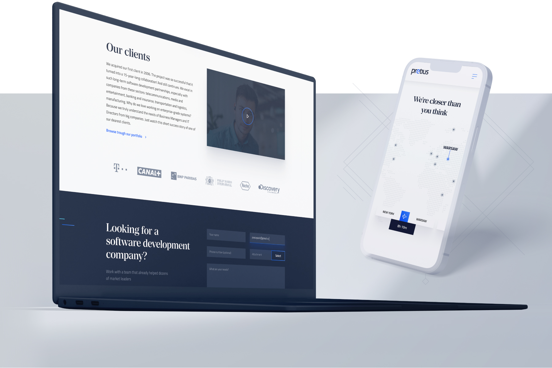
OK, we know how our brand should be perceived: a trustworthy partner in the implementation of the most technologically advanced software systems. A brand that directs its services to a few large entities on the market. When building the style of the website, we tried to put a strong emphasis on visually perceiving Pretius as a mature, serious, and experienced entity that implements projects in a friendly way. We tried to express all this in the design through colors, and typography, but also the dynamics of the website and its animations as well as smoothness of operation.


OTHER VIEWS
DROP US A LINE